Brands
Spykar’s new podcast stitches heritage with ambition in ‘It’s in our jeans’
MUMBAI: All sewn up, Spykar is threading stories, not just jeans. India’s homegrown denim label has unzipped a new chapter in storytelling with the launch of its podcast, ‘It’s in our jeans/genes.’ The series promises conversations as textured as a vintage denim jacket, spotlighting change makers who are stitching heritage into modern ambition.
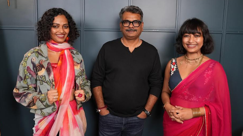
The debut episode features the dynamic Suta sisters: Sujata and Taniya. The brand has reimagined the saree for today’s generation while empowering more than 17,000 artisans across India. True to the show’s theme, the duo even paired denim with sarees in a playful diy experiment, blending tradition with trend in one seamless drape.
“Fashion is about more than denim, it’s about identity and the stories that connect us,” said Spykar Lifestyles, co-founder and ceo, Sanjay Vakharia. “The Suta sisters embody the balance of heritage and modernity, reflecting the ambition of a new India that thinks global while staying rooted.”
For Sujata and Taniya, the podcast felt like a natural fit. “Suta has always been about effortless, joyful sarees and supporting artisans. Spykar’s podcast celebrates the same values: authenticity, storytelling, and pride in taking Indian traditions to the world,” they shared.
With more episodes lined up across technology, food, music, and start-ups, ‘It’s in our jeans/genes’ aims to inspire students, entrepreneurs, and dreamers alike. Available on Spotify, Youtube, Apple podcasts and more, the series cements Spykar’s role not just as India’s denim favourite, but also as a storyteller for a new India: authentic, ambitious, and global.
Brands
Godrej clarifies ‘GI’ identifier after logo similarity debate
Says GI is not a logo, will not replace Godrej signature across products.
MUMBAI: In a branding storm where shapes did the talking, Godrej is now spelling things out. Godrej Industries Group (GIG) has issued a clarification on its newly introduced ‘GI’ identifier, addressing questions around its purpose and design following a wave of online criticism. At the centre of the debate were two concerns: whether the new mark replaces the long-standing Godrej logo, and whether its geometric design mirrors other corporate identities.
The company has drawn a clear line. The Godrej signature logo, it said, remains unchanged and continues to be the sole logo across all consumer-facing products and services. The ‘GI’ mark, by contrast, is not a logo but a corporate group identifier intended for use alongside the Godrej signature or company name, and aimed at stakeholders such as investors, media and talent rather than consumers.
The need for such a distinction stems from the 2024 restructuring of the broader Godrej Group into two separate business entities. With both continuing to operate under the same Godrej name and signature, the identifier is positioned as a way to differentiate the Godrej Industries Group at a corporate level.
The rollout, however, triggered a broader conversation on design originality. Critics pointed to similarities between the GI mark’s geometric composition and logos used by companies globally, raising questions about distinctiveness.
Responding to this, GIG said its intellectual property and legal review found that such overlaps are common in minimalist, geometry-led design systems. Basic forms such as circles and rectangles appear across dozens of brand identities worldwide, the company noted.
It added that the identifier emerged from an extensive design process and was chosen for its simplicity, allowing it to sit alongside the Godrej signature without competing visually. While acknowledging that elemental shapes may appear less distinctive in isolation, the group emphasised that the mark is part of a broader identity system that includes a custom typeface, sonic branding and other proprietary elements.
Following legal and ethical assessments, the company said it found no impediment to using the identifier, reiterating that the GI mark is a corporate tool not a consumer-facing symbol.
In short, the logo isn’t changing but the conversation around it certainly has.


