Brands
Sierra shifts into legend gear as Tata revives its iconic SUV for 2025
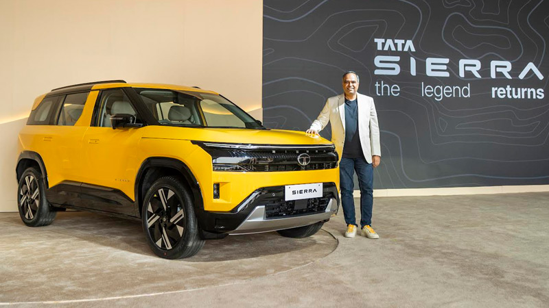
MUMBAI: Some comebacks whisper but the Sierra roared back like it never left. At the much-anticipated Sierra Brand Day, Tata Motors rolled out the production-ready version of the iconic Tata Sierra, signalling the official revival of one of India’s most beloved SUVs and setting up a grand launch on 25 November 2025.
The evening unfolded like a nostalgia-soaked film reel, the 1991 original standing proudly beside its modern descendant tracing a journey of design, emotion, and engineering ambition. If the old Sierra was a symbol of freedom for a generation, the new one is Tata’s bold bid to recast that spirit for an audience that dreams bigger, drives harder, and seeks identity in its machines.
For Tata Motors, this was more than a product reveal, it was the return of a cultural icon.
“The Tata Sierra is much more than a name or a vehicle; it’s a living symbol of Indian ingenuity and aspiration,” said Tata Motors vice president & head of global design and Tata Motors Design Tech Centre executive director Martin Uhlarik.
Uhlarik’s words struck a chord with the crowd, the Sierra has always been more feeling than form. Its silhouette on highways became a memory for many; its spirit of exploration became a metaphor. “Reimagining a legend is not simply nostalgia, it’s courageous design and innovation,” he added, underscoring Tata’s attempt to bridge heritage and future.
And in the new Sierra, that bridge looks sturdy, a modern, assertive, expressive SUV that still carries the unmistakable Sierra stance.
The launch night also doubled as a showcase of six exclusive collaborations, each weaving Sierra’s ethos into a different corner of Indian creativity. Every partnership felt like a character sketch of the Sierra’s personality bold, thoughtful, expressive, and steeped in storytelling.
• Delhi Watch Company – Timekeeping with character
A limited-edition Sierra x Delhi Watch Company timepiece restricted to 500 numbered pieces features design elements inspired by the SUV’s B-pillar, hidden horse motif, and topographic patterns. It’s craftsmanship that nods to the Sierra’s roots while ticking towards the future.
• Divine – Sierra rides into the beat
In Divine’s latest track ‘You & I’, the Sierra takes centre seat, embodying raw confidence and originality. The collaboration fuses rhythm with motion, marking the SUV’s entry into pop culture with swagger and soul.
• Gully Labs – Streetwear meets street machines
Gully Labs’ flagship Dvaita sneaker gets a Sierra-infused makeover topographic lines, horse emblem, and a signature yellow heel patch. It’s a limited-edition drop made for those who take the road less followed.
• Huemn – Wearable wanderlust
From T-shirts to jackets and caps, the Sierra × Huemn capsule distils the SUV’s DNA into bold minimalism. This collection celebrates freedom, individuality, and the audacity to stand apart much like the SUV itself.
• Nappa Dori – Travel gear with a legacy twist
The Sierra x Nappa Dori line brings functional luxury to life, inspired by the SUV’s earthy palette and iconic silhouette. Crafted to age gracefully, each piece channels the brand’s refined aesthetic blended with Sierra’s spirit of exploration.
• Starbucks – A brew for the road
Tata Sierra and Starbucks present a tumbler crafted especially for the SUV etched with topographical lines and Sierra’s silhouette. It’s designed for long drives, early brews, and journeys where memories feel as warm as the coffee.
By pairing design evolution with cultural crossovers, Tata Motors has made the Sierra’s return bigger than a model launch, it’s a moment. One that taps into India’s love for nostalgia, its desire for modernity, and its appetite for storytelling through objects.
The Sierra now stands not just as a car but as a canvas, a marker of identity, an emotion rekindled, and a pledge that heritage can drive straight into the future without taking a U-turn.
When the SUV officially launches 25 November 2025, it won’t just hit the road. It’ll hit a nerve, the one India has been keeping warm for three decades.