Connect with us

Brands

UPKL’s season 2 film puts kabaddi’s grassroots roar centre stage

Published

on

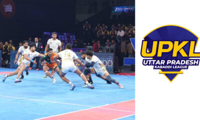
NATIONAL: Uttar Pradesh Kabaddi League (UPKL) has rolled out a high-energy campaign film, Poora UP khelega kabaddi, officially flagging off Season 2 of the league, which tips off on December 24 at the Noida indoor stadium.

Conceptualised and produced by V1 Media, the film leans into kabaddi’s earthy roots, tracing the sport’s journey from improvised neighbourhood grounds to the professional arena. Its narrative follows a young boy sketching a kabaddi court with marking powder: an image that anchors the film’s message of aspiration, access and ambition.

Advertisement

As the story travels across towns and cities in Uttar Pradesh, it mirrors the sport’s deep cultural hold on the state, before culminating at the Noida venue, where Season 2 comes alive. The film positions UPKL as the bridge between raw, local passion and a structured professional pathway.

“Kabaddi begins in streets, grounds and everyday spaces across Uttar Pradesh,” said SJ Uplift Kabaddi founder and director Sambhav Jain. “This film captures that journey, from the first spark of aspiration to the professional stage of UPKL. Season 2 reflects our commitment to grassroots energy and a league that truly belongs to the state.”

The campaign will run across television and digital platforms as part of UPKL’s season launch push. Season 2 will feature 12 teams playing 69 matches over 18 days, all hosted at the Noida indoor stadium. Matches will be broadcast on Zee Bollywood, &pictures HD, Anmol cinema 2 and streamed on Zee5. 
 

Advertisement
Click to comment

Leave a Reply

Your email address will not be published. Required fields are marked *

Brands

Godrej clarifies ‘GI’ identifier after logo similarity debate

Says GI is not a logo, will not replace Godrej signature across products.

Published

on

MUMBAI: In a branding storm where shapes did the talking, Godrej is now spelling things out. Godrej Industries Group (GIG) has issued a clarification on its newly introduced ‘GI’ identifier, addressing questions around its purpose and design following a wave of online criticism. At the centre of the debate were two concerns: whether the new mark replaces the long-standing Godrej logo, and whether its geometric design mirrors other corporate identities.

The company has drawn a clear line. The Godrej signature logo, it said, remains unchanged and continues to be the sole logo across all consumer-facing products and services. The ‘GI’ mark, by contrast, is not a logo but a corporate group identifier intended for use alongside the Godrej signature or company name, and aimed at stakeholders such as investors, media and talent rather than consumers.

The need for such a distinction stems from the 2024 restructuring of the broader Godrej Group into two separate business entities. With both continuing to operate under the same Godrej name and signature, the identifier is positioned as a way to differentiate the Godrej Industries Group at a corporate level.

Advertisement

The rollout, however, triggered a broader conversation on design originality. Critics pointed to similarities between the GI mark’s geometric composition and logos used by companies globally, raising questions about distinctiveness.

Responding to this, GIG said its intellectual property and legal review found that such overlaps are common in minimalist, geometry-led design systems. Basic forms such as circles and rectangles appear across dozens of brand identities worldwide, the company noted.

It added that the identifier emerged from an extensive design process and was chosen for its simplicity, allowing it to sit alongside the Godrej signature without competing visually. While acknowledging that elemental shapes may appear less distinctive in isolation, the group emphasised that the mark is part of a broader identity system that includes a custom typeface, sonic branding and other proprietary elements.

Advertisement

Following legal and ethical assessments, the company said it found no impediment to using the identifier, reiterating that the GI mark is a corporate tool not a consumer-facing symbol.

In short, the logo isn’t changing but the conversation around it certainly has.

Advertisement
Continue Reading

Advertisement News18
Advertisement
Advertisement
Advertisement
Advertisement Whtasapp
Advertisement Year Enders

Indian Television Dot Com Pvt Ltd

Signup for news and special offers!

Copyright © 2026 Indian Television Dot Com PVT LTD

This will close in 10 seconds