Connect with us

Brands

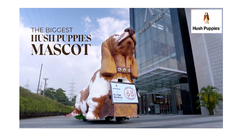
Hush Puppies unveils a larger-than-life installation of its iconic mascot

Published

on

Mumbai: To commemorate the timeless elegance and comfort of Hush Puppies on its 65th birthday, Bata India organised a unique month-long celebration across all touchpoints to spread the message of living life on a brighter side. The celebrations commenced with a restorative yoga session with puppies, special discount offers at HP stores and bata.com, and were culminated by the unveiling of a larger-than-life installation of the brand’s iconic mascot – the Hush Puppies Basset Hound.

A gigantic Basset Hound-themed van circled the streets of Gurugram capturing eye-balls, leaving a trail of smiles and wonder. Its vibrant and playful design drew the attention of both young and old, sparking conversations and igniting curiosity. As captured in the film, the excited faces of the passersby were a reminder that a touch of creativity and whimsy can bring unexpected delight in the midst of daily life. To share this moment with cherished consumers, the van visited the homes of select consumers distributing smiles, cakes & special offers.

Advertisement

Speaking on the campaign Bata India head of category and communications Ullas Vijay said, “The initiatives for Hush Puppies’ 65th Birthday go beyond just brand activations. The brand’s mission is to inspire individuals to live life on the bright side and we, at Bata India, wanted to celebrate in a way that reflects the brand values of Hush Puppies: ‘Be True, Be Comfy, Be Bright, Be Bold.’ We commend Hush Puppies’ 65-year legacy of impeccable craftsmanship and innovative design. Here’s to more style, comfort, and positivity!”

Speaking on the occasion, Xperia Group managing partner and CEO Saibal Gupta said, “Having carved a distinct niche for itself on key parameters such as comfort and style, brand Hush Puppies from Bata has been enjoying a huge recall and love from its customers for several decades. Hence our campaign was aimed to create a larger-than-life installation of the brand’s iconic mascot – the Hush Puppies Basset Hound which we took on the streets of Gurugram to capture and touch the emotions of people with smiles, remembering their association with the brand. Indeed, it has evoked massive eye-balls and has resonated with the sentiments of all Hush Puppies lovers.”

Advertisement
Click to comment

Leave a Reply

Your email address will not be published. Required fields are marked *

Brands

Godrej clarifies ‘GI’ identifier after logo similarity debate

Says GI is not a logo, will not replace Godrej signature across products.

Published

on

MUMBAI: In a branding storm where shapes did the talking, Godrej is now spelling things out. Godrej Industries Group (GIG) has issued a clarification on its newly introduced ‘GI’ identifier, addressing questions around its purpose and design following a wave of online criticism. At the centre of the debate were two concerns: whether the new mark replaces the long-standing Godrej logo, and whether its geometric design mirrors other corporate identities.

The company has drawn a clear line. The Godrej signature logo, it said, remains unchanged and continues to be the sole logo across all consumer-facing products and services. The ‘GI’ mark, by contrast, is not a logo but a corporate group identifier intended for use alongside the Godrej signature or company name, and aimed at stakeholders such as investors, media and talent rather than consumers.

The need for such a distinction stems from the 2024 restructuring of the broader Godrej Group into two separate business entities. With both continuing to operate under the same Godrej name and signature, the identifier is positioned as a way to differentiate the Godrej Industries Group at a corporate level.

Advertisement

The rollout, however, triggered a broader conversation on design originality. Critics pointed to similarities between the GI mark’s geometric composition and logos used by companies globally, raising questions about distinctiveness.

Responding to this, GIG said its intellectual property and legal review found that such overlaps are common in minimalist, geometry-led design systems. Basic forms such as circles and rectangles appear across dozens of brand identities worldwide, the company noted.

It added that the identifier emerged from an extensive design process and was chosen for its simplicity, allowing it to sit alongside the Godrej signature without competing visually. While acknowledging that elemental shapes may appear less distinctive in isolation, the group emphasised that the mark is part of a broader identity system that includes a custom typeface, sonic branding and other proprietary elements.

Advertisement

Following legal and ethical assessments, the company said it found no impediment to using the identifier, reiterating that the GI mark is a corporate tool not a consumer-facing symbol.

In short, the logo isn’t changing but the conversation around it certainly has.

Advertisement
Continue Reading

Advertisement News18
Advertisement
Advertisement
Advertisement
Advertisement Whtasapp
Advertisement Year Enders

Indian Television Dot Com Pvt Ltd

Signup for news and special offers!

Copyright © 2026 Indian Television Dot Com PVT LTD

This will close in 10 seconds