Connect with us

Brands

UP Warriorz rope in L’Oréal Professionnel as title sponsor for WPL season 4

Published

on

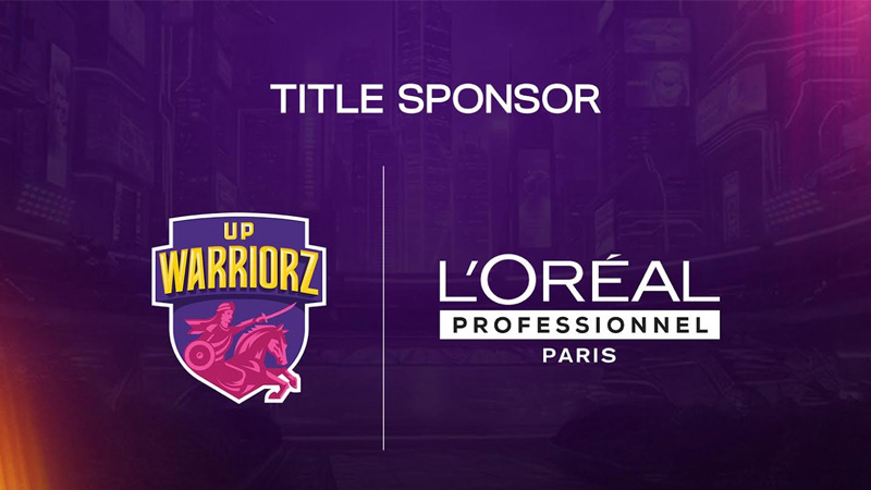
MUMBAI: UP Warriorz, the Capri Sports–owned Women’s Premier League franchise, has roped in L’Oréal Professionnel as its title sponsor for WPL season 4, forging a partnership built on performance, confidence and women-first ambition.

The association pairs UP Warriorz’s positioning as a purpose-led women’s team with L’Oréal Professionnel’s professional beauty pedigree, extending beyond logo visibility into content-led storytelling and season-long integrations. The collaboration aims to spotlight confidence as a competitive edge: on the pitch and beyond it.

Capri Sports director Jinisha Sharma, said the tie-up reflects a shared belief in transformation and empowerment. “This is more than a sponsorship. It is about building narratives that encourage young women to dream fearlessly and pursue excellence,” she said.

Advertisement

UP Warriorz COO Kshemal Waingankar, added that the partnership aligns closely with the franchise’s women-first ethos. “It is about enabling women to perform at their best, in sport and in life,” he said.

L’Oréal Professionnel India general manager Mathilde Barthélemy-Vigier, said the brand’s association with UP Warriorz was a natural extension of its values. “Together, we celebrate women who challenge boundaries and inspire change. It is truly where the pros meet the pros,” she added.

The partnership strengthens UP Warriorz’s commercial playbook ahead of WPL season 4, as brands increasingly look to women’s sport for credibility, cultural relevance and long-term engagement.

Advertisement
Click to comment

Leave a Reply

Your email address will not be published. Required fields are marked *

Brands

Godrej clarifies ‘GI’ identifier after logo similarity debate

Says GI is not a logo, will not replace Godrej signature across products.

Published

on

MUMBAI: In a branding storm where shapes did the talking, Godrej is now spelling things out. Godrej Industries Group (GIG) has issued a clarification on its newly introduced ‘GI’ identifier, addressing questions around its purpose and design following a wave of online criticism. At the centre of the debate were two concerns: whether the new mark replaces the long-standing Godrej logo, and whether its geometric design mirrors other corporate identities.

The company has drawn a clear line. The Godrej signature logo, it said, remains unchanged and continues to be the sole logo across all consumer-facing products and services. The ‘GI’ mark, by contrast, is not a logo but a corporate group identifier intended for use alongside the Godrej signature or company name, and aimed at stakeholders such as investors, media and talent rather than consumers.

The need for such a distinction stems from the 2024 restructuring of the broader Godrej Group into two separate business entities. With both continuing to operate under the same Godrej name and signature, the identifier is positioned as a way to differentiate the Godrej Industries Group at a corporate level.

Advertisement

The rollout, however, triggered a broader conversation on design originality. Critics pointed to similarities between the GI mark’s geometric composition and logos used by companies globally, raising questions about distinctiveness.

Responding to this, GIG said its intellectual property and legal review found that such overlaps are common in minimalist, geometry-led design systems. Basic forms such as circles and rectangles appear across dozens of brand identities worldwide, the company noted.

It added that the identifier emerged from an extensive design process and was chosen for its simplicity, allowing it to sit alongside the Godrej signature without competing visually. While acknowledging that elemental shapes may appear less distinctive in isolation, the group emphasised that the mark is part of a broader identity system that includes a custom typeface, sonic branding and other proprietary elements.

Advertisement

Following legal and ethical assessments, the company said it found no impediment to using the identifier, reiterating that the GI mark is a corporate tool not a consumer-facing symbol.

In short, the logo isn’t changing but the conversation around it certainly has.

Advertisement
Continue Reading

Advertisement News18
Advertisement
Advertisement
Advertisement
Advertisement Whtasapp
Advertisement Year Enders

Indian Television Dot Com Pvt Ltd

Signup for news and special offers!

Copyright © 2026 Indian Television Dot Com PVT LTD

This will close in 10 seconds