Brands
Spykar unveils ‘Daur Apna Hai’ campaign with rap anthem celebrating India’s youth spirit
MUMBAI: Spykar Lifestyle, one of India’s most loved and trusted homegrown denim brands, has announced the launch of its latest campaign, Daur Apna Hai. The campaign reflects the belief that this is India’s moment, a celebration of the country’s youthful, vibrant spirit at heart, mind and soul.
Daur Apna Hai champions the confidence, self-expression and pride of today’s generation, echoing Spykar’s own journey as India’s finest denim brand, renowned for authenticity and the perfect fit for Indian bodies. The campaign kicks off with a high-energy rap anthem created in collaboration with Wicked Sunny, Dharmik and the Vixens Crew. With its addictive rhythm and hard-hitting lyrics, the track celebrates the grit, ambition and talent of India’s youth, underscoring Spykar’s conviction that it is India’s time to shine on the global stage.
Commenting on the campaign, Spykar Lifestyle Pvt. Ltd, co-founder and CEO, Sanjay Vakharia said, “Spykar has always stood for the young and restless Indian spirit : self-made, unapologetic and ambitious. ‘Daur Apna Hai’ stems from the same philosophy. The rap anthem is just the first step of this larger campaign, which marks the beginning of an exciting new chapter. As India’s youth push boundaries and redefine success, we are ready to walk alongside them, empowering them with style and confidence that is proudly Indian. We will soon unveil more initiatives, collaborations and stories that celebrate Indian creativity.”
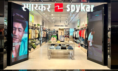
From pioneering denim in India to emerging as a full-fledged lifestyle brand with apparel and accessories, Spykar has consistently delivered products that combine global design sensibilities with Indian authenticity. Known for high-quality fabrics, cutting-edge styles and fits crafted for Indian bodies, Spykar enjoys a strong presence across stores, e-commerce platforms and a loyal customer base nationwide.
With Daur Apna Hai, Spykar reinforces its position as India’s leading denim brand and a champion of originality, individuality and youth-led creativity. The campaign goes beyond fashion to spark conversations around confidence, self-expression and the celebration of Indian talent.
Brands
Godrej clarifies ‘GI’ identifier after logo similarity debate
Says GI is not a logo, will not replace Godrej signature across products.
MUMBAI: In a branding storm where shapes did the talking, Godrej is now spelling things out. Godrej Industries Group (GIG) has issued a clarification on its newly introduced ‘GI’ identifier, addressing questions around its purpose and design following a wave of online criticism. At the centre of the debate were two concerns: whether the new mark replaces the long-standing Godrej logo, and whether its geometric design mirrors other corporate identities.
The company has drawn a clear line. The Godrej signature logo, it said, remains unchanged and continues to be the sole logo across all consumer-facing products and services. The ‘GI’ mark, by contrast, is not a logo but a corporate group identifier intended for use alongside the Godrej signature or company name, and aimed at stakeholders such as investors, media and talent rather than consumers.
The need for such a distinction stems from the 2024 restructuring of the broader Godrej Group into two separate business entities. With both continuing to operate under the same Godrej name and signature, the identifier is positioned as a way to differentiate the Godrej Industries Group at a corporate level.
The rollout, however, triggered a broader conversation on design originality. Critics pointed to similarities between the GI mark’s geometric composition and logos used by companies globally, raising questions about distinctiveness.
Responding to this, GIG said its intellectual property and legal review found that such overlaps are common in minimalist, geometry-led design systems. Basic forms such as circles and rectangles appear across dozens of brand identities worldwide, the company noted.
It added that the identifier emerged from an extensive design process and was chosen for its simplicity, allowing it to sit alongside the Godrej signature without competing visually. While acknowledging that elemental shapes may appear less distinctive in isolation, the group emphasised that the mark is part of a broader identity system that includes a custom typeface, sonic branding and other proprietary elements.
Following legal and ethical assessments, the company said it found no impediment to using the identifier, reiterating that the GI mark is a corporate tool not a consumer-facing symbol.
In short, the logo isn’t changing but the conversation around it certainly has.


