Brands
Safari packs a punch of colour with Shades Ahead
MUMBAI: Who says baggage has to be boring? Safari is turning the travel aisle into a runway with Shades Ahead, a vibrant new luggage collection that swaps the old blacks and greys for a riot of colour. Launching first on Flipkart during its Big Bang Diwali Sale, the range brings festive flair to every getaway.
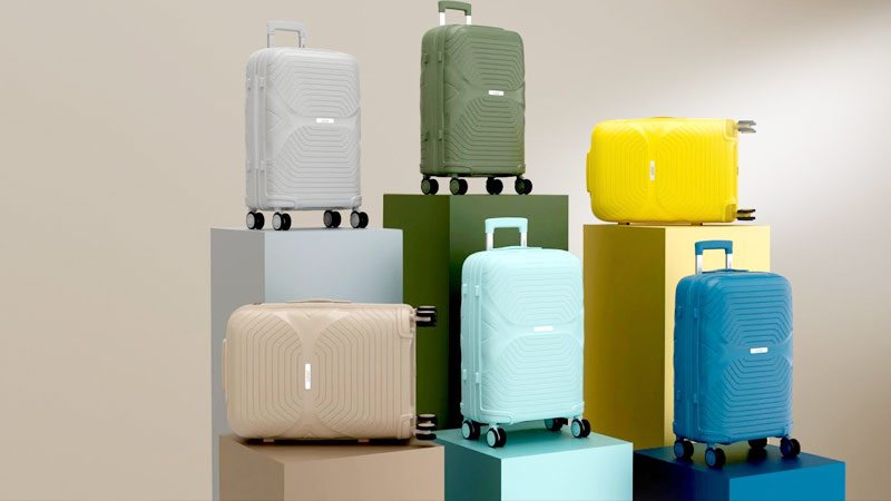
Crafted for the expressive millennial and Gen Z traveller, Shades Ahead reimagines luggage as lifestyle. The collection debuts two ranges, Froniq and Rovera, in six striking hues: sundune yellow, skyglass blue, coral orange, misty sage green, deeptide navy, and midnight black. Each shade tells its own story, inspired by surreal dreamscapes visualised through AI.
“With Shades Ahead, Safari is creating a colour-first movement in luggage,” said Safari Industries (India) Ltd. managing director Sudhir Jatia. “Today’s travellers want something bold and expressive, and with Flipkart’s reach, we’re bringing that vibrancy to homes across India this festive season.”
Flipkart Fashion vice president Kunal Gupta added, “Big Bang Diwali Sale is where India discovers what’s next. Shades Ahead perfectly captures that spirit: bold, stylish, and built to last.”
Backed by playful digital films, social chatter, and AI-powered storytelling, the campaign turns every suitcase into a statement piece. Whether it’s for gifting, weddings, or wanderlust, Shades Ahead promises to add a pop of personality to every trip.
This Diwali, it’s not just about where you’re headed, but how bright your bag looks getting there.
Brands
Godrej clarifies ‘GI’ identifier after logo similarity debate
Says GI is not a logo, will not replace Godrej signature across products.
MUMBAI: In a branding storm where shapes did the talking, Godrej is now spelling things out. Godrej Industries Group (GIG) has issued a clarification on its newly introduced ‘GI’ identifier, addressing questions around its purpose and design following a wave of online criticism. At the centre of the debate were two concerns: whether the new mark replaces the long-standing Godrej logo, and whether its geometric design mirrors other corporate identities.
The company has drawn a clear line. The Godrej signature logo, it said, remains unchanged and continues to be the sole logo across all consumer-facing products and services. The ‘GI’ mark, by contrast, is not a logo but a corporate group identifier intended for use alongside the Godrej signature or company name, and aimed at stakeholders such as investors, media and talent rather than consumers.
The need for such a distinction stems from the 2024 restructuring of the broader Godrej Group into two separate business entities. With both continuing to operate under the same Godrej name and signature, the identifier is positioned as a way to differentiate the Godrej Industries Group at a corporate level.
The rollout, however, triggered a broader conversation on design originality. Critics pointed to similarities between the GI mark’s geometric composition and logos used by companies globally, raising questions about distinctiveness.
Responding to this, GIG said its intellectual property and legal review found that such overlaps are common in minimalist, geometry-led design systems. Basic forms such as circles and rectangles appear across dozens of brand identities worldwide, the company noted.
It added that the identifier emerged from an extensive design process and was chosen for its simplicity, allowing it to sit alongside the Godrej signature without competing visually. While acknowledging that elemental shapes may appear less distinctive in isolation, the group emphasised that the mark is part of a broader identity system that includes a custom typeface, sonic branding and other proprietary elements.
Following legal and ethical assessments, the company said it found no impediment to using the identifier, reiterating that the GI mark is a corporate tool not a consumer-facing symbol.
In short, the logo isn’t changing but the conversation around it certainly has.


