Brands
Polycab sparks festive joy with safe and happy connections across India
MUMBAI: Festivals may be about faith and fireworks, but this year it’s Polycab India limited that’s turning up the voltage on celebration. As India steps into its busiest festive calendar from Navratri in Gujarat to Durga Puja in Kolkata and Dasara in Mysuru Polycab is proving that a safe connection can be just as powerful as a spiritual one.
At the heart of it all is the brand’s promise: “India’s Safe & Happy Connection.” And Polycab is delivering it with community-first activations that blend tradition, comfort, and inclusion.
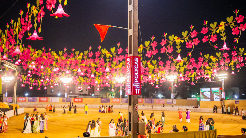
In Ahmedabad’s Heritage Garba, revellers are welcomed with selfie installations and cooling zones to keep spirits high (and temperatures low). Vadodara’s VVN Garba takes it a step further with illuminated connect points designed to help people meet, plus mobile charging stations that keep phones buzzing long after the dandiya beats. At the iconic Nyay Mandir Garba, grand Polycab-branded entry gates greet thousands, lighting up the festive nights with style and safety.
Polycab’s theme “Priyojoner Safety, Anonder Connection” (Loved ones’ safety, the connection of happiness) is making a cultural splash across the city’s pandals. At Samaj Sebi Sangha, Goddess Durga’s Vaahans come alive with Polycab products woven into their design, symbolising modern innovation anchored in tradition. Over at Ballygunge Cultural Association, a striking curved LED tunnel narrates Polycab’s journey through culture and light.
For the crowds weaving through Kolkata’s Puja routes, comfort zones offer not just shade and seating but also mobile charging hubs, wheelchair assistance for the elderly, and baby care rooms for young mothers thoughtful touches that make pandal hopping more inclusive.
In Karnataka, Polycab’s footprint shines during the grandeur of Mysuru Dasara. At the Chamundi Hill Temple, devotees find relief in cool zones with water and charging points, while the brand backs the Mysuru Traffic Police with branded jackets and booths to aid crowd management. High-visibility hoardings across the Nada Habba routes ensure that Polycab remains part of the city’s most iconic spectacle.
“At Polycab, our purpose has always been to put people first, and India’s festivals are a natural extension of this belief,” said Polycab India senior vice president for brand & marcom Shwetal Basu. “By creating activations rooted in tradition yet aligned with evolving community needs, we aim to make celebrations safer, more inclusive, and truly memorable.”
This isn’t Polycab’s first tryst with cultural milestones. From Lalbaugcha Raja in Mumbai to Rath Yatra in Puri, the brand has consistently delivered comfort zones, safety booths, and charging hubs to millions of devotees. With its 2025 festive activations, Polycab has cemented its role not just as an electrical brand but as a partner in India’s most cherished celebrations.
In a season where lights, sound, and spirit converge, Polycab has managed to weave in its own sparkle ensuring that the connection of happiness is not just felt, but safely shared.