Brands
Myprotein partners with Indian Social Media Celebrity Harsh Beniwal
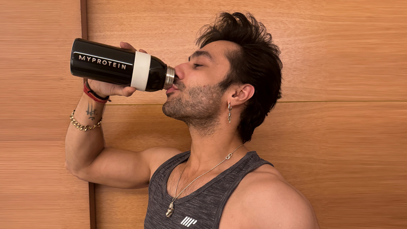
Mumbai: Myprotein, a leading online sports nutrition brand, proudly announces a momentous collaboration with renowned Indian social media celebrity, Harsh Beniwal. The partnership sees the two come together to inspire and encourage Indians to prioritize their health and wellness. Focusing on Harsh Beniwal’s own fitness journey and the importance of nutrition to support his goals.
Demonstrating how dedication, determination, and the right nutritional support can support a healthy lifestyle the collaboration aligns with Myproteins commitment to champion a health movement in the country. With Harsh, the brand is aligned with this vision, partnering with a personality who seamlessly balances his acting and fitness journey, inspiring the youth of India to prioritize their wellbeing.
Over the past two decades, Myprotein has become synonymous with excellence in the sports nutrition industry, inspiring countless individuals to pursue their fitness goals with passion and dedication. In India, the brand partners with renowned Indian athletes such as Prachi Choudhary, Niharika Vaishist, Ankita Bali, Jayesh Rane, and Aryan Brahmin.
Expressing his excitement, Beniwal stated, “I am thrilled to partner with Myprotein. Myprotein has been an integral part of my fitness journey, and I am honored to collaborate with a brand that shares my passion for health and wellness. Together, we aim to motivate and empower individuals to prioritize their physical and mental well-being.”
A Myprotein spokesperson added, “We are delighted to join forces with Harsh Beniwal, whose influence within India is exceptional. This collaboration exemplifies our commitment to reach far and wide with our messaging and inspire everyone to move a little more and priotize your health. It underscores the message of unity and strength encapsulated in our tagline, ‘Stronger Together, Since 2004.’ By reaching a diverse audience, we are ensuring that everyone can embark on their fitness journey and achieve their goals – no matter their starting point.”
Brands
Godrej clarifies ‘GI’ identifier after logo similarity debate
Says GI is not a logo, will not replace Godrej signature across products.
MUMBAI: In a branding storm where shapes did the talking, Godrej is now spelling things out. Godrej Industries Group (GIG) has issued a clarification on its newly introduced ‘GI’ identifier, addressing questions around its purpose and design following a wave of online criticism. At the centre of the debate were two concerns: whether the new mark replaces the long-standing Godrej logo, and whether its geometric design mirrors other corporate identities.
The company has drawn a clear line. The Godrej signature logo, it said, remains unchanged and continues to be the sole logo across all consumer-facing products and services. The ‘GI’ mark, by contrast, is not a logo but a corporate group identifier intended for use alongside the Godrej signature or company name, and aimed at stakeholders such as investors, media and talent rather than consumers.
The need for such a distinction stems from the 2024 restructuring of the broader Godrej Group into two separate business entities. With both continuing to operate under the same Godrej name and signature, the identifier is positioned as a way to differentiate the Godrej Industries Group at a corporate level.
The rollout, however, triggered a broader conversation on design originality. Critics pointed to similarities between the GI mark’s geometric composition and logos used by companies globally, raising questions about distinctiveness.
Responding to this, GIG said its intellectual property and legal review found that such overlaps are common in minimalist, geometry-led design systems. Basic forms such as circles and rectangles appear across dozens of brand identities worldwide, the company noted.
It added that the identifier emerged from an extensive design process and was chosen for its simplicity, allowing it to sit alongside the Godrej signature without competing visually. While acknowledging that elemental shapes may appear less distinctive in isolation, the group emphasised that the mark is part of a broader identity system that includes a custom typeface, sonic branding and other proprietary elements.
Following legal and ethical assessments, the company said it found no impediment to using the identifier, reiterating that the GI mark is a corporate tool not a consumer-facing symbol.
In short, the logo isn’t changing but the conversation around it certainly has.


