Connect with us

Brands

Myprotein celebrates Impact Week with the latest addition of Cinnamon Danish Impact Whey

Published

on

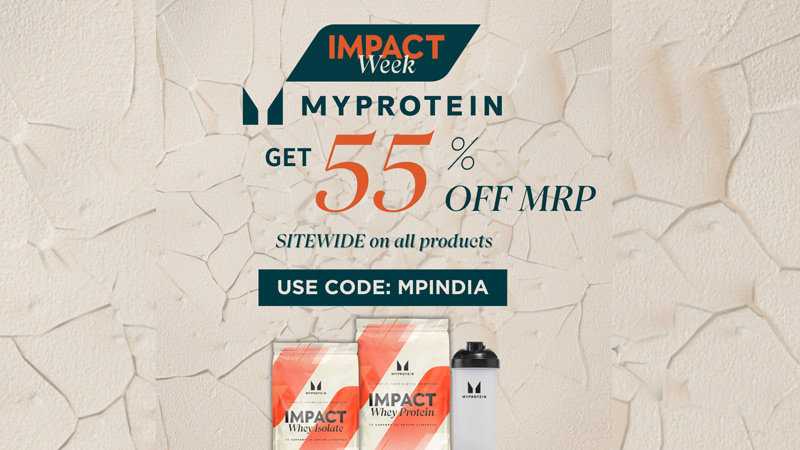
Mumbai: Myprotein, a leading online sports nutrition brand, proudly celebrates Impact Week, an exclusive online event running from now until 31 May offering customers significant discounts, promotions, and special offers, as well as innovative new products.

A centrepiece of Impact Week is the introduction of Impact Whey Protein Cinnamon Danish, a delectable new flavour added to Myprotein’s flagship Impact Whey Range. This latest addition underscores the brand’s continuous innovation and commitment to providing diverse, high-quality nutrition options.

Each serving of Impact Whey Protein Cinnamon Danish is packed with 23g of high-quality protein, providing the essential nourishment your body needs daily. With only 1.9g of fat, 1.8g of carbs, and 114 kcal, it supports muscle growth and bone maintenance. Rich in essential amino acids and BCAAs, it ensures your body remains strong and resilient.

Advertisement

Since its inception in 2004, Myprotein has been dedicated to delivering high-quality, innovative products that support athletes and fitness enthusiasts worldwide. The brand’s commitment to excellence has fuelled its growth into a comprehensive health and wellness provider, consistently pushing the boundaries of sports nutrition.

THG Nutrition CEO Neil Mistry, said: “As we celebrate 20 years of Myprotein, we reflect on our incredible journey and the lives we’ve impacted along the way. Our success is built on a foundation of quality and innovation, driven by a passion for helping our customers achieve their fitness and wellness goals. We are excited to invite our community to join us in celebrating this milestone through our Impact Sale, where we offer exclusive discounts and introduce new, cutting-edge products.”

Advertisement
Click to comment

Leave a Reply

Your email address will not be published. Required fields are marked *

Brands

Godrej clarifies ‘GI’ identifier after logo similarity debate

Says GI is not a logo, will not replace Godrej signature across products.

Published

on

MUMBAI: In a branding storm where shapes did the talking, Godrej is now spelling things out. Godrej Industries Group (GIG) has issued a clarification on its newly introduced ‘GI’ identifier, addressing questions around its purpose and design following a wave of online criticism. At the centre of the debate were two concerns: whether the new mark replaces the long-standing Godrej logo, and whether its geometric design mirrors other corporate identities.

The company has drawn a clear line. The Godrej signature logo, it said, remains unchanged and continues to be the sole logo across all consumer-facing products and services. The ‘GI’ mark, by contrast, is not a logo but a corporate group identifier intended for use alongside the Godrej signature or company name, and aimed at stakeholders such as investors, media and talent rather than consumers.

The need for such a distinction stems from the 2024 restructuring of the broader Godrej Group into two separate business entities. With both continuing to operate under the same Godrej name and signature, the identifier is positioned as a way to differentiate the Godrej Industries Group at a corporate level.

Advertisement

The rollout, however, triggered a broader conversation on design originality. Critics pointed to similarities between the GI mark’s geometric composition and logos used by companies globally, raising questions about distinctiveness.

Responding to this, GIG said its intellectual property and legal review found that such overlaps are common in minimalist, geometry-led design systems. Basic forms such as circles and rectangles appear across dozens of brand identities worldwide, the company noted.

It added that the identifier emerged from an extensive design process and was chosen for its simplicity, allowing it to sit alongside the Godrej signature without competing visually. While acknowledging that elemental shapes may appear less distinctive in isolation, the group emphasised that the mark is part of a broader identity system that includes a custom typeface, sonic branding and other proprietary elements.

Advertisement

Following legal and ethical assessments, the company said it found no impediment to using the identifier, reiterating that the GI mark is a corporate tool not a consumer-facing symbol.

In short, the logo isn’t changing but the conversation around it certainly has.

Advertisement
Continue Reading

Advertisement News18
Advertisement
Advertisement
Advertisement
Advertisement Whtasapp
Advertisement Year Enders

Indian Television Dot Com Pvt Ltd

Signup for news and special offers!

Copyright © 2026 Indian Television Dot Com PVT LTD

This will close in 10 seconds