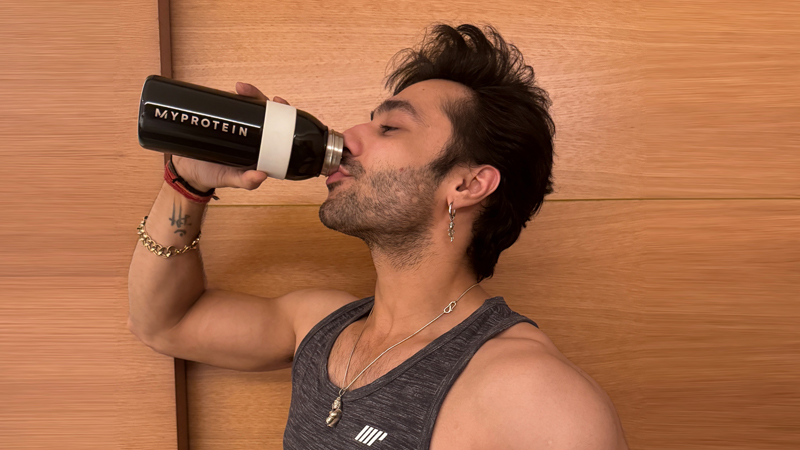
Brands
Myprotein & Keventers launch butterscotch-flavored whey protein
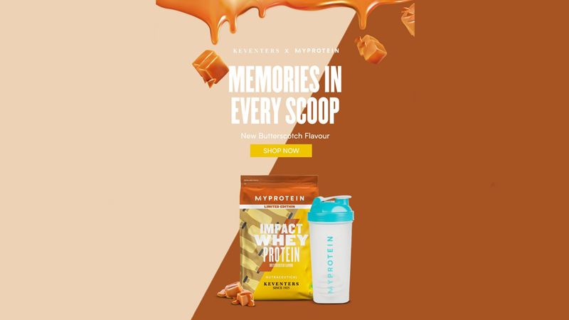
Mumbai: Myprotein, an online sports nutrition brand, announced the launch of Keventers Butterscotch flavored whey protein for its Indian customers. The new Keventers Butterscotch flavor aims to cater to the fitness community in India, enabling them to attain their individual objectives while savouring a new flavor that embodies nostalgic emotions.
The new Keventers Butterscotch flavored whey protein celebrates the union of cherished memories and health-conscious choices. The tagline, “Memories in Every Scoop – Relive Sweetness, Healthily!” perfectly encapsulates the essence of this innovative product. Additionally, the guilt-free protein treat boosts an impressive 23 grams of high-quality protein per scoop, this flavourful alternative empowers individuals to meet their nutritional objectives without compromising on taste.
Myprotein Emerging Markets regional marketing manager Sanya Chhabra said, “We are excited to introduce the Keventers Butterscotch Flavoured Whey Protein to our Indian customers. Myprotein’s collaboration with Keventers underscores a commitment to innovation and customer satisfaction. By combining Myprotein’s expertise in sports nutrition with Keventers’ legacy of taste, the new whey protein flavor will exemplify a harmonious blend of sensory pleasure and dietary purpose.”
Keventers founder and CEO Agastya Dalmia added, “We’re delighted to partner with Myprotein for the launch of Keventers Butterscotch Flavoured Whey Protein in India. This collaboration will beautifully blend the sweetness of nostalgia with the goodness of nutrition, delivering a delightful path towards fitness goals.”
Brands
Godrej clarifies ‘GI’ identifier after logo similarity debate
Says GI is not a logo, will not replace Godrej signature across products.
MUMBAI: In a branding storm where shapes did the talking, Godrej is now spelling things out. Godrej Industries Group (GIG) has issued a clarification on its newly introduced ‘GI’ identifier, addressing questions around its purpose and design following a wave of online criticism. At the centre of the debate were two concerns: whether the new mark replaces the long-standing Godrej logo, and whether its geometric design mirrors other corporate identities.
The company has drawn a clear line. The Godrej signature logo, it said, remains unchanged and continues to be the sole logo across all consumer-facing products and services. The ‘GI’ mark, by contrast, is not a logo but a corporate group identifier intended for use alongside the Godrej signature or company name, and aimed at stakeholders such as investors, media and talent rather than consumers.
The need for such a distinction stems from the 2024 restructuring of the broader Godrej Group into two separate business entities. With both continuing to operate under the same Godrej name and signature, the identifier is positioned as a way to differentiate the Godrej Industries Group at a corporate level.
The rollout, however, triggered a broader conversation on design originality. Critics pointed to similarities between the GI mark’s geometric composition and logos used by companies globally, raising questions about distinctiveness.
Responding to this, GIG said its intellectual property and legal review found that such overlaps are common in minimalist, geometry-led design systems. Basic forms such as circles and rectangles appear across dozens of brand identities worldwide, the company noted.
It added that the identifier emerged from an extensive design process and was chosen for its simplicity, allowing it to sit alongside the Godrej signature without competing visually. While acknowledging that elemental shapes may appear less distinctive in isolation, the group emphasised that the mark is part of a broader identity system that includes a custom typeface, sonic branding and other proprietary elements.
Following legal and ethical assessments, the company said it found no impediment to using the identifier, reiterating that the GI mark is a corporate tool not a consumer-facing symbol.
In short, the logo isn’t changing but the conversation around it certainly has.


