Brands
Messe Frankfurt and BusinessLive unite to scale Media Expo across India
MUMBAI: Messe Frankfurt Trade Fairs India has struck a strategic partnership with BusinessLive Trade Fairs to broaden the reach of its media expo brand, folding the long-running Sign India Expo into a single, unified exhibition platform across South India.
Under the alliance, Sign India Expo will transition into Media Expo in Kochi and Hyderabad, while the Chennai edition will operate under the existing Media Expo Chennai banner. The move expands Media Expo’s presence from three cities to five: Chennai, Hyderabad, Kochi, Mumbai and New Delhi, sharply increasing its national footprint.
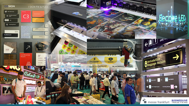
Media Expo, which has hosted 56 editions across Mumbai, New Delhi and Chennai, will now serve as the primary exhibition platform in key southern markets. Sign India Expo, backed by over 70 editions across India, brings deep regional roots, particularly in Chennai, Kochi and Hyderabad.
The organisers aim to build a broader showcase spanning printing, signage, digital signage, OOH and DOOH advertising, retail displays, large-format and industrial printing, fabrication equipment, Pop-Posm, LED screens, substrates, inks and advanced 3D and laser printing technologies.
Messe Frankfurt Asia Holdings executive director and board member Raj Manek, said South India remains a high-growth region for printing and signage, making the collaboration vital to creating a stronger, centralised industry platform.
Palnati BusinessLive Trade Fairs director Siva Prasad, said the partnership blends regional market strength with global exhibition expertise to better serve evolving industry needs.
The expansion comes as India’s printing and signage market is forecast to surge from $1,074.5 million in 2025 to $3,494.3 million by 2034, according to Imarc Group, while the OOH and DOOH segment is projected to grow from $519.93 million in 2025 to $656.13 million by 2030, as per Mordor Intelligence.
Brands
Godrej clarifies ‘GI’ identifier after logo similarity debate
Says GI is not a logo, will not replace Godrej signature across products.
MUMBAI: In a branding storm where shapes did the talking, Godrej is now spelling things out. Godrej Industries Group (GIG) has issued a clarification on its newly introduced ‘GI’ identifier, addressing questions around its purpose and design following a wave of online criticism. At the centre of the debate were two concerns: whether the new mark replaces the long-standing Godrej logo, and whether its geometric design mirrors other corporate identities.
The company has drawn a clear line. The Godrej signature logo, it said, remains unchanged and continues to be the sole logo across all consumer-facing products and services. The ‘GI’ mark, by contrast, is not a logo but a corporate group identifier intended for use alongside the Godrej signature or company name, and aimed at stakeholders such as investors, media and talent rather than consumers.
The need for such a distinction stems from the 2024 restructuring of the broader Godrej Group into two separate business entities. With both continuing to operate under the same Godrej name and signature, the identifier is positioned as a way to differentiate the Godrej Industries Group at a corporate level.
The rollout, however, triggered a broader conversation on design originality. Critics pointed to similarities between the GI mark’s geometric composition and logos used by companies globally, raising questions about distinctiveness.
Responding to this, GIG said its intellectual property and legal review found that such overlaps are common in minimalist, geometry-led design systems. Basic forms such as circles and rectangles appear across dozens of brand identities worldwide, the company noted.
It added that the identifier emerged from an extensive design process and was chosen for its simplicity, allowing it to sit alongside the Godrej signature without competing visually. While acknowledging that elemental shapes may appear less distinctive in isolation, the group emphasised that the mark is part of a broader identity system that includes a custom typeface, sonic branding and other proprietary elements.
Following legal and ethical assessments, the company said it found no impediment to using the identifier, reiterating that the GI mark is a corporate tool not a consumer-facing symbol.
In short, the logo isn’t changing but the conversation around it certainly has.


