Brands
Kay Beauty makes historic UK debut at Space NK
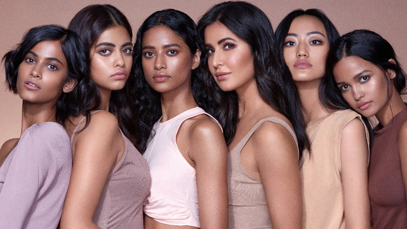
MUMBAI: Kay Beauty, the make-up brand co-founded by actor Katrina Kaif and Indian beauty retailer Nykaa, has made its first international move with an exclusive launch at Space NK in the UK. The tie-up marks the first time a home-grown Indian beauty brand has been stocked by the British luxury chain.
Founded in 2019, Kay Beauty has built its reputation on performance-led, skin-friendly formulas and an inclusive brand voice, encapsulated in its slogans #ItsKayToBeYou and #MakeupThatKares. Its portfolio of 197 products across eyes, lips and face will now sit alongside Space NK’s curated line-up of global labels.
Kaif called the launch “a powerful opportunity to connect with a global community that shares our values.” Nykaa co-founder & head of its owned bands Adwaita Nayar described the step as “more than just a brand milestone,” positioning Kay Beauty as proof that Indian consumer labels can compete on the global stage.
Space NK chief commercial officer Margaret Mitchell said the addition would help the retailer better serve Britain’s growing south Asian community while offering “something genuinely unique”.
The UK launch brings bestsellers such as the Hydra Crème Lipstick, Hydrating Foundation and Velvet Creme Blush, as well as a range of kajals infused with chamomile and ceramides.
Kay Beauty, named Vogue India’s Beauty Brand of the Year in 2022, has already carved a cult following at home with 1.6 million social media followers, 700-plus retail outlets and more than 2.5 million customers. With Space NK’s 80-store network and online reach, the brand is betting that its blend of inclusivity, heritage and innovation will resonate with British consumers too.
Brands
Godrej clarifies ‘GI’ identifier after logo similarity debate
Says GI is not a logo, will not replace Godrej signature across products.
MUMBAI: In a branding storm where shapes did the talking, Godrej is now spelling things out. Godrej Industries Group (GIG) has issued a clarification on its newly introduced ‘GI’ identifier, addressing questions around its purpose and design following a wave of online criticism. At the centre of the debate were two concerns: whether the new mark replaces the long-standing Godrej logo, and whether its geometric design mirrors other corporate identities.
The company has drawn a clear line. The Godrej signature logo, it said, remains unchanged and continues to be the sole logo across all consumer-facing products and services. The ‘GI’ mark, by contrast, is not a logo but a corporate group identifier intended for use alongside the Godrej signature or company name, and aimed at stakeholders such as investors, media and talent rather than consumers.
The need for such a distinction stems from the 2024 restructuring of the broader Godrej Group into two separate business entities. With both continuing to operate under the same Godrej name and signature, the identifier is positioned as a way to differentiate the Godrej Industries Group at a corporate level.
The rollout, however, triggered a broader conversation on design originality. Critics pointed to similarities between the GI mark’s geometric composition and logos used by companies globally, raising questions about distinctiveness.
Responding to this, GIG said its intellectual property and legal review found that such overlaps are common in minimalist, geometry-led design systems. Basic forms such as circles and rectangles appear across dozens of brand identities worldwide, the company noted.
It added that the identifier emerged from an extensive design process and was chosen for its simplicity, allowing it to sit alongside the Godrej signature without competing visually. While acknowledging that elemental shapes may appear less distinctive in isolation, the group emphasised that the mark is part of a broader identity system that includes a custom typeface, sonic branding and other proprietary elements.
Following legal and ethical assessments, the company said it found no impediment to using the identifier, reiterating that the GI mark is a corporate tool not a consumer-facing symbol.
In short, the logo isn’t changing but the conversation around it certainly has.


