Brands
HUL & responsible advertisement: Going beyond Fair & Lovely’s name change
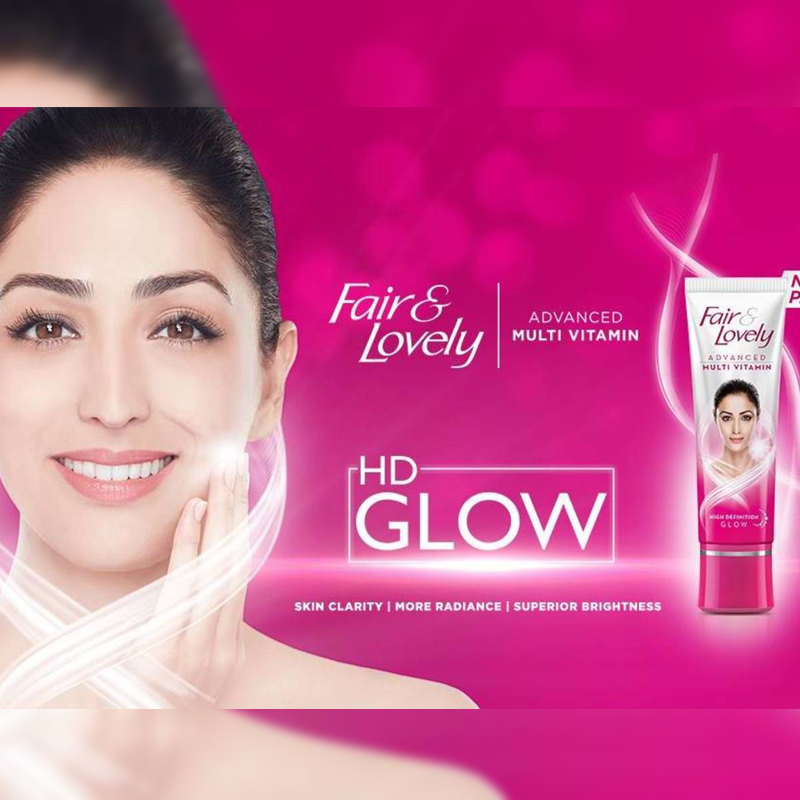
MUMBAI: It took Hindustan Unilever (HUL) 48 years to realise that the term Fair & Lovely has racial connotations. After coming under criticism world over for promoting racial stereotypes, the company decided to drop the word ‘fair’ and replace it with ‘glow’ for both its women’s and men’s product range.
As per a report, Fair & Lovely instituted a series of campaigns centred on “the fairer girl gets the guy” theme which ran from December 2001 to March 2003, but after the backlash, the company discontinued the ads. To revive its image, HUL launched Fair & Lovely Foundation to encourage economic empowerment of women across India.
Will the rebranding to Glow & Lovely see HUL become a more responsible advertiser? Mirum India executive creative director Naila Patel explains, “The reason HUL has withdrawn its current positioning is to add to its image as a responsible advertiser. They take the responsibility narrative seriously and carry out enough sustainability initiatives for the very reason. The fact that we are having this conversation means it has made an impact by withdrawing its current strategy.”
Despite all it says, ‘fairness leads to success’, whether it be in marriage, career or any other field of life, has been the trope portrayed by Fair & Lovely ads over the years.
Business strategist and angel Investor Lloyd Mathias says, “By dropping the word ‘fair’ from Fair & Lovely, they have taken cognisance of the sensitivity associated with skin colour. But, they will need to do a lot more than just renaming the brand to Glow & Lovely, to genuinely address the colourism issue so widely prevalent in India. How they roll out the new positioning will need to be observed.”
It’s interesting to note that the prompt for the change was not Indian but rather the response to the #BlackLivesMatter protest in the US which saw Indians protesting against Fair & Lovely too. Additionally, competitor Johnson & Johnson decided it would discontinue its fairness products entirely.
Mathias asserts, “HUL will have to show genuine intent in what they do in the market with the new rollout. The brand's franchise is far too entrenched to move away from the category it defined with the mere change of the name. The new packaging, logo and communication stance will have a big role to play.”
Patel believes that it will lose the sharp targeting but might end up attracting a more varied audience as millennials prefer to “buy brands that have integrity and stand for a purpose.”
It could also mean a shift in the ad slots to a more enlightened audience. Patel opines, “Yes, they might move the slots from traditional to modern content as they will cease to be relevant to the typical saas bahu …chand jaisi dulhan narrative.”
Mathias differs. He says, “I think in media terms there will be no change in the slots HUL picks for Glow & Lovely. The target audience for the brand essentially remains the same.”
Even as HUL said it would look at more inclusive models, Zirca co-founder and director Neena Dasgupta shares, “I don’t believe a dark-skinned model will replace the word 'fair' at a subliminal level. Their choice of model should continue to be the same. Any special effort would be against the act of rebranding.”
HUL’s product Fair & Lovely leads the skin lightening market in India. The market stands at Rs 10,000 crore, with Fair & Lovely enjoying an 80 per cent market share. Over the years the brand has focused on a deep distribution model. The company made sure the product is available across the country right from kirana shops to malls with higher demand in the rural market.
If HUL truly wants to show its seriousness on the matter, it will have to do more than just a rebrand. It will have to also act on what it says.