Brands
Hangyo and Smoor churn out a chocolatey masterpiece with Black Gold Ice Cream
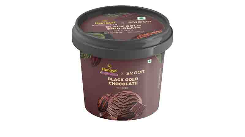
MUMBAI : Two dessert dynamos just scooped out something extraordinary. Hangyo Ice Cream and Smoor have teamed up to launch Black Gold Ice Cream — a luscious blend of Hangyo’s famously smooth, creamy base and Smoor’s rich, artisanal couverture chocolate.
Unveiled in style at Smoor’s Lavelle Road boutique, the launch event brought together ice cream lovers, media, and some very lucky sundae architects. Guests sampled the Black Gold flavour bomb — a silky, bold creation that drips heritage, elegance and luxury in every bite. Think ancient cacao rituals meets 21st-century dessert couture.
The event was headlined by Hangyo Ice Cream head, Business Development, SankeernPai and Smoor founder & CEO Vimal Sharma, who revealed the product in a grand unveiling, followed by a tasting session that delighted guests and media alike. To add to the celebration, attendees enjoyed a DIY Sundae Station, where children and adults alike crafted their own personalized sundaes with a range of toppings and sauces. The event also featured Black Gold-themed games and fun activities for kids, ensuring the afternoon was filled with flavor and joy.
Hangyo Ice Cream vice chairman Ullas Kamath said, “At Hangyo, innovation has always been at the heart of what we do. The launch of Black Gold in association with Smoor Chocolates is a celebration of craftsmanship, indulgence, and collaboration. This luxurious creation brings together our legacy in ice creams with Smoor’s artisanal chocolate expertise to deliver a truly premium dessert experience. Black Gold is more than just a product—it’s a statement of elegance, quality, and the power of partnerships in redefining indulgence”.
Sankeern Pai said, “We’ve always believed that ice cream is more than dessert — it’s an emotion that speaks to every palate differently. Our strength lies in understanding and celebrating this diversity, which has helped us become a beloved brand across regions and generations. With the launch of Black Gold, we take that philosophy a step further — blending our legacy of rich, creamy textures with Smoor’s mastery of fine chocolate. This collaboration is a bold exploration of taste, tradition, and innovation, elevating indulgence to a whole new level. It’s not just about introducing a new flavor; it’s about crafting a refined experience that’s rooted in who we are as a brand.”
Sharma commented, “Smoor has always stood for purity, precision, and the power of true couverture chocolate. With Black Gold, we’re venturing into a new dimension — where the art of chocolate-making meets the soul of Ice Cream craftsmanship. Partnering with Hangyo has enabled us to reimagine what indulgence means for the Indian consumer. This creation is a fine blend of two legacies — one that balances tradition with refinement and elevates familiar comfort with luxurious flair. It’s a celebration of two brands that understand their craft deeply, coming together to offer something rare, bold, and unforgettable.”
Smoor CMO Kanchan said, “At Smoor, we’ve always believed that true indulgence lies in the details — in the richness of taste, the finesse of craftsmanship, and the joy of discovery. ‘Black Gold’ is a celebration of that philosophy. This collaboration with Hangyo brings together our artisanal chocolate expertise with their legacy in Ice Creams, resulting in a creation that’s bold, luxurious, and truly unforgettable. It’s not just ice cream — it’s a sensory experience.”
Beyond the tasting, the event was a carnival of cocoa dreams — from a DIY Sundae Station for kids (and kids-at-heart) to Black Gold-themed games and treats that made the launch a full-blown flavour fest.
Hangyo, a brand that has blended tradition with trend, and Smoor, known for its high-end chocolate wizardry, have together created a dessert that’s as much about legacy as it is about sensory joy.
Black Gold Ice Cream is now available at all Smoor outlets and can also be ordered via Swiggy and Zomato. A dessert this decadent doesn’t just deserve a place in your freezer — it deserves a standing ovation.