Brands
Crafting timeless elegance: The journey of Chandrika Raamz
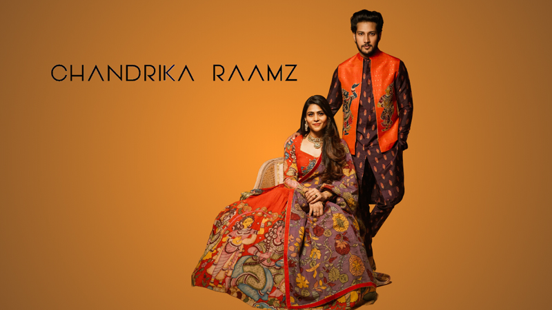
Mumbai: In the vibrant heart of Hyderabad, emerges Chandrika Raamz, weaving tradition with innovation. Established in 2013 by the dynamic duo, Chandrika and Raamz, this fashion powerhouse is not just a brand but a celebration of their cinematic journey in Tollywood, envisioning a global redefinition of men’s fashion. The duo infuses narratives of craftsmanship and artistry into each piece, reflecting a love for heritage, modernity, and individuality.
Ushering sartorial elegance in their silhouettes, Chandrika Raamz embodies an amalgamation of class and sophistication, rooted in the co-founders’ global aspirations and rich experiences in Tollywood costume designing. Having graced two consecutive seasons of the prestigious ‘Lakme Fashion Week,’ the brand boasts a clientele resembling a constellation of stars—Rajnikanth, Akkineni Nagarjuna, Rana Daggubati, Vijay Deverkonda, and Vikram. This portfolio echoes their prowess in the corridors of the fashion elite.
Indiantelevision.com in an interview with Chandrika Raamz gained insights on their brands’ inception, their stand-out aspect, and more.
Edited Excerpts:
On the inspiration behind the establishment of Chandrika Raamz in 2013 and how has it evolved since its inception
Founded in 2013, we emerged from a rich experience in Tollywood industry, envisioning a global redefinition of men’s fashion. Together, we merged our individual inspirations – one rooted in childhood memories and color aesthetics, the other in the beauty of natural landscapes and human interactions. This harmonious fusion is evident in our brand’s evolution over the years, from our flagship store’s inauguration in 2013 to the diverse collections, iconic collaborations, and social causes we champion today. Our brand was born from childhood dreams and a passion for design, and it has now become a beacon of luxury menswear, celebrating tradition, individuality, and the vibrant colors of life.
On the stand-out aspect of Chandrika Raamz, amidst a sea of fashion brands
The brand stands out with our unique and meticulous use of raw materials, crafted by skilled artisans, transcending each piece into a testament of heritage, craftsmanship, and individuality. Both of us brought in our diverse expertise to create clothing that redefines classic silhouettes with vibrant prints.
On Chandrika Raamz’s collaboration with several iconic brands and celebrities influencing their design process and brand narrative
We have gotten a lot of creative inspiration from working with well-known brands and celebrities. Our design approach has become more innovative as a result of working with people who bring different viewpoints and special talents. Products that surpass traditional design norms while adhering to high standards have been produced as a result of this collaborative effort.
On maintaining a balance between creating pieces that are trendy yet timeless
To strike the correct mix between modernity and traditionalism takes time and effort. To make sure the designs are timeless and relevant, we review our approach on a regular basis in light of changing consumer demands and market trends.
On the inspiration behind the creation of “Raamz Junior” its contribution to the overall vision of Chandrika Raamz
The inception of “Raamz Junior” by Chandrika Raamz was driven by our desire to meet the needs of a younger demographic aged 0-14. This new line not only provides stylish and comfortable clothing for children but also addresses the concerns of mothers searching for designer ethnic wear for their little ones, transforming each occasion into a blend of joy and style. This strategic expansion aligns seamlessly with our commitment to offering elegance and comfort, creating a holistic brand experience that resonates with the discerning consumer, both online and offline.
On your future expansion plans regarding geographical reach and potential new lines or collaborations on the horizon
We are looking at a future geographical expansion, aiming to reach a global audience with our luxury menswear collections. We will also be exploring new collaborations to diversify our offerings while staying true to our commitment to craftsmanship, heritage, and individuality. With a strong foundation in Hyderabad and many notable collaborations, we seek to continue our journey of redefining men’s fashion in different parts of India starting from the North Indian market and then expanding to other markets as well.