Connect with us

Brands

Courtyard By Marriott reveals new positioning

Published

on

MUMBAI: Hospitality company Marriott International has  given one of its key brands – Courtyard by Marriott – an updated logo and look. On the occassion, the company has also launched a new ad film that reflects its new positioning focussing on what success means to its next generation of guests.

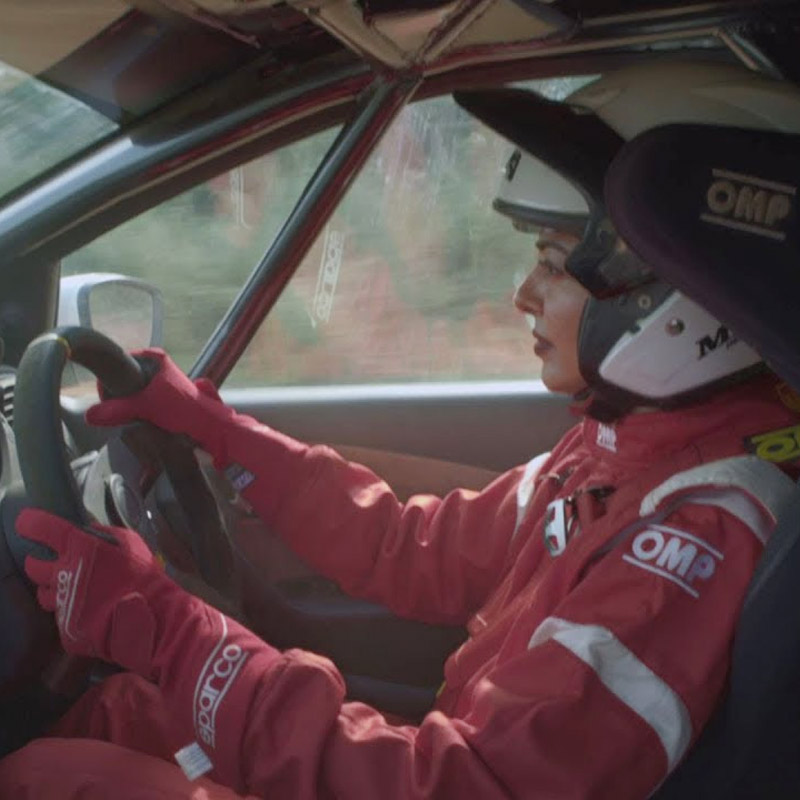
Created by Ogilvy  Mumbai, the campaign revolves around a day in the life of Garima Avtar – one of India’s top female rally drivers. It merges her stint on the track with her stay in the hotel seamlessly and reveals how the brand supports the champion in her passion for rally racing.

Advertisement

Ogilvy Mumbai group creative director Burzin Mehta said, “Speaking to one’s audience for the very first time is never easy. And this campaign was no different. But what stood out in this brief was the absolute synergy between the brand and its audience.”

He adds, “The spot, aptly titled Driven, tells the story of a real trailblazer – a female champion in a male-dominated sport. Unlike lots of hospitality advertising, this one’s not so much about rooms and restaurants as much as it is about mirroring the attitude of the consumer. And we’ve seamlessly merged two very different aspects of Garima’s life, to tell that story.”

Marriott International Asia Pacific vice president – brand and marketing Mike Fulkerson said, “The evolution of the Courtyard brand reflects the changing mindset of Courtyard’s “next generation of guests” –  trailblazers who have a different perception of success (it’s not just about climbing the career ladder, but more about chasing their personal and professional passions, and collecting experiences). The spot is an articulation of our shared belief system – the passion that drives you as a person, is the passion that drives us as a brand.”

Advertisement

Debuting with a video spot on CNBCTV18.com’s new digital series ‘Disruptors’ (of which Courtyard by Marriott is also a sponsor), the video will also run across other digital advertising platforms and the brand’s social media channels.

Click to comment

Leave a Reply

Your email address will not be published. Required fields are marked *

Brands

Godrej clarifies ‘GI’ identifier after logo similarity debate

Says GI is not a logo, will not replace Godrej signature across products.

Published

on

MUMBAI: In a branding storm where shapes did the talking, Godrej is now spelling things out. Godrej Industries Group (GIG) has issued a clarification on its newly introduced ‘GI’ identifier, addressing questions around its purpose and design following a wave of online criticism. At the centre of the debate were two concerns: whether the new mark replaces the long-standing Godrej logo, and whether its geometric design mirrors other corporate identities.

The company has drawn a clear line. The Godrej signature logo, it said, remains unchanged and continues to be the sole logo across all consumer-facing products and services. The ‘GI’ mark, by contrast, is not a logo but a corporate group identifier intended for use alongside the Godrej signature or company name, and aimed at stakeholders such as investors, media and talent rather than consumers.

The need for such a distinction stems from the 2024 restructuring of the broader Godrej Group into two separate business entities. With both continuing to operate under the same Godrej name and signature, the identifier is positioned as a way to differentiate the Godrej Industries Group at a corporate level.

Advertisement

The rollout, however, triggered a broader conversation on design originality. Critics pointed to similarities between the GI mark’s geometric composition and logos used by companies globally, raising questions about distinctiveness.

Responding to this, GIG said its intellectual property and legal review found that such overlaps are common in minimalist, geometry-led design systems. Basic forms such as circles and rectangles appear across dozens of brand identities worldwide, the company noted.

It added that the identifier emerged from an extensive design process and was chosen for its simplicity, allowing it to sit alongside the Godrej signature without competing visually. While acknowledging that elemental shapes may appear less distinctive in isolation, the group emphasised that the mark is part of a broader identity system that includes a custom typeface, sonic branding and other proprietary elements.

Advertisement

Following legal and ethical assessments, the company said it found no impediment to using the identifier, reiterating that the GI mark is a corporate tool not a consumer-facing symbol.

In short, the logo isn’t changing but the conversation around it certainly has.

Advertisement
Continue Reading

Advertisement News18
Advertisement
Advertisement
Advertisement
Advertisement Whtasapp
Advertisement Year Enders

Indian Television Dot Com Pvt Ltd

Signup for news and special offers!

Copyright © 2026 Indian Television Dot Com PVT LTD

This will close in 10 seconds