Connect with us

Brands

Chumbak launches new brand identity

Published

on

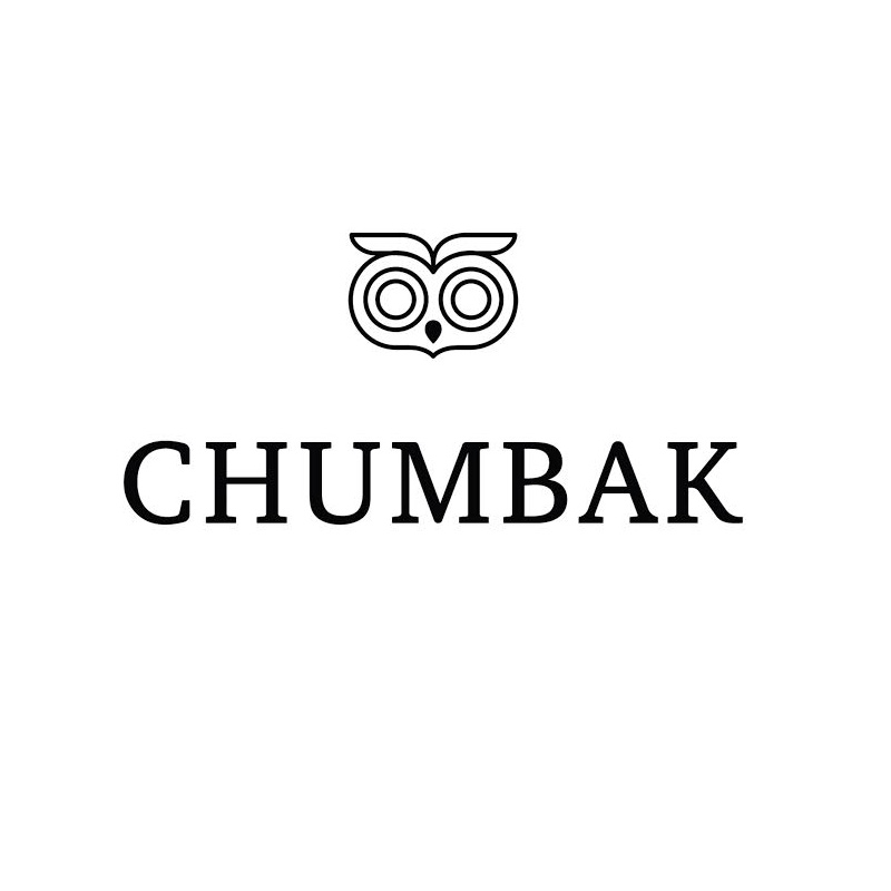
NEW DELHI: Chumbak, the design-led lifestyle brand, unveiled its new logo today with a digital release. The logo change is part of the larger shift in the positioning of the brand.

Chumbak was founded in 2010 by Shubhra Chadha and Vivek Prabhakar with the idea of designing fun souvenirs & collectibles inspired by India. 

The new logo reaffirms Chumbak’s positioning as a lifestyle brand. Speaking about it Chumbak  co-founder  Vivek Prabhakar, mentioned “When we launched Chumbak ten years ago, the logo was designed to reflect the quirky, young brand positioning. At the time, the logo enabled us to stand out in a serious retail landscape. It worked perfectly with the initial product range that was India inspired. Over the years, we’ve not only expanded our product range but also presented an evolved, globally relevant design language. The new logo represents & establishes that shift.”

Advertisement

Chumbak CEO Vasant Nangia added “In the last ten years, Chumbak has successfully diversified its product portfolio and scaled to appeal to audiences across the country. The new brand identity reflects our mission to be an evolved and globally relevant, design-led lifestyle brand.”

Designed to work effortlessly across the brand’s digital and physical channels, the new logo uses simple serif typography that mirrors the brand pillars of wit, warmth, and authenticity. It also brings to the forefront, the beloved Chumbak owl that is known and recognised by its growing community of consumers and community. The design was developed with the in-house brand team and Delhi-based design consultancy, Bull Design. The logo will be rolled out across brand touchpoints in the months to come. 

Advertisement
Click to comment

Leave a Reply

Your email address will not be published. Required fields are marked *

Brands

Godrej clarifies ‘GI’ identifier after logo similarity debate

Says GI is not a logo, will not replace Godrej signature across products.

Published

on

MUMBAI: In a branding storm where shapes did the talking, Godrej is now spelling things out. Godrej Industries Group (GIG) has issued a clarification on its newly introduced ‘GI’ identifier, addressing questions around its purpose and design following a wave of online criticism. At the centre of the debate were two concerns: whether the new mark replaces the long-standing Godrej logo, and whether its geometric design mirrors other corporate identities.

The company has drawn a clear line. The Godrej signature logo, it said, remains unchanged and continues to be the sole logo across all consumer-facing products and services. The ‘GI’ mark, by contrast, is not a logo but a corporate group identifier intended for use alongside the Godrej signature or company name, and aimed at stakeholders such as investors, media and talent rather than consumers.

The need for such a distinction stems from the 2024 restructuring of the broader Godrej Group into two separate business entities. With both continuing to operate under the same Godrej name and signature, the identifier is positioned as a way to differentiate the Godrej Industries Group at a corporate level.

Advertisement

The rollout, however, triggered a broader conversation on design originality. Critics pointed to similarities between the GI mark’s geometric composition and logos used by companies globally, raising questions about distinctiveness.

Responding to this, GIG said its intellectual property and legal review found that such overlaps are common in minimalist, geometry-led design systems. Basic forms such as circles and rectangles appear across dozens of brand identities worldwide, the company noted.

It added that the identifier emerged from an extensive design process and was chosen for its simplicity, allowing it to sit alongside the Godrej signature without competing visually. While acknowledging that elemental shapes may appear less distinctive in isolation, the group emphasised that the mark is part of a broader identity system that includes a custom typeface, sonic branding and other proprietary elements.

Advertisement

Following legal and ethical assessments, the company said it found no impediment to using the identifier, reiterating that the GI mark is a corporate tool not a consumer-facing symbol.

In short, the logo isn’t changing but the conversation around it certainly has.

Advertisement
Continue Reading

Advertisement News18
Advertisement
Advertisement
Advertisement
Advertisement Whtasapp
Advertisement Year Enders

Indian Television Dot Com Pvt Ltd

Signup for news and special offers!

Copyright © 2026 Indian Television Dot Com PVT LTD

This will close in 10 seconds