Brands
ITW Playworx gets communications mandate from furniture firm Furlenco
MUMBAI: Furniture rental and lifestyle brand Furlenco has signed ITW Playworx, the brand solutions arm of ITW Universe, as its strategic communications partner. The partnership will focus on driving Furlenco’s communication strategies to enhance its brand narrative and build stronger connections with its target audience.
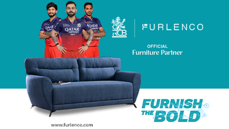
As part of this mandate, ITW Playworx, which says it is India’s only full-stack agency offering a complete range of services through a single window, will craft and execute a comprehensive PR strategy for Furlenco, leveraging innovative approaches to elevate the brand’s visibility. Additionally, ITW Universe will work closely with its marketing team to amplify the brand’s presence through outdoor advertising (OOH) and sports marketing platforms, ensuring an integrated and impactful outreach.
Said Fluorenco CEO & fonder Ajith Karimpana: “Furlenco has always strived to create exceptional experiences for the customers by offering premium, flexible home solutions. Partnering with ITW Playworx aligns with our goal of engaging meaningfully with our audience. We are confident this collaboration will help us achieve greater visibility and strengthen our brand’s positioning in the market.”
ITW Playworx CEO Sidharth Ghosh said, “Furlenco is redefining modern living, and we are proud to partner with a brand that resonates with urban India’s aspirations. At ITW Playworx, we craft purpose-driven strategies that elevate brands and build deeper emotional connections. This partnership is a valuable opportunity to showcase our expertise in impactful storytelling.”
ITW Universe co-founder Bhairav Shanth opined, “We are excited to be working with a truly new economy brand like Furlenco on boosting its brand presence and salience. An interconnected consumer market requires strategies that are truly integrated across multiple channels and building on the work that ITW Playworx will be doing we will also be helping the brand with a holistic 360 plan spanning across multiple touchpoints such as digital/OTT, sports marketing, OOH and more.”
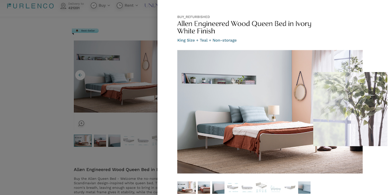
ITW Playworx aims to position Furlenco as not just a furniture rental platform but a lifestyle brand that resonates with the modern Indian consumer.
Brands
Godrej clarifies ‘GI’ identifier after logo similarity debate
Says GI is not a logo, will not replace Godrej signature across products.
MUMBAI: In a branding storm where shapes did the talking, Godrej is now spelling things out. Godrej Industries Group (GIG) has issued a clarification on its newly introduced ‘GI’ identifier, addressing questions around its purpose and design following a wave of online criticism. At the centre of the debate were two concerns: whether the new mark replaces the long-standing Godrej logo, and whether its geometric design mirrors other corporate identities.
The company has drawn a clear line. The Godrej signature logo, it said, remains unchanged and continues to be the sole logo across all consumer-facing products and services. The ‘GI’ mark, by contrast, is not a logo but a corporate group identifier intended for use alongside the Godrej signature or company name, and aimed at stakeholders such as investors, media and talent rather than consumers.
The need for such a distinction stems from the 2024 restructuring of the broader Godrej Group into two separate business entities. With both continuing to operate under the same Godrej name and signature, the identifier is positioned as a way to differentiate the Godrej Industries Group at a corporate level.
The rollout, however, triggered a broader conversation on design originality. Critics pointed to similarities between the GI mark’s geometric composition and logos used by companies globally, raising questions about distinctiveness.
Responding to this, GIG said its intellectual property and legal review found that such overlaps are common in minimalist, geometry-led design systems. Basic forms such as circles and rectangles appear across dozens of brand identities worldwide, the company noted.
It added that the identifier emerged from an extensive design process and was chosen for its simplicity, allowing it to sit alongside the Godrej signature without competing visually. While acknowledging that elemental shapes may appear less distinctive in isolation, the group emphasised that the mark is part of a broader identity system that includes a custom typeface, sonic branding and other proprietary elements.
Following legal and ethical assessments, the company said it found no impediment to using the identifier, reiterating that the GI mark is a corporate tool not a consumer-facing symbol.
In short, the logo isn’t changing but the conversation around it certainly has.


