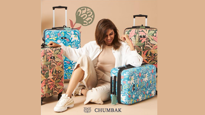
Connect with us

Brands

Festive table goals Chumbak plates up a Christmas-ready hosting range

Published

on

MUMBAI: If Christmas tables could talk, Chumbak’s latest launch would be humming carols already. India’s contemporary lifestyle brand Chumbak has unveiled its new Lost in Paradise Hosting Range, timed for the festive rush and the long, leisurely countdown to New Year 2026.

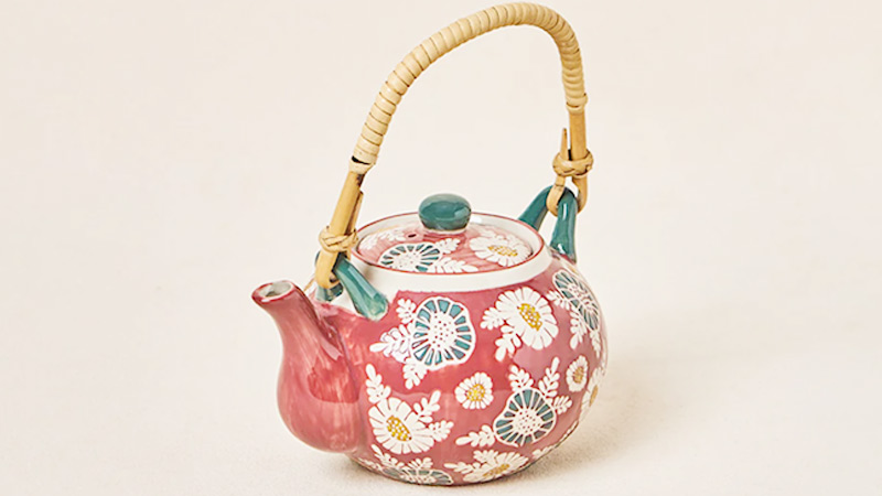
Dressed in deep reds and lush greens, the ceramic collection leans into winter warmth, pairing blooming hibiscus and fig motifs with Chumbak’s signature wilderness-inspired illustrations. Designed for both hosting and gifting, the range blends visual cheer with everyday utility, making it as functional as it is festive.

At the heart of the edit is a playful mini baking collection. Highlights include a hen-shaped ceramic Egg Basket, a Tea Kettle and tumbler set for slow winter mornings, a generously sized casserole for baked comfort food, and a four-piece measuring cup set aimed squarely at enthusiastic home bakers. The assortment is rounded out with snack bowls and flat platters suited for everything from fig salads to classic chip-and-dip spreads.

Advertisement

The Egg Basket stands out as the most conversation-worthy piece, doubling as kitchen décor and a serving dish, a nod to Chumbak’s knack for turning everyday objects into visual talking points. Across the collection, the brand keeps things light-hearted without tipping into novelty, striking a balance between festive flair and practical design.

Commenting on the launch, Chumbak founder Shubhra Chadda said the Lost in Paradise range draws inspiration from nature and the simple joys of everyday living, aiming to bring warmth and cheer to year-end gatherings.

The Lost in Paradise Hosting Range, including the hen-shaped Egg Basket, is now available across Chumbak stores and online, just in time to dress up festive tables and gifting lists alike.

Advertisement
Click to comment

Leave a Reply

Your email address will not be published. Required fields are marked *

Brands

Godrej clarifies ‘GI’ identifier after logo similarity debate

Says GI is not a logo, will not replace Godrej signature across products.

Published

on

MUMBAI: In a branding storm where shapes did the talking, Godrej is now spelling things out. Godrej Industries Group (GIG) has issued a clarification on its newly introduced ‘GI’ identifier, addressing questions around its purpose and design following a wave of online criticism. At the centre of the debate were two concerns: whether the new mark replaces the long-standing Godrej logo, and whether its geometric design mirrors other corporate identities.

The company has drawn a clear line. The Godrej signature logo, it said, remains unchanged and continues to be the sole logo across all consumer-facing products and services. The ‘GI’ mark, by contrast, is not a logo but a corporate group identifier intended for use alongside the Godrej signature or company name, and aimed at stakeholders such as investors, media and talent rather than consumers.

The need for such a distinction stems from the 2024 restructuring of the broader Godrej Group into two separate business entities. With both continuing to operate under the same Godrej name and signature, the identifier is positioned as a way to differentiate the Godrej Industries Group at a corporate level.

Advertisement

The rollout, however, triggered a broader conversation on design originality. Critics pointed to similarities between the GI mark’s geometric composition and logos used by companies globally, raising questions about distinctiveness.

Responding to this, GIG said its intellectual property and legal review found that such overlaps are common in minimalist, geometry-led design systems. Basic forms such as circles and rectangles appear across dozens of brand identities worldwide, the company noted.

It added that the identifier emerged from an extensive design process and was chosen for its simplicity, allowing it to sit alongside the Godrej signature without competing visually. While acknowledging that elemental shapes may appear less distinctive in isolation, the group emphasised that the mark is part of a broader identity system that includes a custom typeface, sonic branding and other proprietary elements.

Advertisement

Following legal and ethical assessments, the company said it found no impediment to using the identifier, reiterating that the GI mark is a corporate tool not a consumer-facing symbol.

In short, the logo isn’t changing but the conversation around it certainly has.

Advertisement
Continue Reading

Advertisement News18
Advertisement
Advertisement
Advertisement
Advertisement Whtasapp
Advertisement Year Enders

Indian Television Dot Com Pvt Ltd

Signup for news and special offers!

Copyright © 2026 Indian Television Dot Com PVT LTD

This will close in 10 seconds