Connect with us

Brands

Chandrika Raamz marks a decade of success

Published

on

Mumbai: Chandrika Raamz, the leading luxury menswear brand helmed by visionary designers Raamz and Chandrika, celebrates a decade of sartorial excellence. Over the past ten years, Raamz has cultivated an impressive portfolio, garnering a loyal clientele that includes A-list celebrities like Mahesh Babu, Allu Arjun, Ramcharan, Junior NTR, and Dulquer Salmaan, alongside renowned figures like the KCR family and also worked legendary actors like Rajnikanth, Chiranjeevi, Nagarjuna, and Balakrishna.

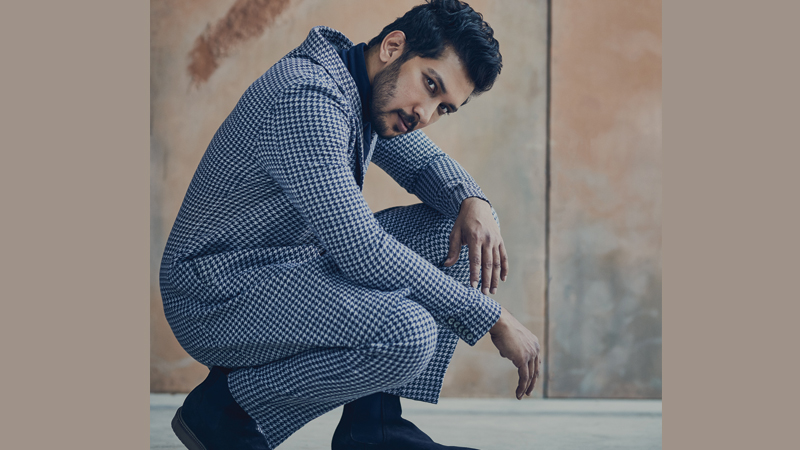
Raamz’s and Chandrika’s dedication is further reflected in the brand’s recent summer collection, “Swinging City.” This playful collection, featuring bold colors like red, black, and white, showcases Raamz’s ability to seamlessly blend traditional with contemporary flair.

Their designs have not only graced the esteemed Lakme Fashion Week runway twice but have also redefined luxury menswear in India. Chandrika Raamz caters to the discerning gentleman, offering a meticulously crafted selection of menswear that transcends fleeting trends. The brand boasts a comprehensive collection, including Dhoti Sets, Kurta Sets, Jodhpuri Sets, Shirt Sets, Sherwanis, Indo-Western pieces, and Jacket Sets. Each garment is a testament to Raamz and Chandrika’s unwavering commitment to quality and intricate design, resulting in timeless sophistication. For the younger generation, Raamz Jr., a dedicated line for boys, offers exquisite Kurta Sets, ensuring that fathers and sons can experience the Chandrika Raamz legacy together.

Advertisement

Raamz and Chandrika’s dedication extends beyond flawless tailoring. Chandrika Raamz is a brand built on a foundation of unwavering dedication. Through sheer hard work, unwavering consistency, and countless sacrifices, both of them have established a label that commands respect and admiration within the industry.

Click to comment

Leave a Reply

Your email address will not be published. Required fields are marked *

Brands

Godrej clarifies ‘GI’ identifier after logo similarity debate

Says GI is not a logo, will not replace Godrej signature across products.

Published

on

MUMBAI: In a branding storm where shapes did the talking, Godrej is now spelling things out. Godrej Industries Group (GIG) has issued a clarification on its newly introduced ‘GI’ identifier, addressing questions around its purpose and design following a wave of online criticism. At the centre of the debate were two concerns: whether the new mark replaces the long-standing Godrej logo, and whether its geometric design mirrors other corporate identities.

The company has drawn a clear line. The Godrej signature logo, it said, remains unchanged and continues to be the sole logo across all consumer-facing products and services. The ‘GI’ mark, by contrast, is not a logo but a corporate group identifier intended for use alongside the Godrej signature or company name, and aimed at stakeholders such as investors, media and talent rather than consumers.

The need for such a distinction stems from the 2024 restructuring of the broader Godrej Group into two separate business entities. With both continuing to operate under the same Godrej name and signature, the identifier is positioned as a way to differentiate the Godrej Industries Group at a corporate level.

Advertisement

The rollout, however, triggered a broader conversation on design originality. Critics pointed to similarities between the GI mark’s geometric composition and logos used by companies globally, raising questions about distinctiveness.

Responding to this, GIG said its intellectual property and legal review found that such overlaps are common in minimalist, geometry-led design systems. Basic forms such as circles and rectangles appear across dozens of brand identities worldwide, the company noted.

It added that the identifier emerged from an extensive design process and was chosen for its simplicity, allowing it to sit alongside the Godrej signature without competing visually. While acknowledging that elemental shapes may appear less distinctive in isolation, the group emphasised that the mark is part of a broader identity system that includes a custom typeface, sonic branding and other proprietary elements.

Advertisement

Following legal and ethical assessments, the company said it found no impediment to using the identifier, reiterating that the GI mark is a corporate tool not a consumer-facing symbol.

In short, the logo isn’t changing but the conversation around it certainly has.

Advertisement
Continue Reading

Advertisement News18
Advertisement
Advertisement
Advertisement
Advertisement Whtasapp
Advertisement Year Enders

Indian Television Dot Com Pvt Ltd

Signup for news and special offers!

Copyright © 2026 Indian Television Dot Com PVT LTD

This will close in 10 seconds