Connect with us

Brands

CenturyPly puts consumers in the driver’s seat

Published

on

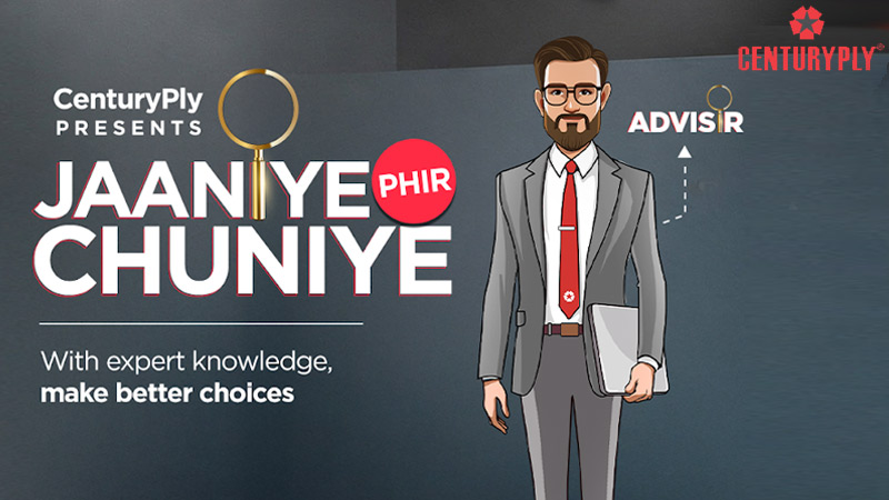
MUMBAI: Knowledge is power, and CenturyPly just handed the keys to consumers. In a first for India’s building materials sector, CenturyPly has launched Jaaniye Phir Chuniye, a knowledge-driven campaign designed to simplify choices in a notoriously complex category. Central to the initiative is Advisir, India’s first consumer education mascot in the industry, tasked with guiding homeowners, architects, designers, and trade professionals through the maze of plywood and interior materials.

The campaign also introduces a direct customer helpdesk at customerhelpdesk@centuryply.com, giving consumers instant access to expert advice. From fact-checking to myth-busting and product guidance, Advisir aims to make every purchase smarter and more confident.

“An informed consumer is a powerful consumer,” said CenturyPly. “With Jaaniye Phir Chuniye, we are bridging the knowledge gap in interiors and empowering people to make choices with clarity and confidence.”

Advertisement

This initiative builds on CenturyPly’s legacy of consumer-first practices, including the CenturyPromise app for product authentication, 48-hour customer service, and a robust ecosystem connecting users with architects, designers, carpenters, contractors, and dealers.

By putting education at the centre of its narrative, CenturyPly is not just leading the market, it’s reshaping what leadership in the building materials sector should look like, transparent, responsible, and empowering.

Advertisement
Click to comment

Leave a Reply

Your email address will not be published. Required fields are marked *

Brands

Godrej clarifies ‘GI’ identifier after logo similarity debate

Says GI is not a logo, will not replace Godrej signature across products.

Published

on

MUMBAI: In a branding storm where shapes did the talking, Godrej is now spelling things out. Godrej Industries Group (GIG) has issued a clarification on its newly introduced ‘GI’ identifier, addressing questions around its purpose and design following a wave of online criticism. At the centre of the debate were two concerns: whether the new mark replaces the long-standing Godrej logo, and whether its geometric design mirrors other corporate identities.

The company has drawn a clear line. The Godrej signature logo, it said, remains unchanged and continues to be the sole logo across all consumer-facing products and services. The ‘GI’ mark, by contrast, is not a logo but a corporate group identifier intended for use alongside the Godrej signature or company name, and aimed at stakeholders such as investors, media and talent rather than consumers.

The need for such a distinction stems from the 2024 restructuring of the broader Godrej Group into two separate business entities. With both continuing to operate under the same Godrej name and signature, the identifier is positioned as a way to differentiate the Godrej Industries Group at a corporate level.

Advertisement

The rollout, however, triggered a broader conversation on design originality. Critics pointed to similarities between the GI mark’s geometric composition and logos used by companies globally, raising questions about distinctiveness.

Responding to this, GIG said its intellectual property and legal review found that such overlaps are common in minimalist, geometry-led design systems. Basic forms such as circles and rectangles appear across dozens of brand identities worldwide, the company noted.

It added that the identifier emerged from an extensive design process and was chosen for its simplicity, allowing it to sit alongside the Godrej signature without competing visually. While acknowledging that elemental shapes may appear less distinctive in isolation, the group emphasised that the mark is part of a broader identity system that includes a custom typeface, sonic branding and other proprietary elements.

Advertisement

Following legal and ethical assessments, the company said it found no impediment to using the identifier, reiterating that the GI mark is a corporate tool not a consumer-facing symbol.

In short, the logo isn’t changing but the conversation around it certainly has.

Advertisement
Continue Reading

Advertisement News18
Advertisement
Advertisement
Advertisement
Advertisement Whtasapp
Advertisement Year Enders

Indian Television Dot Com Pvt Ltd

Signup for news and special offers!

Copyright © 2026 Indian Television Dot Com PVT LTD

This will close in 10 seconds