Brands
CenturyPly forays into Indian E-commerce market via Flipkart
MUMBAI: Century Plyboards (India) Ltd forayed into the Indian e-commerce platform by associating with e-commerce giant, Flipkart. This is a first-of-its-kind association where the country’s leading building material company has stepped into the e-commerce service to leverage the spike in online shopping and digital consumption amid the Covid2019 pandemic.
Initially, the product lines available from CenturyPly on Flipkart are those of Club Prime, Sainik 710 and Sainik MR to which more variants will be added with time. These products will be exclusively available for consumers in Bangalore, Hyderabad and Chennai, while the company learns to be mulling scaling it up to other cities in the near future.
Consumers sometimes get duped while buying plywood from the offline retail market due to the presence of duplicate products in the market. This issue of authenticity and quality will be completely addressed while buying online as consumers will buy directly from CenturyPly, a brand that always shows commitment and loyalty towards its consumers.
Since Covid2019 has impacted business across all sectors, this is a welcome step as this would open a lot of opportunities for both sellers and consumers. The association will benefit consumers for letting them browse CenturyPly products without travelling to local shops and risking contact with outsiders.
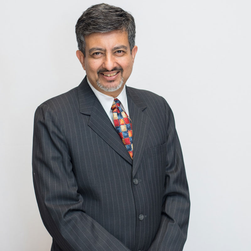
Navarun Sen, President, Panel division said, “Given the current growth in the consumption of digital platforms, our association with Flipkart couldn’t have been timed better. While most consumers are reluctant to visit stores physically, are not sure of the quality of products, this initiative will make shopping of plywood hassle-free for them. We are expecting that this association will definitely help us reach our consumers better and add momentum to our business.”
Through this association with one of the most widely used e-commerce sites, Flipkart, the company is aiming to reach the increasing number of net-savvy consumers along with widening business opportunities in Indian plywood market.
Brands
Godrej clarifies ‘GI’ identifier after logo similarity debate
Says GI is not a logo, will not replace Godrej signature across products.
MUMBAI: In a branding storm where shapes did the talking, Godrej is now spelling things out. Godrej Industries Group (GIG) has issued a clarification on its newly introduced ‘GI’ identifier, addressing questions around its purpose and design following a wave of online criticism. At the centre of the debate were two concerns: whether the new mark replaces the long-standing Godrej logo, and whether its geometric design mirrors other corporate identities.
The company has drawn a clear line. The Godrej signature logo, it said, remains unchanged and continues to be the sole logo across all consumer-facing products and services. The ‘GI’ mark, by contrast, is not a logo but a corporate group identifier intended for use alongside the Godrej signature or company name, and aimed at stakeholders such as investors, media and talent rather than consumers.
The need for such a distinction stems from the 2024 restructuring of the broader Godrej Group into two separate business entities. With both continuing to operate under the same Godrej name and signature, the identifier is positioned as a way to differentiate the Godrej Industries Group at a corporate level.
The rollout, however, triggered a broader conversation on design originality. Critics pointed to similarities between the GI mark’s geometric composition and logos used by companies globally, raising questions about distinctiveness.
Responding to this, GIG said its intellectual property and legal review found that such overlaps are common in minimalist, geometry-led design systems. Basic forms such as circles and rectangles appear across dozens of brand identities worldwide, the company noted.
It added that the identifier emerged from an extensive design process and was chosen for its simplicity, allowing it to sit alongside the Godrej signature without competing visually. While acknowledging that elemental shapes may appear less distinctive in isolation, the group emphasised that the mark is part of a broader identity system that includes a custom typeface, sonic branding and other proprietary elements.
Following legal and ethical assessments, the company said it found no impediment to using the identifier, reiterating that the GI mark is a corporate tool not a consumer-facing symbol.
In short, the logo isn’t changing but the conversation around it certainly has.


