Brands
Bingo! chips away at Its past with a bold new bite
MUMBAI: Now that’s how you take the chips on your shoulder and turn them into a punchline. Bingo! potato chips has flipped the script on its “Big No” phase with a hilariously self-aware new campaign that sees the brand roast itself before making a fiery comeback.
Known for its trademark wit and quirky energy, Bingo! has never shied away from humour, and this time, it’s using it to reclaim its snack throne in north and west India. In the new campaign film, the brand cheekily admits it wasn’t quite everyone’s first pick before declaring, “Yes, we were a Big No. But not anymore!”
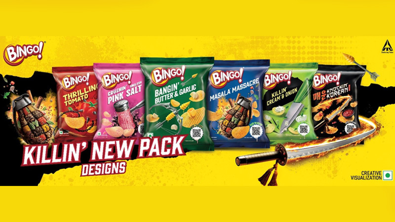
The bold relaunch features a complete makeover, right from edgy, gothic-inspired pack designs to two flavour-packed innovations, butter garlic, the garlic-bread-in-a-chip experience, and Himalayan pink salt, a refined twist on a timeless classic. With six striking packs that blend art, attitude and appetite, Bingo! is betting on curiosity, confidence and serious crunch.
“Humour has always been in Bingo!’s DNA,” said ITC Foods VP & head of marketing, snacks, noodles & pasta Suresh Chand. “This isn’t just a comeback, it’s a new energy, a new attitude, and a brand that’s owning its journey.”
Echoing that sentiment, Ogilvy senior executive creative director Rohit Dubey added, “When mischief and marketing meet in the right spot, magic happens.”
With this self-roasting, high-flavour reboot, Bingo! isn’t just back on the shelves, it’s back in the conversation. And this time, the answer to Bingo! is a loud, crunchy “YES.”
Brands
Godrej clarifies ‘GI’ identifier after logo similarity debate
Says GI is not a logo, will not replace Godrej signature across products.
MUMBAI: In a branding storm where shapes did the talking, Godrej is now spelling things out. Godrej Industries Group (GIG) has issued a clarification on its newly introduced ‘GI’ identifier, addressing questions around its purpose and design following a wave of online criticism. At the centre of the debate were two concerns: whether the new mark replaces the long-standing Godrej logo, and whether its geometric design mirrors other corporate identities.
The company has drawn a clear line. The Godrej signature logo, it said, remains unchanged and continues to be the sole logo across all consumer-facing products and services. The ‘GI’ mark, by contrast, is not a logo but a corporate group identifier intended for use alongside the Godrej signature or company name, and aimed at stakeholders such as investors, media and talent rather than consumers.
The need for such a distinction stems from the 2024 restructuring of the broader Godrej Group into two separate business entities. With both continuing to operate under the same Godrej name and signature, the identifier is positioned as a way to differentiate the Godrej Industries Group at a corporate level.
The rollout, however, triggered a broader conversation on design originality. Critics pointed to similarities between the GI mark’s geometric composition and logos used by companies globally, raising questions about distinctiveness.
Responding to this, GIG said its intellectual property and legal review found that such overlaps are common in minimalist, geometry-led design systems. Basic forms such as circles and rectangles appear across dozens of brand identities worldwide, the company noted.
It added that the identifier emerged from an extensive design process and was chosen for its simplicity, allowing it to sit alongside the Godrej signature without competing visually. While acknowledging that elemental shapes may appear less distinctive in isolation, the group emphasised that the mark is part of a broader identity system that includes a custom typeface, sonic branding and other proprietary elements.
Following legal and ethical assessments, the company said it found no impediment to using the identifier, reiterating that the GI mark is a corporate tool not a consumer-facing symbol.
In short, the logo isn’t changing but the conversation around it certainly has.


