Brands
Bigbasket launches low GI bb Royal atta for steady sugar control
New blend developed with CFTRI aims to bring science-led nutrition home
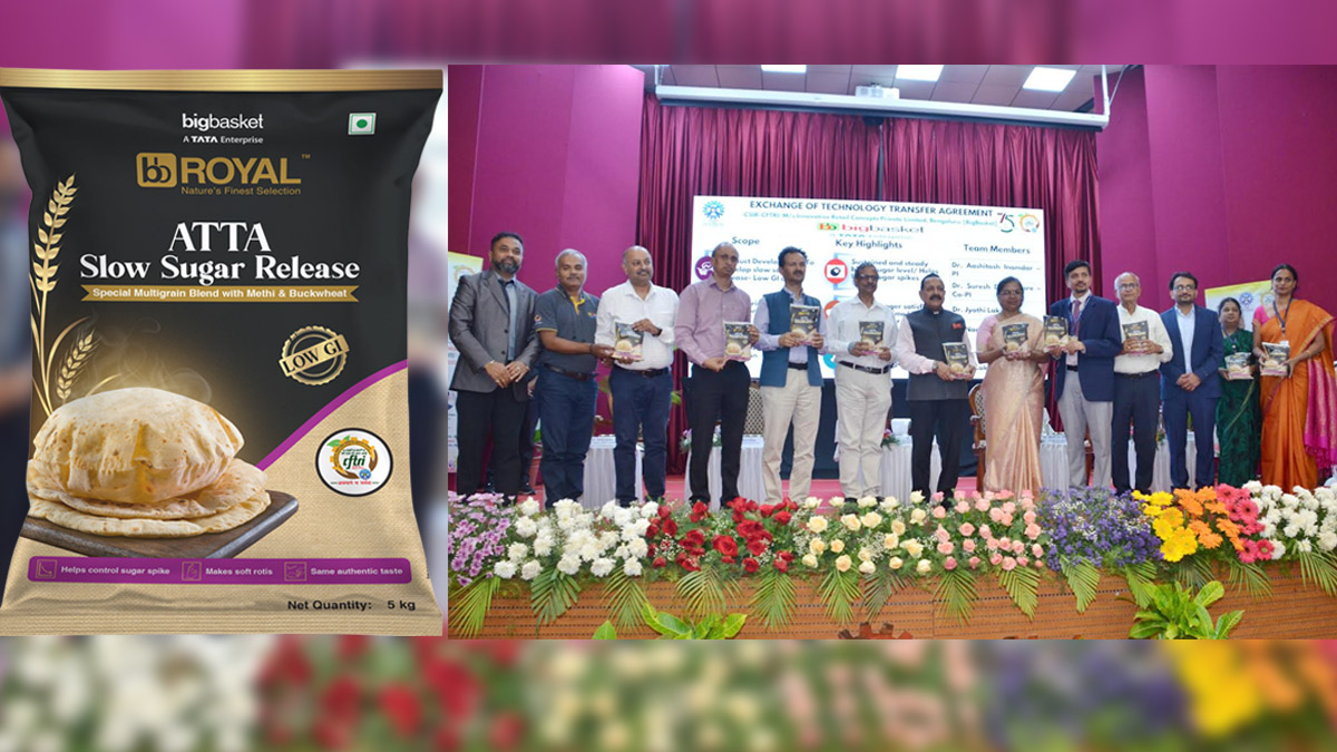
MYSORE: Bigbasket has expanded its health-focused portfolio with the launch of bb Royal Slow Sugar Release Atta, a scientifically developed flour designed to help manage blood sugar levels while fitting seamlessly into everyday diets.
The product, part of its bb Royal range, was unveiled by Jitendra Singh at the CSIR-CFTRI in Mysore, underscoring the growing intersection of food science and consumer health.
Developed in collaboration with CFTRI, the atta blends wheat with ingredients such as soya, buckwheat, Bengal gram, oats, psyllium husk and fenugreek. The formulation has been clinically tested and carries a glycaemic index of under 45, significantly lower than conventional wheat flour, indicating a slower release of sugar into the bloodstream.
This slow-release property is designed to support steady energy levels, reduce post-meal sugar spikes and promote satiety. In simpler terms, it aims to keep you fuller for longer while helping manage metabolic health, a growing concern among urban consumers.
Speaking about the launch, bigbasket chief buying and merchandising officer Seshu Kumar Tirumala said, “At bigbasket, private labels are more than just products, they are strategic choices rooted in quality, innovation and consumer insight. With bb Royal Slow Sugar Release Atta, we are bringing scientifically backed nutrition into everyday Indian kitchens, supporting better metabolic health without compromising on taste or versatility.”
Echoing this sentiment, CSIR-CFTRI director Giridhar Parvatam said, “Our collaboration with bigbasket is rooted in a shared vision of making scientifically validated, healthier food choices more accessible to Indian households at scale. Innovations like this are not just about a single product, but about enabling a shift towards better dietary habits.”
The launch reflects a broader trend where consumers are increasingly seeking functional foods that deliver both nutrition and convenience. With science stepping into the kitchen, everyday staples like atta are quietly getting a smarter upgrade.
As bigbasket continues to build out its private label strategy, this latest offering suggests that the future of grocery may well be equal parts taste, trust and technology.
Brands
Godrej clarifies ‘GI’ identifier after logo similarity debate
Says GI is not a logo, will not replace Godrej signature across products.
MUMBAI: In a branding storm where shapes did the talking, Godrej is now spelling things out. Godrej Industries Group (GIG) has issued a clarification on its newly introduced ‘GI’ identifier, addressing questions around its purpose and design following a wave of online criticism. At the centre of the debate were two concerns: whether the new mark replaces the long-standing Godrej logo, and whether its geometric design mirrors other corporate identities.
The company has drawn a clear line. The Godrej signature logo, it said, remains unchanged and continues to be the sole logo across all consumer-facing products and services. The ‘GI’ mark, by contrast, is not a logo but a corporate group identifier intended for use alongside the Godrej signature or company name, and aimed at stakeholders such as investors, media and talent rather than consumers.
The need for such a distinction stems from the 2024 restructuring of the broader Godrej Group into two separate business entities. With both continuing to operate under the same Godrej name and signature, the identifier is positioned as a way to differentiate the Godrej Industries Group at a corporate level.
The rollout, however, triggered a broader conversation on design originality. Critics pointed to similarities between the GI mark’s geometric composition and logos used by companies globally, raising questions about distinctiveness.
Responding to this, GIG said its intellectual property and legal review found that such overlaps are common in minimalist, geometry-led design systems. Basic forms such as circles and rectangles appear across dozens of brand identities worldwide, the company noted.
It added that the identifier emerged from an extensive design process and was chosen for its simplicity, allowing it to sit alongside the Godrej signature without competing visually. While acknowledging that elemental shapes may appear less distinctive in isolation, the group emphasised that the mark is part of a broader identity system that includes a custom typeface, sonic branding and other proprietary elements.
Following legal and ethical assessments, the company said it found no impediment to using the identifier, reiterating that the GI mark is a corporate tool not a consumer-facing symbol.
In short, the logo isn’t changing but the conversation around it certainly has.


