Brands
Asian Paints launches Northeast Book of Colours
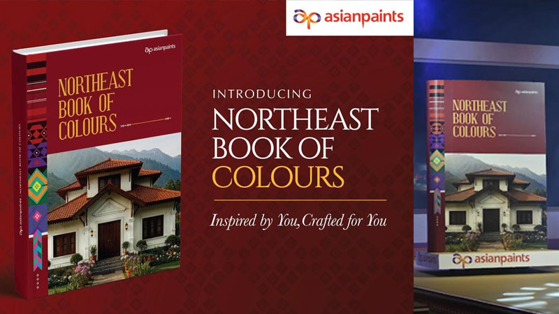
NATIONAL: Asian Paints has launched the Northeast Book of Colours, a region-specific shade guide that translates the cultural life, craft traditions and landscapes of India’s Northeast into a curated colour campaign for homes.
Built around the theme Inspired by you, crafted for you, the book positions colour as cultural expression rather than decoration. It features more than 80 curated shade combinations, presented through mood boards, design cues and popular palettes drawn from across the Northeastern states.
The campaign taps into familiar regional references, from the deep blacks of Longpi pottery in Manipur and the red-and-white Gamosa of Assam, to the bold red, black and green of Tripura’s Rignai. Earth tones inspired by hills, forests and rivers soften the palette, offering homeowners combinations that feel rooted yet contemporary.
The book is designed as both a practical tool and a cultural statement, helping consumers choose colours that reflect local identity while fitting modern living spaces.
“Colour is one of the strongest expressions of identity,” said Asian Paints Ltd MD and CEO Amit Syngle. “This book is our tribute to a region rich in character and craft, bringing together its most loved palettes into a guide inspired by its people and communities.”
To amplify the launch, Asian Paints has released a campaign film that traces the origins of the shades and their cultural stories. The Northeast edition was unveiled at a flagship event at Radisson, Guwahati, marked by a fashion show interpreting indigenous textiles, art forms and natural hues for contemporary homes.
With this launch, Asian Paints deepens its regional play, using localisation and cultural storytelling to strengthen its position as India’s colour authority.
Brands
Godrej clarifies ‘GI’ identifier after logo similarity debate
Says GI is not a logo, will not replace Godrej signature across products.
MUMBAI: In a branding storm where shapes did the talking, Godrej is now spelling things out. Godrej Industries Group (GIG) has issued a clarification on its newly introduced ‘GI’ identifier, addressing questions around its purpose and design following a wave of online criticism. At the centre of the debate were two concerns: whether the new mark replaces the long-standing Godrej logo, and whether its geometric design mirrors other corporate identities.
The company has drawn a clear line. The Godrej signature logo, it said, remains unchanged and continues to be the sole logo across all consumer-facing products and services. The ‘GI’ mark, by contrast, is not a logo but a corporate group identifier intended for use alongside the Godrej signature or company name, and aimed at stakeholders such as investors, media and talent rather than consumers.
The need for such a distinction stems from the 2024 restructuring of the broader Godrej Group into two separate business entities. With both continuing to operate under the same Godrej name and signature, the identifier is positioned as a way to differentiate the Godrej Industries Group at a corporate level.
The rollout, however, triggered a broader conversation on design originality. Critics pointed to similarities between the GI mark’s geometric composition and logos used by companies globally, raising questions about distinctiveness.
Responding to this, GIG said its intellectual property and legal review found that such overlaps are common in minimalist, geometry-led design systems. Basic forms such as circles and rectangles appear across dozens of brand identities worldwide, the company noted.
It added that the identifier emerged from an extensive design process and was chosen for its simplicity, allowing it to sit alongside the Godrej signature without competing visually. While acknowledging that elemental shapes may appear less distinctive in isolation, the group emphasised that the mark is part of a broader identity system that includes a custom typeface, sonic branding and other proprietary elements.
Following legal and ethical assessments, the company said it found no impediment to using the identifier, reiterating that the GI mark is a corporate tool not a consumer-facing symbol.
In short, the logo isn’t changing but the conversation around it certainly has.


