Connect with us

Brands

Alpona by CaratLane: Tradition reimagined with modern aesthetics

Published

on

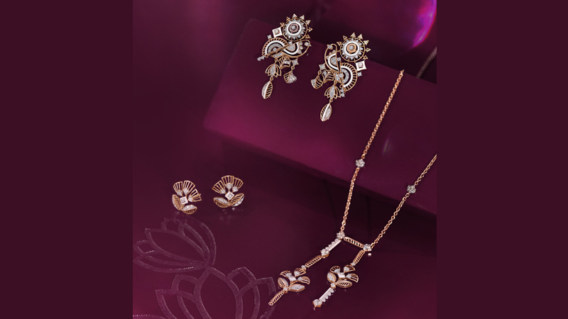
Mumbai: CaratLane, India’s leading omni-channel jewellery brand, has marked the beginning of the festive season with the launch of its new collection, Alpona. The collection draws inspiration from the mesmerising traditional Bengali art style and its eight unique motifs, crafted with modern aesthetics. These intricate patterns carry profound meaning in each motif, symbolising prosperity, good health, and triumphs. Bringing to life these symbolic elements, the collection also taps into the nostalgia of creating these Alpona designs at home to signal the beginning of any celebration.

Crafted in 14kt gold, white ceramic, and diamonds, the gorgeous Alpona motifs can be seen in a variety of categories, including earrings, rings, bracelets, and pendants. The intricate detailing on each piece demonstrates the perfect blend of tradition and modern elegance.

Talking about the collection, CaratLane VP of marketing Jennifer Pandya said, “Design has always been at the core of everything we do at CaratLane, and the Alpona collection stays true to its inspiration. The handcrafted intricate motifs of this collection are reminiscent of the nostalgia of creating something beautiful with our hands and sharing the joy with our families during every occasion. We’ve translated this idea into gorgeous, affordable designs that can be worn every day to make this festive season even more joyous for our customers.”

Advertisement

The collection has been launched with a heartwarming film that gives Alpona the spotlight, showcasing how jewellery brings people together and enables them to express their emotions beautifully. The film stays true to the brand’s ethos of ‘Khul Ke Karo Express’. The film’s protagonist displays a balance of tradition and modernity, embodying the essence of the Alpona collection.


Advertisement


Alpona by CaratLane is the ideal choice this festive season, whether you’re going for the classic traditional or a trendy indo-western look. The collection is available online at www.caratlane.com and can be experienced in person at over 230 CaratLane stores across India.

Advertisement
Click to comment

Leave a Reply

Your email address will not be published. Required fields are marked *

Brands

Godrej clarifies ‘GI’ identifier after logo similarity debate

Says GI is not a logo, will not replace Godrej signature across products.

Published

on

MUMBAI: In a branding storm where shapes did the talking, Godrej is now spelling things out. Godrej Industries Group (GIG) has issued a clarification on its newly introduced ‘GI’ identifier, addressing questions around its purpose and design following a wave of online criticism. At the centre of the debate were two concerns: whether the new mark replaces the long-standing Godrej logo, and whether its geometric design mirrors other corporate identities.

The company has drawn a clear line. The Godrej signature logo, it said, remains unchanged and continues to be the sole logo across all consumer-facing products and services. The ‘GI’ mark, by contrast, is not a logo but a corporate group identifier intended for use alongside the Godrej signature or company name, and aimed at stakeholders such as investors, media and talent rather than consumers.

The need for such a distinction stems from the 2024 restructuring of the broader Godrej Group into two separate business entities. With both continuing to operate under the same Godrej name and signature, the identifier is positioned as a way to differentiate the Godrej Industries Group at a corporate level.

Advertisement

The rollout, however, triggered a broader conversation on design originality. Critics pointed to similarities between the GI mark’s geometric composition and logos used by companies globally, raising questions about distinctiveness.

Responding to this, GIG said its intellectual property and legal review found that such overlaps are common in minimalist, geometry-led design systems. Basic forms such as circles and rectangles appear across dozens of brand identities worldwide, the company noted.

It added that the identifier emerged from an extensive design process and was chosen for its simplicity, allowing it to sit alongside the Godrej signature without competing visually. While acknowledging that elemental shapes may appear less distinctive in isolation, the group emphasised that the mark is part of a broader identity system that includes a custom typeface, sonic branding and other proprietary elements.

Advertisement

Following legal and ethical assessments, the company said it found no impediment to using the identifier, reiterating that the GI mark is a corporate tool not a consumer-facing symbol.

In short, the logo isn’t changing but the conversation around it certainly has.

Advertisement
Continue Reading

Advertisement News18
Advertisement
Advertisement
Advertisement
Advertisement Whtasapp
Advertisement Year Enders

Indian Television Dot Com Pvt Ltd

Signup for news and special offers!

Copyright © 2026 Indian Television Dot Com PVT LTD

This will close in 10 seconds