Brands
Yu-Gi-Oh! levels up your wardrobe with a fashion fusion power play
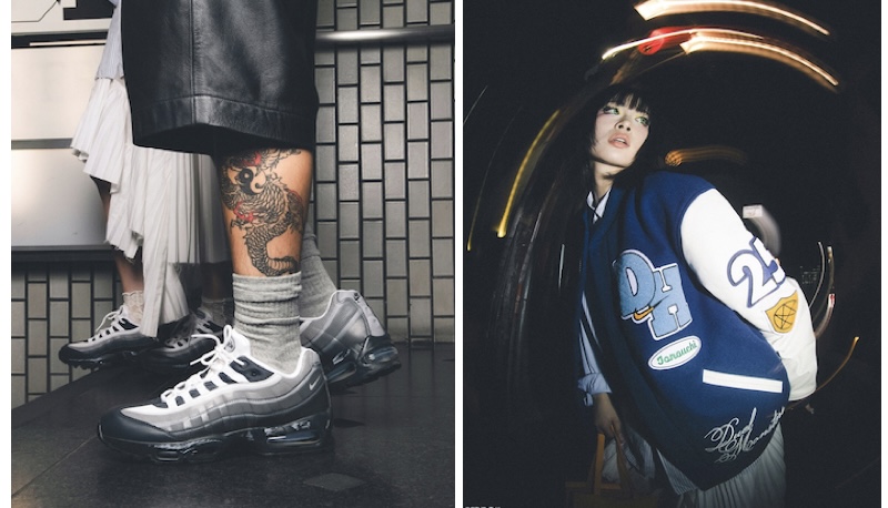
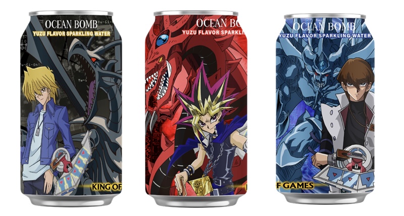
MUMBAI: Get ready to summon some serious style, Yu-Gi-Oh! is no longer just for the duel arena. It’s coming for your closet. Konami Cross Media NY, Inc. has inked fresh global licensing deals that bring the iconic anime franchise to life through streetwear, activewear and knitwear. With new collaborations spanning Vanquish Fitness, Creating Fun, and Steady Hands, Yu-Gi-Oh! is entering the lifestyle fashion chat, one duel disc at a time.
“Each of our new partners is looking to expand their Anime presence in the marketplace and Yu-Gi-Oh! is their top choice,” said Konami Cross Media VP of licensing and marketing Jennifer Coleman. “These agreements will bring new lines of athletic wear, high-end jackets and bespoke knitwear, a new apparel offering for the Yu-Gi-Oh! merchandising business.”
Vanquish Fitness, the London-based athleisure brand started in 2015 by school friends Oliver Maloney and Ruben O’Brien, will launch a line of Yu-Gi-Oh! themed fitness wear including joggers, hoodies, and track suits. The partnership gives fans an excuse to flex both muscles and nostalgia, all under the banner of the brand’s community-driven platform #VQFIT.
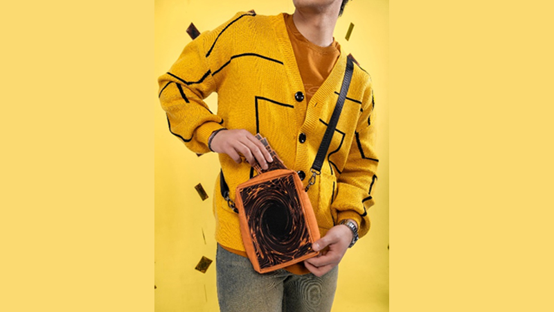
Boutique online label Creating Fun brings premium streetwear into the duel. Known for its “if you know, you know” drops and a knack for merging bespoke tailoring with modern style, the US-based brand is crafting exclusive pieces for the fandom with a heavy dose of anime affection stitched into every seam.
Meanwhile, Steady Hands, a Gen Z favourite known for its viral knitwear drops, will stitch together Yu-Gi-Oh!’s first official knitwear line. The collection includes bespoke sweaters, tees, button-ups and even a themed blanket upping the snuggle stakes for fans. This follows their previously successful accessories capsule inspired by the Yu-Gi-Oh! Trading Card Game.
The deals were born out of connections made at the Licensing Expo in Las Vegas, where Konami Cross Media first met with Steady Hands, leading to a deeper collaboration.
For fans, it’s a win-win: nostalgic references, bold design, and wearable art that lets you rep your duel spirit without the cosplay. Whether you’re bench pressing or binge-watching, the new Yu-Gi-Oh! collections are set to be both fashion-forward and fandom-first.
Now that’s a turn worth drawing.
Brands
Godrej clarifies ‘GI’ identifier after logo similarity debate
Says GI is not a logo, will not replace Godrej signature across products.
MUMBAI: In a branding storm where shapes did the talking, Godrej is now spelling things out. Godrej Industries Group (GIG) has issued a clarification on its newly introduced ‘GI’ identifier, addressing questions around its purpose and design following a wave of online criticism. At the centre of the debate were two concerns: whether the new mark replaces the long-standing Godrej logo, and whether its geometric design mirrors other corporate identities.
The company has drawn a clear line. The Godrej signature logo, it said, remains unchanged and continues to be the sole logo across all consumer-facing products and services. The ‘GI’ mark, by contrast, is not a logo but a corporate group identifier intended for use alongside the Godrej signature or company name, and aimed at stakeholders such as investors, media and talent rather than consumers.
The need for such a distinction stems from the 2024 restructuring of the broader Godrej Group into two separate business entities. With both continuing to operate under the same Godrej name and signature, the identifier is positioned as a way to differentiate the Godrej Industries Group at a corporate level.
The rollout, however, triggered a broader conversation on design originality. Critics pointed to similarities between the GI mark’s geometric composition and logos used by companies globally, raising questions about distinctiveness.
Responding to this, GIG said its intellectual property and legal review found that such overlaps are common in minimalist, geometry-led design systems. Basic forms such as circles and rectangles appear across dozens of brand identities worldwide, the company noted.
It added that the identifier emerged from an extensive design process and was chosen for its simplicity, allowing it to sit alongside the Godrej signature without competing visually. While acknowledging that elemental shapes may appear less distinctive in isolation, the group emphasised that the mark is part of a broader identity system that includes a custom typeface, sonic branding and other proprietary elements.
Following legal and ethical assessments, the company said it found no impediment to using the identifier, reiterating that the GI mark is a corporate tool not a consumer-facing symbol.
In short, the logo isn’t changing but the conversation around it certainly has.


