Brands
Nike takes a walk with Yu-Gi-Oh! for Joey Wheeler-inspired Air Max 95
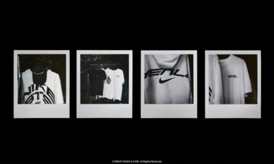
MUMBAI: Konami Cross Media NY and Nike have cut a deal that pulls one of anime’s most beloved universes straight into sneaker culture. The new Nike Air Max 95 QS YGO, inspired by Kazuki Takahashi’s Yu-Gi-Oh!, lands this September alongside a capsule of apparel. At its heart: Joey Wheeler—Yugi’s brash, loyal sidekick—recast as a global athlete.
The tie-up is more than a simple branding exercise. It comes with a full-blown campaign fronted by the original English and Japanese voice actors from the anime series, blurring the line between nostalgia and contemporary fashion. For fans who grew up duelling with trading cards or glued to Toonami, the sneaker is both a collector’s item and a wearable badge of fandom.
Konami Cross Media senior vice-president of licensing and marketing Jennifer Coleman said Nike’s handling of the project had been “extraordinary”. She credited the brand with bringing “passion, care and attention to detail” and praised its “unique vision of Yu-Gi-Oh! characters and fans as athletes”, a framing she said would “redefine how audiences connect with their favourite characters, especially Joey Wheeler.”
Nike, never shy of myth-making, pitched the collaboration as part of its broader belief that sport is a limitless canvas. Dave Vericker, the company’s senior director of neighbourhood merchandise, said: “We didn’t invent this lore: it was born organically from the community. Through our partnership with Konami, we wanted to show love to longtime fans and inspire the next generation by bringing a beloved, mythical story to life through design.”
The collection is built around two centrepieces: a global release of the “Joey” colourway and apparel on 12 September via Nike’s Snkrs app and select partners, and a Japan-exclusive “Jonouchi” version—named for the character’s original manga identity—dropping on the same day in local stores.
The timing is apt. Yu-Gi-Oh! has spent more than 25 years as a fixture in global pop culture, with over 1,000 anime episodes, countless manga volumes and one of the world’s most enduring trading card games. For Nike, the collaboration is both a courtship of older millennial collectors and a way to seed loyalty among Gen Z and Gen Alpha, for whom anime has become as much a cultural touchstone as sport.
Nike’s mission statement has long been: “If you have a body, you are an athlete.” This partnership stretches that definition further—suggesting that even duelists, strategists and manga heroes can lace up and join the ranks.