Brands
The Souled Store casts a retail spell in Colaba and rolls into Bhatinda in style
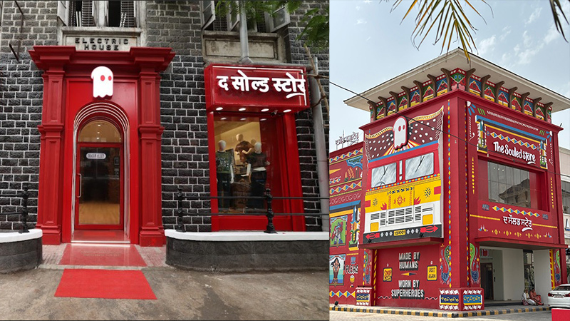
MUMBAI: Some brands hang up neon signs. The Souled Store builds a wizarding alley and paints an entire building like a truck. In its latest expansion, the pop culture-led fashion and lifestyle brand has opened two highly thematic stores—one in Mumbai’s Colaba and the other in Punjab’s Bhatinda—each tailored to offer an experience as unforgettable as the merchandise inside.
In Colaba, The Souled Store has conjured up a Harry Potter-inspired wonderland, transporting shoppers straight into Diagon Alley. The store features atmospheric lighting, magical décor, and architectural details that echo the iconic wizarding universe. This is not a retail outlet—it’s a portal. Designed with intricate care, the space feels like a living tribute to J.K. Rowling’s world.
Meanwhile, Bhatinda’s outlet is a roaring tribute to Indian roads. Crafted in the image of a giant colourful truck, the store’s façade mirrors the bold, playful, and kitschy aesthetic of Punjabi truck art. With its massive presence and unmistakable design, it functions not just as a fashion stop but a visual landmark celebrating desi street culture.
“We’re incredibly excited about these two openings”, said The Souled Store co-founder Vedang Patel. “At The Souled Store, we believe that a store should be more than four walls—it should be an experience. Colaba and Bhatinda are two very different expressions of that vision: one magical, the other rooted in local culture. Both are unforgettable”.
With 50 stores now across India, the brand continues its mission to redefine retail as a playground for fandoms, storytelling, and self-expression. From Hogwarts to highways, The Souled Store’s journey seems determined to colour outside the lines.
Brands
Godrej clarifies ‘GI’ identifier after logo similarity debate
Says GI is not a logo, will not replace Godrej signature across products.
MUMBAI: In a branding storm where shapes did the talking, Godrej is now spelling things out. Godrej Industries Group (GIG) has issued a clarification on its newly introduced ‘GI’ identifier, addressing questions around its purpose and design following a wave of online criticism. At the centre of the debate were two concerns: whether the new mark replaces the long-standing Godrej logo, and whether its geometric design mirrors other corporate identities.
The company has drawn a clear line. The Godrej signature logo, it said, remains unchanged and continues to be the sole logo across all consumer-facing products and services. The ‘GI’ mark, by contrast, is not a logo but a corporate group identifier intended for use alongside the Godrej signature or company name, and aimed at stakeholders such as investors, media and talent rather than consumers.
The need for such a distinction stems from the 2024 restructuring of the broader Godrej Group into two separate business entities. With both continuing to operate under the same Godrej name and signature, the identifier is positioned as a way to differentiate the Godrej Industries Group at a corporate level.
The rollout, however, triggered a broader conversation on design originality. Critics pointed to similarities between the GI mark’s geometric composition and logos used by companies globally, raising questions about distinctiveness.
Responding to this, GIG said its intellectual property and legal review found that such overlaps are common in minimalist, geometry-led design systems. Basic forms such as circles and rectangles appear across dozens of brand identities worldwide, the company noted.
It added that the identifier emerged from an extensive design process and was chosen for its simplicity, allowing it to sit alongside the Godrej signature without competing visually. While acknowledging that elemental shapes may appear less distinctive in isolation, the group emphasised that the mark is part of a broader identity system that includes a custom typeface, sonic branding and other proprietary elements.
Following legal and ethical assessments, the company said it found no impediment to using the identifier, reiterating that the GI mark is a corporate tool not a consumer-facing symbol.
In short, the logo isn’t changing but the conversation around it certainly has.


