Brands
Sennheiser teams with Souled Store for stylish sticker release
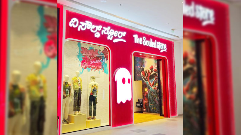
MUMBAI: Great sound may soothe the soul, but Sennheiser is now giving music lovers something for the eyes too. The audio brand has joined hands with The Souled Store to launch a limited-edition sticker pack for buyers of its Momentum and Accentum headphones on its official website.
The collaboration blends Sennheiser’s high-fidelity heritage with the pop-culture sparkle of The Souled Store, creating a playful gift-with-purchase aimed squarely at style-driven younger listeners. The idea is simple: let customers match their sound with their personality. The campaign’s tagline, “Sound meets Style”, sums up the mood perfectly.
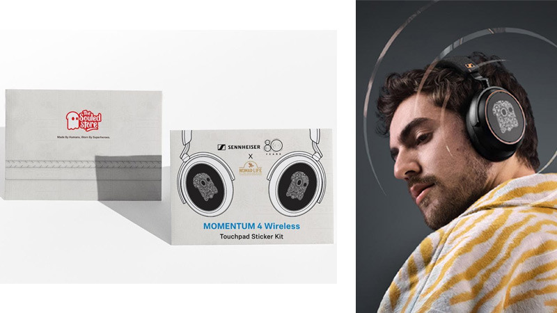
Inspired by travel, everyday expression and the spirit of the Nomad Collection, each sticker pack features custom artwork created exclusively for this partnership. From mood-driven doodles to wanderlust-coloured motifs, the collection invites users to personalise their headphones, laptops or workspaces in a way that mirrors their own sound journey. Even the packaging has been designed to elevate the unboxing moment into a small collectible treat.
Sennheiser said the link-up is rooted in creativity and individuality. Sennheiser general manager consumer hearing business India Saahil Kumar, noted that the collaboration “brings together Sennheiser’s passion for exceptional sound and The Souled Store’s flair for expressive design”.
The Souled Store co-founder Harsh Lal echoed that thought, adding that the Nomad Collection celebrates exploration and self-expression, making the partnership a natural fit for fans who want their stories to show through in every accessory they own.
The sticker pack is available as a complimentary gift for customers purchasing the Momentum 4, Accentum Plus or Accentum Wireless headphones exclusively via sennheiser-hearing.com. It is a small but stylish addition designed to make Sennheiser’s signature audio experience feel even more personal.
Brands
Godrej clarifies ‘GI’ identifier after logo similarity debate
Says GI is not a logo, will not replace Godrej signature across products.
MUMBAI: In a branding storm where shapes did the talking, Godrej is now spelling things out. Godrej Industries Group (GIG) has issued a clarification on its newly introduced ‘GI’ identifier, addressing questions around its purpose and design following a wave of online criticism. At the centre of the debate were two concerns: whether the new mark replaces the long-standing Godrej logo, and whether its geometric design mirrors other corporate identities.
The company has drawn a clear line. The Godrej signature logo, it said, remains unchanged and continues to be the sole logo across all consumer-facing products and services. The ‘GI’ mark, by contrast, is not a logo but a corporate group identifier intended for use alongside the Godrej signature or company name, and aimed at stakeholders such as investors, media and talent rather than consumers.
The need for such a distinction stems from the 2024 restructuring of the broader Godrej Group into two separate business entities. With both continuing to operate under the same Godrej name and signature, the identifier is positioned as a way to differentiate the Godrej Industries Group at a corporate level.
The rollout, however, triggered a broader conversation on design originality. Critics pointed to similarities between the GI mark’s geometric composition and logos used by companies globally, raising questions about distinctiveness.
Responding to this, GIG said its intellectual property and legal review found that such overlaps are common in minimalist, geometry-led design systems. Basic forms such as circles and rectangles appear across dozens of brand identities worldwide, the company noted.
It added that the identifier emerged from an extensive design process and was chosen for its simplicity, allowing it to sit alongside the Godrej signature without competing visually. While acknowledging that elemental shapes may appear less distinctive in isolation, the group emphasised that the mark is part of a broader identity system that includes a custom typeface, sonic branding and other proprietary elements.
Following legal and ethical assessments, the company said it found no impediment to using the identifier, reiterating that the GI mark is a corporate tool not a consumer-facing symbol.
In short, the logo isn’t changing but the conversation around it certainly has.


