Brands
The Smurfs go global on TCL channel for 50 million viewers
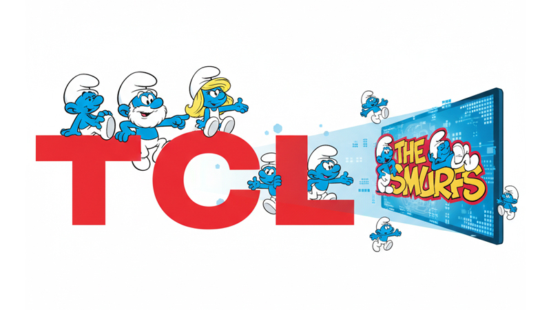
SHENZHEN: TCL, the world’s second-largest TV brand, and Peyo Company have joined forces to bring the timeless charm of The Smurfs to millions of households around the globe.
With over 14 per cent market share and a free streaming platform boasting more than 50 million users, TCL Channel is set to broadcast the classic Smurf series in six languages: English, French, Spanish, Brazilian Portuguese, Arabic and Hindi. This makes 2026 a double celebration, marking both the 45th anniversary of the series and its worldwide availability on TCL CTVs.
TCL Channel head of business development Rebecca Wan said, “We are thrilled to welcome The Smurfs to our platform. This partnership strengthens our commitment to offering high-quality, family-friendly entertainment for our global audience. It’s a joy to bring such a beloved series to millions of homes at no cost.”
Peyo Company CCO audiovisual & music Nele De Wilde added, “This partnership kicks off our 45th anniversary celebrations. Since 1981, The Smurfs have enchanted families across generations. We are proud to continue sharing Peyo’s legacy with new audiences worldwide.”
The deal highlights TCL’s focus on delivering diverse, engaging content for children and families, while reinforcing its global reach in free streaming entertainment.
Brands
Godrej clarifies ‘GI’ identifier after logo similarity debate
Says GI is not a logo, will not replace Godrej signature across products.
MUMBAI: In a branding storm where shapes did the talking, Godrej is now spelling things out. Godrej Industries Group (GIG) has issued a clarification on its newly introduced ‘GI’ identifier, addressing questions around its purpose and design following a wave of online criticism. At the centre of the debate were two concerns: whether the new mark replaces the long-standing Godrej logo, and whether its geometric design mirrors other corporate identities.
The company has drawn a clear line. The Godrej signature logo, it said, remains unchanged and continues to be the sole logo across all consumer-facing products and services. The ‘GI’ mark, by contrast, is not a logo but a corporate group identifier intended for use alongside the Godrej signature or company name, and aimed at stakeholders such as investors, media and talent rather than consumers.
The need for such a distinction stems from the 2024 restructuring of the broader Godrej Group into two separate business entities. With both continuing to operate under the same Godrej name and signature, the identifier is positioned as a way to differentiate the Godrej Industries Group at a corporate level.
The rollout, however, triggered a broader conversation on design originality. Critics pointed to similarities between the GI mark’s geometric composition and logos used by companies globally, raising questions about distinctiveness.
Responding to this, GIG said its intellectual property and legal review found that such overlaps are common in minimalist, geometry-led design systems. Basic forms such as circles and rectangles appear across dozens of brand identities worldwide, the company noted.
It added that the identifier emerged from an extensive design process and was chosen for its simplicity, allowing it to sit alongside the Godrej signature without competing visually. While acknowledging that elemental shapes may appear less distinctive in isolation, the group emphasised that the mark is part of a broader identity system that includes a custom typeface, sonic branding and other proprietary elements.
Following legal and ethical assessments, the company said it found no impediment to using the identifier, reiterating that the GI mark is a corporate tool not a consumer-facing symbol.
In short, the logo isn’t changing but the conversation around it certainly has.


