Brands
Surf Excel celebrates Ramazan with #madadekibadat
MUMBAI: “Kisi ki madad karna bhi ek ibadat hai. Aur agar madad karne mein daag lag jaye, toh daag acche hai” — is the message Surf Excel is conveying in the holy month of Ramazan.
The cute factor of Surf Excel campaigns with kids staining their clothes is something that we have always seen in its campaigns with the signature phrase ‘Daag Acche Hai’, but this time Surf Excel’s all new campaign has touched the chords of many hearts as innocent kids go out of their way to help an old samosa seller in need highlighting and bringing in #madadkiibadat.

The advertisement tagged #madadekibadat has been conceptualised by Lowe Lintas and produced by Absolute Productions. It is shot in Old Delhi. The campaign has gone viral on digital platforms owing to its feel good factor. The advertisement is directed by Vasan Mala and music is by Hanif. It was released only on digital platforms on June 10. Apart from India, the campaign is garnering eyeballs in Pakistan as well; the brand is planning to launch the campaign internationally.
“Surf Excel wished to create something with the divine feel of Ramadan, and the creative team of Lowe Lintas developed the story around it. We tried creating a story that people will connect to. We wanted to convey the true spirit of the holy month.” said Lowe Lintas CCO Arun Iyer.
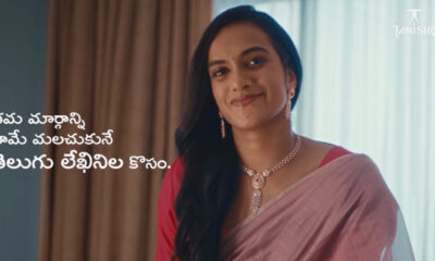
The 2 minutes 20 seconds video starts with three adorable kids celebrating Ramazan evening by breaking their fast at Iftaar. In between the celebrations, where some people just pass by a broken cart of an old samosa seller, the three kids decide to go out of their way and help the old man. In their shiny new kurtas, they pick the samosa cart and run around to sell them; and manage to bring smile on everyone’s faces leaving the strong message that the festival is about helping others. Their mother is shown in the end with a proud smile. After all, if you stain your clothes while helping someone, then stains are good; Daag Acche Hai.

The vision came from pulling out a story that can touch viewer’s heart. The essence of the holy month of Ramazan is cleansing the souls and actions of people. The video reflects that perfectly – kids who could just carry on with their own evening, but instead decide to help an old man. That is a very strong message for people to realise that goodness and helping others is the true prayer. The makers of the video also explained that samosas and jalebis are very popular for Iftaar, which is another factor in developing a story like #madadekibadat.
Ad campaigns have seen a turn over with digitalization where 30 seconds adverts have stretched to 1-2 minutes short films. There are many recent well received campaigns which have appealing stories to tell and emphasise on a message rather than just promoting the product in conventional ways. Brands have turned to narrating stories around the inspiration of the product, which can leave a greater impact on consumer. The same formula has worked for #madadekibadat campaign. The human emotion of helping in the holy month is what consumers are connecting with. Despite the hassle of cleaning stains, a mother is happy because of the gesture her child made.
The agency seems very confident about the connection the story has with its viewers, and that the viewers will take it forward. It claims that the video had 21,000 shares and 142,586 views after going live.
Commenting on the kids’ factor of Surf Excel advertisements, Iyer said, “The brand is planning to stick to children as they are the ones with most stained clothes. Even in the present campaign, both factors have connected the audiences with the goodness of the holy month and innocence of kids”.
About making campaigns relevant to festivals, agency clarified it is not very focused on occasions but stories which will stay with people.