Brands
Spykar celebrates the spirit of Diwali: A festival of togetherness and style
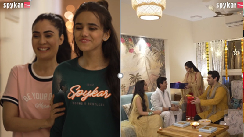
Mumbai: Spykar, the leading casual denim wear brand, is thrilled to announce the release of a heart-warming Diwali video, capturing the essence of the upcoming festival and the spirit of togetherness it brings. As a homegrown brand that has become a household name, Spykar is excited to be a part of the joyous celebrations that Diwali represents.
In the latest expression of joy, Spykar shares how Diwali is not just a festival but a time to come together, celebrate with loved ones, and create lasting memories. Spykar, known for its casual and comfortable denim wear, highlights the significance of dressing up in all-new clothes during this festive season. Spykar brings to life the magic of Diwali as family members exchange gifts, with Spykar clothing at the center of it all. Witnessing the delight on the faces of loved ones as they unwrap the stylish, casual denim wear from Spykar, adding a touch of fashion to the festive season. Diwali is not just about lights; it’s about the radiant smiles that Spykar aims to evoke.
Diwali, also known as the Festival of Lights, is a time when families gather, homes are adorned with diyas and lights, and love and laughter fill the air. Spykar recognizes the importance of these moments and aims to be a part of the everyday happiness that Diwali brings.
Spykar CEO Sanjay Vakharia said that Diwali is a time for creating lasting memories with loved ones, and Spykar is here to be a part of those cherished moments. Our video captures the joy of gifting and dressing up in new clothes, showcasing how Spykar becomes an integral part of your celebrations. We are more than just a brand we are a companion in your journey of happiness.
The video beautifully encapsulates the sentiment of family bonds and the joy of giving, with Spykar adding a fashionable touch to these special moments. As the festive season approaches, Spykar invites you to embrace the spirit of Diwali with style, creating memories that last a lifetime.
Embed link: https://www.instagram.com/reel/CzahYiaCl2o/?igshid=MWJpaWVxbHJucGphbg==
Brands
Godrej clarifies ‘GI’ identifier after logo similarity debate
Says GI is not a logo, will not replace Godrej signature across products.
MUMBAI: In a branding storm where shapes did the talking, Godrej is now spelling things out. Godrej Industries Group (GIG) has issued a clarification on its newly introduced ‘GI’ identifier, addressing questions around its purpose and design following a wave of online criticism. At the centre of the debate were two concerns: whether the new mark replaces the long-standing Godrej logo, and whether its geometric design mirrors other corporate identities.
The company has drawn a clear line. The Godrej signature logo, it said, remains unchanged and continues to be the sole logo across all consumer-facing products and services. The ‘GI’ mark, by contrast, is not a logo but a corporate group identifier intended for use alongside the Godrej signature or company name, and aimed at stakeholders such as investors, media and talent rather than consumers.
The need for such a distinction stems from the 2024 restructuring of the broader Godrej Group into two separate business entities. With both continuing to operate under the same Godrej name and signature, the identifier is positioned as a way to differentiate the Godrej Industries Group at a corporate level.
The rollout, however, triggered a broader conversation on design originality. Critics pointed to similarities between the GI mark’s geometric composition and logos used by companies globally, raising questions about distinctiveness.
Responding to this, GIG said its intellectual property and legal review found that such overlaps are common in minimalist, geometry-led design systems. Basic forms such as circles and rectangles appear across dozens of brand identities worldwide, the company noted.
It added that the identifier emerged from an extensive design process and was chosen for its simplicity, allowing it to sit alongside the Godrej signature without competing visually. While acknowledging that elemental shapes may appear less distinctive in isolation, the group emphasised that the mark is part of a broader identity system that includes a custom typeface, sonic branding and other proprietary elements.
Following legal and ethical assessments, the company said it found no impediment to using the identifier, reiterating that the GI mark is a corporate tool not a consumer-facing symbol.
In short, the logo isn’t changing but the conversation around it certainly has.


