Connect with us

Brands

Sock Street rolls out smart vending at NCR metro stations

Published

on

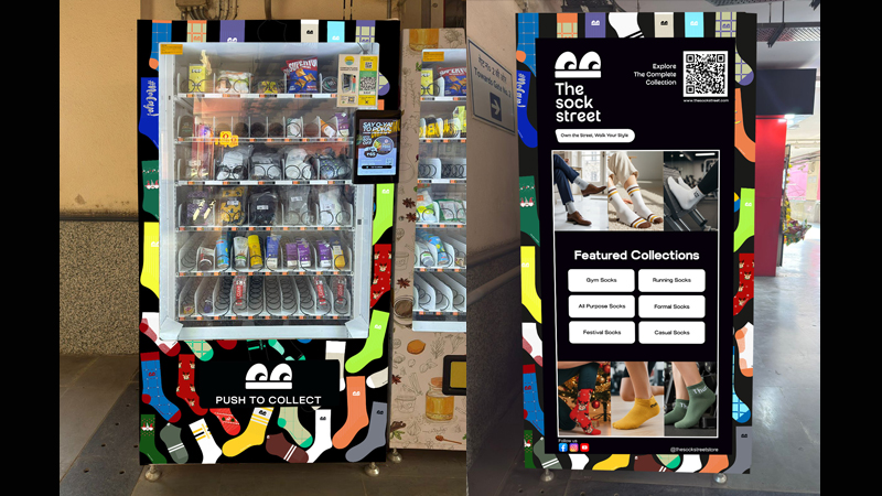
NEW DELHI: The Sock Street has taken a bold step into metro life with the launch of its first smart vending machines across key stations in the National Capital Region. The Gurgaon based premium sock brand unveiled the initiative under its Step into the Metro Life campaign, marking a fresh stride in its omnichannel journey.

Five bustling stations MG Road, Guru Dronacharya, South Campus, INA and Noida City Centre now host automated kiosks stocked with the brand’s best sellers. From bamboo socks and sports styles to everyday essentials, commuters can grab their picks in seconds through a smooth, contactless checkout designed for fast paced city routines.

The Sock Street CEO Udit Mayor, said the vending rollout was a significant leap toward a seamless retail ecosystem. He noted that the aim was to make premium and sustainable socks available wherever customers move through the city.

Advertisement

Chief business officer Saurabh Srivastava added that the pilot would help the company read real time consumer behaviour and imagine new micro touchpoints that blend convenience, hygiene and clever technology.

The trial phase will guide future expansion as The Sock Street studies demand patterns and evaluates vending machines as a micro retail format. The brand hopes the model will open the door to similar placements across urban hotspots.

With this launch, The Sock Street continues its mission to upgrade everyday essentials using thoughtful design, planet friendly materials and fresh retail ideas. For NCR’s metro riders, quality socks are now just a quick tap away.

Advertisement


Click to comment

Leave a Reply

Your email address will not be published. Required fields are marked *

Brands

Godrej clarifies ‘GI’ identifier after logo similarity debate

Says GI is not a logo, will not replace Godrej signature across products.

Published

on

MUMBAI: In a branding storm where shapes did the talking, Godrej is now spelling things out. Godrej Industries Group (GIG) has issued a clarification on its newly introduced ‘GI’ identifier, addressing questions around its purpose and design following a wave of online criticism. At the centre of the debate were two concerns: whether the new mark replaces the long-standing Godrej logo, and whether its geometric design mirrors other corporate identities.

The company has drawn a clear line. The Godrej signature logo, it said, remains unchanged and continues to be the sole logo across all consumer-facing products and services. The ‘GI’ mark, by contrast, is not a logo but a corporate group identifier intended for use alongside the Godrej signature or company name, and aimed at stakeholders such as investors, media and talent rather than consumers.

The need for such a distinction stems from the 2024 restructuring of the broader Godrej Group into two separate business entities. With both continuing to operate under the same Godrej name and signature, the identifier is positioned as a way to differentiate the Godrej Industries Group at a corporate level.

Advertisement

The rollout, however, triggered a broader conversation on design originality. Critics pointed to similarities between the GI mark’s geometric composition and logos used by companies globally, raising questions about distinctiveness.

Responding to this, GIG said its intellectual property and legal review found that such overlaps are common in minimalist, geometry-led design systems. Basic forms such as circles and rectangles appear across dozens of brand identities worldwide, the company noted.

It added that the identifier emerged from an extensive design process and was chosen for its simplicity, allowing it to sit alongside the Godrej signature without competing visually. While acknowledging that elemental shapes may appear less distinctive in isolation, the group emphasised that the mark is part of a broader identity system that includes a custom typeface, sonic branding and other proprietary elements.

Advertisement

Following legal and ethical assessments, the company said it found no impediment to using the identifier, reiterating that the GI mark is a corporate tool not a consumer-facing symbol.

In short, the logo isn’t changing but the conversation around it certainly has.

Advertisement
Continue Reading

Advertisement News18
Advertisement
Advertisement
Advertisement
Advertisement Whtasapp
Advertisement Year Enders

Indian Television Dot Com Pvt Ltd

Signup for news and special offers!

Copyright © 2026 Indian Television Dot Com PVT LTD

This will close in 10 seconds