Connect with us

Brands

Smirnoff stirs up a flavour fiesta with Minty Jamun, Mirchi Mango and Zesty Lime

Published

on

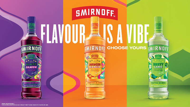
MUMBAI: Smirnoff Is raising the bar (and a few eyebrows) with the launch of three punchy new flavours — Minty Jamun, Mirchi Mango, and Zesty Lime — tailor-made for the bold, experimental tastes of India’s new-age drinkers.

Now hitting shelves across Karnataka, Uttar Pradesh, Haryana, and Maharashtra, this flavour-forward line-up is part of Smirnoff’s India-first playbook, as it courts the Gen Z and millennial crowd that prefers party nights on rooftops over banquets, and DIY cocktails over bar menus.

“We’re seeing a clear shift in how young Indians approach their favourite spirits — they want global brands to build a stronger local connect that is fresh and premium and yet playful. With Minty Jamun, Mirchi Mango,and Zesty Lime we’re not just offering new flavours, we’re creating moments of discovery that are vibrant, social, and rooted in today’s cultural codes,” said Diageo India (USL) CMO Ruchira Jaitly.

Advertisement

Each variant packs its own punch:

. Minty Jamun: A throwback to schoolyard summers, now with a stylish twist

. Mirchi Mango: A sweet-spicy bombshell, echoing India’s chilli-laced fruit obsession

Advertisement

. Zesty Lime: Bright, breezy and built for easy pours at pre-games and house parties

The launch is wrapped in Smirnoff’s new campaign “Flavour is a Vibe” — a cheeky nudge to embrace taste with spontaneity, style, and a generous splash of self-expression.

With India’s cocktail culture bubbling over and at-home mixology becoming the new norm, Smirnoff’s latest desi detour is likely to find itself clinking glasses at celebrations of every size. Because in 2025, it’s not just about what you’re drinking, it’s how you vibe with it.

Advertisement
Click to comment

Leave a Reply

Your email address will not be published. Required fields are marked *

Brands

Godrej clarifies ‘GI’ identifier after logo similarity debate

Says GI is not a logo, will not replace Godrej signature across products.

Published

on

MUMBAI: In a branding storm where shapes did the talking, Godrej is now spelling things out. Godrej Industries Group (GIG) has issued a clarification on its newly introduced ‘GI’ identifier, addressing questions around its purpose and design following a wave of online criticism. At the centre of the debate were two concerns: whether the new mark replaces the long-standing Godrej logo, and whether its geometric design mirrors other corporate identities.

The company has drawn a clear line. The Godrej signature logo, it said, remains unchanged and continues to be the sole logo across all consumer-facing products and services. The ‘GI’ mark, by contrast, is not a logo but a corporate group identifier intended for use alongside the Godrej signature or company name, and aimed at stakeholders such as investors, media and talent rather than consumers.

The need for such a distinction stems from the 2024 restructuring of the broader Godrej Group into two separate business entities. With both continuing to operate under the same Godrej name and signature, the identifier is positioned as a way to differentiate the Godrej Industries Group at a corporate level.

Advertisement

The rollout, however, triggered a broader conversation on design originality. Critics pointed to similarities between the GI mark’s geometric composition and logos used by companies globally, raising questions about distinctiveness.

Responding to this, GIG said its intellectual property and legal review found that such overlaps are common in minimalist, geometry-led design systems. Basic forms such as circles and rectangles appear across dozens of brand identities worldwide, the company noted.

It added that the identifier emerged from an extensive design process and was chosen for its simplicity, allowing it to sit alongside the Godrej signature without competing visually. While acknowledging that elemental shapes may appear less distinctive in isolation, the group emphasised that the mark is part of a broader identity system that includes a custom typeface, sonic branding and other proprietary elements.

Advertisement

Following legal and ethical assessments, the company said it found no impediment to using the identifier, reiterating that the GI mark is a corporate tool not a consumer-facing symbol.

In short, the logo isn’t changing but the conversation around it certainly has.

Advertisement
Continue Reading

Advertisement News18
Advertisement
Advertisement
Advertisement
Advertisement Whtasapp
Advertisement Year Enders

Indian Television Dot Com Pvt Ltd

Signup for news and special offers!

Copyright © 2026 Indian Television Dot Com PVT LTD

This will close in 10 seconds