Connect with us

Brands

Seagram puts the spotlight on women in iconic ‘Men Will Be Men’ campaign

Published

on

DELHI: With the society and media & entertainment industry getting more serious about issues like inclusivity and women rights in their approach, it becomes tactical to harness campaigns that rely on very gendered aspects of one’s nature. There have been several instances of brands stepping on the wrong side to attract great backlash from the consumers. But one brand that doesn’t fail to do it right every time is Imperial Blue with its ‘Men Will Be Men’ spot. Even though it has been subject to a lot of scrutiny when it comes to social movements, the campaign never fails to resonate with the audience with its crisp, tongue-in-cheek, and responsible humour.

This year’s edition, titled ‘Heartbeat’, created by Ogilvy & Mather, received a similar response from the viewers as it went viral across three continents. It had managed to get 20 million impressions on social media in just 5 days of the launch and its popularity is only growing with each passing day.

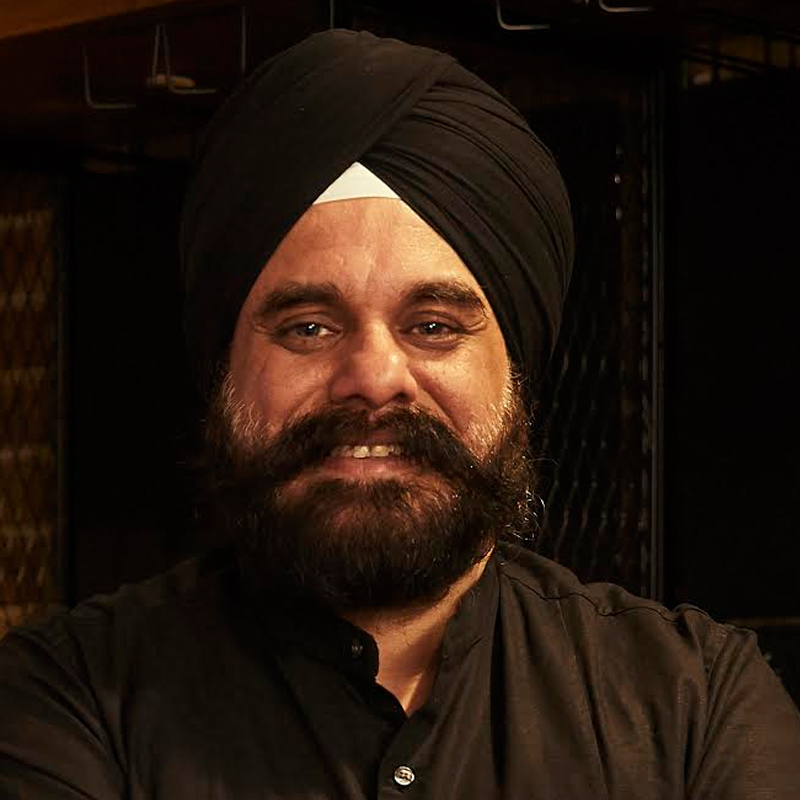
Talking about the spot to Indiantelevision.com, Pernod Ricard India general manager marketing, Seagram’s whiskies Ishwindar Singh shared that he was surprised to see the level of engagement the campaign got on digital media.

Advertisement

Elaborating on the gendered nature of the ad, Ishwindar admitted that the brief for the particular campaign is any agency’s nightmare. “We want it to be crisp, within 20-seconds, without any dialogues, comic but not slapstick, and there should be no objectification of women,” he said.

Singh added that this year, the aim was to create it from a woman’s perspective. “This year, we have looked at the whole act of ‘men will be men’ from a woman’s eyes. This is a historic campaign, and if you would have looked at it 10-years-ago, the whole story was from men’s perspective. The scenario back then was very different. There was no concept of objectification of women. This time, we have got the female character at the centre-stage.”

Advertisement

He also noted that this inclusivity was not only at the creative level but the team working on the project comprised of a good number of women. Even the creative director from Ogilvy’s team, Ritu Sharda, gave a fine women’s angle to the story.

The campaign was launched with a digital-first strategy and will be launched across TV channels. Speaking about the strategy, Singh said that the brand will be targeting sports and music programmes with the spot.

Talking about the digital-first approach, Singh shared that launching the ad on social channels first helps the brands understand if the campaign will fly on its own or will need media push to travel. He insisted that the constant feedback received on social media helps the marketers gauge the full potential of a campaign.

Advertisement
Click to comment

Leave a Reply

Your email address will not be published. Required fields are marked *

Brands

Godrej clarifies ‘GI’ identifier after logo similarity debate

Says GI is not a logo, will not replace Godrej signature across products.

Published

on

MUMBAI: In a branding storm where shapes did the talking, Godrej is now spelling things out. Godrej Industries Group (GIG) has issued a clarification on its newly introduced ‘GI’ identifier, addressing questions around its purpose and design following a wave of online criticism. At the centre of the debate were two concerns: whether the new mark replaces the long-standing Godrej logo, and whether its geometric design mirrors other corporate identities.

The company has drawn a clear line. The Godrej signature logo, it said, remains unchanged and continues to be the sole logo across all consumer-facing products and services. The ‘GI’ mark, by contrast, is not a logo but a corporate group identifier intended for use alongside the Godrej signature or company name, and aimed at stakeholders such as investors, media and talent rather than consumers.

The need for such a distinction stems from the 2024 restructuring of the broader Godrej Group into two separate business entities. With both continuing to operate under the same Godrej name and signature, the identifier is positioned as a way to differentiate the Godrej Industries Group at a corporate level.

Advertisement

The rollout, however, triggered a broader conversation on design originality. Critics pointed to similarities between the GI mark’s geometric composition and logos used by companies globally, raising questions about distinctiveness.

Responding to this, GIG said its intellectual property and legal review found that such overlaps are common in minimalist, geometry-led design systems. Basic forms such as circles and rectangles appear across dozens of brand identities worldwide, the company noted.

It added that the identifier emerged from an extensive design process and was chosen for its simplicity, allowing it to sit alongside the Godrej signature without competing visually. While acknowledging that elemental shapes may appear less distinctive in isolation, the group emphasised that the mark is part of a broader identity system that includes a custom typeface, sonic branding and other proprietary elements.

Advertisement

Following legal and ethical assessments, the company said it found no impediment to using the identifier, reiterating that the GI mark is a corporate tool not a consumer-facing symbol.

In short, the logo isn’t changing but the conversation around it certainly has.

Advertisement
Continue Reading

Advertisement News18
Advertisement
Advertisement
Advertisement
Advertisement Whtasapp
Advertisement Year Enders

Indian Television Dot Com Pvt Ltd

Signup for news and special offers!

Copyright © 2026 Indian Television Dot Com PVT LTD

This will close in 10 seconds