Connect with us

Brands

No Pain No Pilgrimage Iodex Steps into Magh Mela

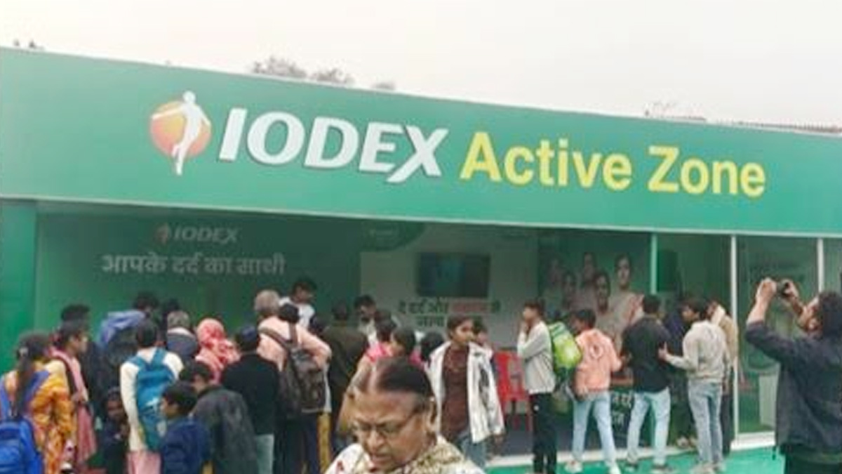
Active Zones offer relief at Prayagraj as brand backs faith with care.

Published

on

Iodex

Prayagraj: When devotion stretches for miles, so do aching calves. At the sprawling grounds of Prayagraj’s Magh Mela, where millions gather in faith and footfall, Iodex has quietly positioned itself as a companion not just to prayer, but to pain relief.

The pain management brand has set up Iodex Active Zones across the mela grounds, offering on-the-go relief to weary pilgrims navigating long walks, crowded routes and packed schedules. The initiative, designed to provide quick massages, product sampling and awareness around pain management practices, aims to ensure that discomfort does not eclipse devotion.

Iodex is leaning into high-footfall religious congregations to build deeper consumer engagement. At Magh Mela, the activation goes beyond product presence, blending experiential outreach with education on managing strain and fatigue during physically demanding journeys.

Advertisement

Local influencers have also joined the effort, creating relevant, ground-level content that connects the brand’s promise of relief with the lived realities of pilgrims. The approach mirrors Iodex’s strategy over the past year, during which it engaged millions of consumers across major gatherings including Maha Kumbh, Kanwar Yatra, Pandharpur Yatra and Ganesh Chaturthi.

Haleon India, category lead for pain & respiratory care Pavan Wani said, “Across India’s bustling congregations, millions walk long distances carrying hopes, offerings, and the strength of their faith. As a brand dedicated to helping Indians do more of what matters by eliminating pain, Iodex ensures a meaningful presence at these high footfall events. Our Iodex Active Zones provide targeted pain management support through massages, sampling, and education, ensuring that pain never stands in the way of devotion, travel, or personal purpose. These efforts reflect Haleon’s commitment to putting Health in More Hands and supporting every Indian’s journey, one pain free step at a time.”

In a landscape where brands often chase eyeballs, Iodex appears to be chasing sore muscles instead, inserting itself at the intersection of culture, movement and moment. At Magh Mela, relief has become part of the ritual, and in the long walk of faith, comfort has found a sponsor.

Advertisement
Click to comment

Leave a Reply

Your email address will not be published. Required fields are marked *

Brands

Godrej clarifies ‘GI’ identifier after logo similarity debate

Says GI is not a logo, will not replace Godrej signature across products.

Published

on

MUMBAI: In a branding storm where shapes did the talking, Godrej is now spelling things out. Godrej Industries Group (GIG) has issued a clarification on its newly introduced ‘GI’ identifier, addressing questions around its purpose and design following a wave of online criticism. At the centre of the debate were two concerns: whether the new mark replaces the long-standing Godrej logo, and whether its geometric design mirrors other corporate identities.

The company has drawn a clear line. The Godrej signature logo, it said, remains unchanged and continues to be the sole logo across all consumer-facing products and services. The ‘GI’ mark, by contrast, is not a logo but a corporate group identifier intended for use alongside the Godrej signature or company name, and aimed at stakeholders such as investors, media and talent rather than consumers.

The need for such a distinction stems from the 2024 restructuring of the broader Godrej Group into two separate business entities. With both continuing to operate under the same Godrej name and signature, the identifier is positioned as a way to differentiate the Godrej Industries Group at a corporate level.

Advertisement

The rollout, however, triggered a broader conversation on design originality. Critics pointed to similarities between the GI mark’s geometric composition and logos used by companies globally, raising questions about distinctiveness.

Responding to this, GIG said its intellectual property and legal review found that such overlaps are common in minimalist, geometry-led design systems. Basic forms such as circles and rectangles appear across dozens of brand identities worldwide, the company noted.

It added that the identifier emerged from an extensive design process and was chosen for its simplicity, allowing it to sit alongside the Godrej signature without competing visually. While acknowledging that elemental shapes may appear less distinctive in isolation, the group emphasised that the mark is part of a broader identity system that includes a custom typeface, sonic branding and other proprietary elements.

Advertisement

Following legal and ethical assessments, the company said it found no impediment to using the identifier, reiterating that the GI mark is a corporate tool not a consumer-facing symbol.

In short, the logo isn’t changing but the conversation around it certainly has.

Advertisement
Continue Reading

Advertisement News18
Advertisement
Advertisement
Advertisement
Advertisement Whtasapp
Advertisement Year Enders

Indian Television Dot Com Pvt Ltd

Signup for news and special offers!

Copyright © 2026 Indian Television Dot Com PVT LTD

This will close in 10 seconds