Connect with us

Brands

Mutual Funds catch the metro at Mumbai’s Andheri station

Published

on

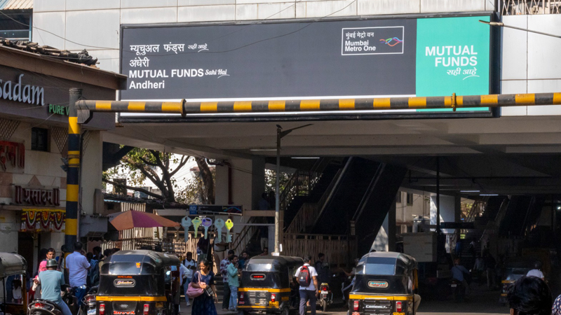
MUMBAI: If your morning commute just felt a little more money-minded, there is a reason. One of Mumbai metro line one’s busiest stops, Andheri metro station, has been rebranded as ‘Mutual Funds Sahi Hai Andheri’, as part of AMFI’s latest push to take investor awareness straight to the platform.

In a city that rarely slows down, AMFI has chosen to meet Mumbaikars where they already are, on the move. The exclusive station takeover brings the message of simple, transparent and goal-based investing into the everyday journeys of nearly 1.8 lakh commuters who pass through Andheri station each day.

The newly branded station was unveiled by Manoj Kumar, executive director, SEBI, in the presence of Venkat Chalasani, chief executive, AMFI, along with senior officials from partner authorities.

Advertisement

From station name boards to escalators, elevators, glass railings, entry gates and platform maps, the Mutual Funds Sahi Hai message now travels alongside commuters at every turn. Even in-train announcements and route maps have been woven into the experience, ensuring the idea of disciplined investing stays top of mind between stops.

AMFI chairman Sundeep Sikka, said the metro mirrors life itself. Every journey is driven by goals, responsibilities and aspirations. By associating with Andheri Metro Station, AMFI hopes to remind commuters that long-term planning and informed investing are just as essential to progress as getting from point A to point B.

AMFI chief executive Venkat Chalasani, said taking investor education out of traditional financial spaces makes it more approachable. Simple messaging in a familiar setting, he noted, helps demystify mutual funds and links financial planning to everyday life, encouraging people to make confident and informed choices.

Advertisement

Times OOH chief operating officer Rohit Chopra, said metro stations are more than transit points. With Andheri’s massive footfall, the station offers a powerful space to spark meaningful conversations. He added that the partnership allows purpose-led messaging to blend seamlessly into daily routines.

The launch concluded with a guided walkthrough of the station’s refreshed look, turning an ordinary commute into a gentle nudge towards smarter financial habits. For Andheri’s daily travellers, the journey now comes with a side of financial sense.


Advertisement
Click to comment

Leave a Reply

Your email address will not be published. Required fields are marked *

Brands

Godrej clarifies ‘GI’ identifier after logo similarity debate

Says GI is not a logo, will not replace Godrej signature across products.

Published

on

MUMBAI: In a branding storm where shapes did the talking, Godrej is now spelling things out. Godrej Industries Group (GIG) has issued a clarification on its newly introduced ‘GI’ identifier, addressing questions around its purpose and design following a wave of online criticism. At the centre of the debate were two concerns: whether the new mark replaces the long-standing Godrej logo, and whether its geometric design mirrors other corporate identities.

The company has drawn a clear line. The Godrej signature logo, it said, remains unchanged and continues to be the sole logo across all consumer-facing products and services. The ‘GI’ mark, by contrast, is not a logo but a corporate group identifier intended for use alongside the Godrej signature or company name, and aimed at stakeholders such as investors, media and talent rather than consumers.

The need for such a distinction stems from the 2024 restructuring of the broader Godrej Group into two separate business entities. With both continuing to operate under the same Godrej name and signature, the identifier is positioned as a way to differentiate the Godrej Industries Group at a corporate level.

Advertisement

The rollout, however, triggered a broader conversation on design originality. Critics pointed to similarities between the GI mark’s geometric composition and logos used by companies globally, raising questions about distinctiveness.

Responding to this, GIG said its intellectual property and legal review found that such overlaps are common in minimalist, geometry-led design systems. Basic forms such as circles and rectangles appear across dozens of brand identities worldwide, the company noted.

It added that the identifier emerged from an extensive design process and was chosen for its simplicity, allowing it to sit alongside the Godrej signature without competing visually. While acknowledging that elemental shapes may appear less distinctive in isolation, the group emphasised that the mark is part of a broader identity system that includes a custom typeface, sonic branding and other proprietary elements.

Advertisement

Following legal and ethical assessments, the company said it found no impediment to using the identifier, reiterating that the GI mark is a corporate tool not a consumer-facing symbol.

In short, the logo isn’t changing but the conversation around it certainly has.

Advertisement
Continue Reading

Advertisement News18
Advertisement
Advertisement
Advertisement
Advertisement Whtasapp
Advertisement Year Enders

Indian Television Dot Com Pvt Ltd

Signup for news and special offers!

Copyright © 2026 Indian Television Dot Com PVT LTD

This will close in 10 seconds