Brands
Moxie Beauty debuts on Nykaa
Mumbai – Moxie Beauty has announced its partnership with Nykaa. This collaboration marks a significant step in Moxie Beauty’s growth strategy, making its full range of products available on the Nykaa platform.
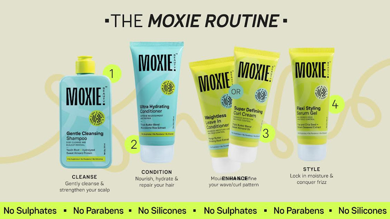
All of Moxie Beauty’s current lineup will now be available on Nykaa, offering customers access to its premium haircare solutions. In celebration of this partnership, Moxie Beauty will be exclusively launching its highly sought-after Frizz Fighting Serum on Nykaa. Specifically developed based on insights from Nykaa’s customer base, this product is designed to tackle frizzy and dry hair, a common concern among Indian consumers.
Company’s primary target audience is a concern-driven demographic of individuals aged 24-40, who are focused on building an effective haircare routine for dry and frizzy hair. The brand anticipates that Nykaa’s platform will enable it to reach a broader audience and reinforce its positioning as a leader in the haircare segment.
Moxie Beauty founder Nikita Khanna said, “Our partnership with Nykaa is more than just about increasing sales; it’s about building deeper connections with consumers who are looking for thoughtfully formulated products to address their hair concerns. We see Nykaa as a key partner in our journey to becoming a household name in the Indian beauty market. We believe this collaboration will help us to engage with a wider audience that values quality and efficacy in their haircare routine.”
Brands
Godrej clarifies ‘GI’ identifier after logo similarity debate
Says GI is not a logo, will not replace Godrej signature across products.
MUMBAI: In a branding storm where shapes did the talking, Godrej is now spelling things out. Godrej Industries Group (GIG) has issued a clarification on its newly introduced ‘GI’ identifier, addressing questions around its purpose and design following a wave of online criticism. At the centre of the debate were two concerns: whether the new mark replaces the long-standing Godrej logo, and whether its geometric design mirrors other corporate identities.
The company has drawn a clear line. The Godrej signature logo, it said, remains unchanged and continues to be the sole logo across all consumer-facing products and services. The ‘GI’ mark, by contrast, is not a logo but a corporate group identifier intended for use alongside the Godrej signature or company name, and aimed at stakeholders such as investors, media and talent rather than consumers.
The need for such a distinction stems from the 2024 restructuring of the broader Godrej Group into two separate business entities. With both continuing to operate under the same Godrej name and signature, the identifier is positioned as a way to differentiate the Godrej Industries Group at a corporate level.
The rollout, however, triggered a broader conversation on design originality. Critics pointed to similarities between the GI mark’s geometric composition and logos used by companies globally, raising questions about distinctiveness.
Responding to this, GIG said its intellectual property and legal review found that such overlaps are common in minimalist, geometry-led design systems. Basic forms such as circles and rectangles appear across dozens of brand identities worldwide, the company noted.
It added that the identifier emerged from an extensive design process and was chosen for its simplicity, allowing it to sit alongside the Godrej signature without competing visually. While acknowledging that elemental shapes may appear less distinctive in isolation, the group emphasised that the mark is part of a broader identity system that includes a custom typeface, sonic branding and other proprietary elements.
Following legal and ethical assessments, the company said it found no impediment to using the identifier, reiterating that the GI mark is a corporate tool not a consumer-facing symbol.
In short, the logo isn’t changing but the conversation around it certainly has.


