Brands
Maruti Suzuki Swift drives past three million sales mark
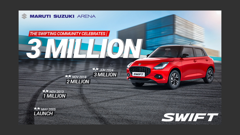
Mumbai: A premium hatchback, the Maruti Suzuki Swift, has achieved the extraordinary milestone of three million sales in India. A driver’s delight for four generations, the iconic car has established its glorious legacy and consistently delivered an unmatched driving experience and outstanding performance. Designed for the youthful and spirited, Swift has ignited a passionate community of like-minded ‘Swifters’ who share a love for driving. The launch of the Epic New Swift in May 2024 has created new benchmarks and propelled the revered Swift legacy to its three million sales milestone.
Commenting on the momentous occasion, Maruti Suzuki India Ltd senior executive officer, marketing & sales Partho Banerjee said, “The Swift has been more than just a car to the millions who have owned it – it has been a symbol of fun, freedom and exhilaration. With each new generation, the Swift has continued to raise the bar, offering cutting-edge technology, contemporary style, and that unmistakable ‘Swift DNA’ which continues to captivate customers. This accomplishment fills us with immense gratitude, and we are thankful to all Swift owners across the country.”
Inspired by the iconic Suzuki Hayabusa motorcycle, the Swift was ahead of its time when it was launched in 2005 with segment-first features such as climate control, airbags and anti-lock braking system (ABS). With its unparalleled driving experience, Swift continues to enjoy widespread popularity with its cult fan following and their love for driving. The brand has achieved over 6.5 million sales worldwide, with India being Swift’s largest market.
Each new model of the Swift has continued to carry forward the core philosophy of the Swift brand, consistently pushing boundaries for the sporty premium hatchback. The Swift surpassed 1 million sales in 2013 within 8 years since its introduction, the two million sales mark was breached in 2018, and now the iconic sporty hatchback has driven past the 3 million sales mark.
In its fourth generation today, the Epic New Swift continues to build on its legacy, winning over customers with its sporty design, spirited yet efficient Z-Series engine and an array of standard safety features such as six airbags, Electronic Stability Program+ (ESP®), Hill Hold Assist and more.
Brands
Godrej clarifies ‘GI’ identifier after logo similarity debate
Says GI is not a logo, will not replace Godrej signature across products.
MUMBAI: In a branding storm where shapes did the talking, Godrej is now spelling things out. Godrej Industries Group (GIG) has issued a clarification on its newly introduced ‘GI’ identifier, addressing questions around its purpose and design following a wave of online criticism. At the centre of the debate were two concerns: whether the new mark replaces the long-standing Godrej logo, and whether its geometric design mirrors other corporate identities.
The company has drawn a clear line. The Godrej signature logo, it said, remains unchanged and continues to be the sole logo across all consumer-facing products and services. The ‘GI’ mark, by contrast, is not a logo but a corporate group identifier intended for use alongside the Godrej signature or company name, and aimed at stakeholders such as investors, media and talent rather than consumers.
The need for such a distinction stems from the 2024 restructuring of the broader Godrej Group into two separate business entities. With both continuing to operate under the same Godrej name and signature, the identifier is positioned as a way to differentiate the Godrej Industries Group at a corporate level.
The rollout, however, triggered a broader conversation on design originality. Critics pointed to similarities between the GI mark’s geometric composition and logos used by companies globally, raising questions about distinctiveness.
Responding to this, GIG said its intellectual property and legal review found that such overlaps are common in minimalist, geometry-led design systems. Basic forms such as circles and rectangles appear across dozens of brand identities worldwide, the company noted.
It added that the identifier emerged from an extensive design process and was chosen for its simplicity, allowing it to sit alongside the Godrej signature without competing visually. While acknowledging that elemental shapes may appear less distinctive in isolation, the group emphasised that the mark is part of a broader identity system that includes a custom typeface, sonic branding and other proprietary elements.
Following legal and ethical assessments, the company said it found no impediment to using the identifier, reiterating that the GI mark is a corporate tool not a consumer-facing symbol.
In short, the logo isn’t changing but the conversation around it certainly has.


