Connect with us

Brands

Mars Cosmetics turns International Women’s Day into a night of play and confidence

Women take the night by storm with fitness, fun and beauty at Mars Cosmetics event

Published

on

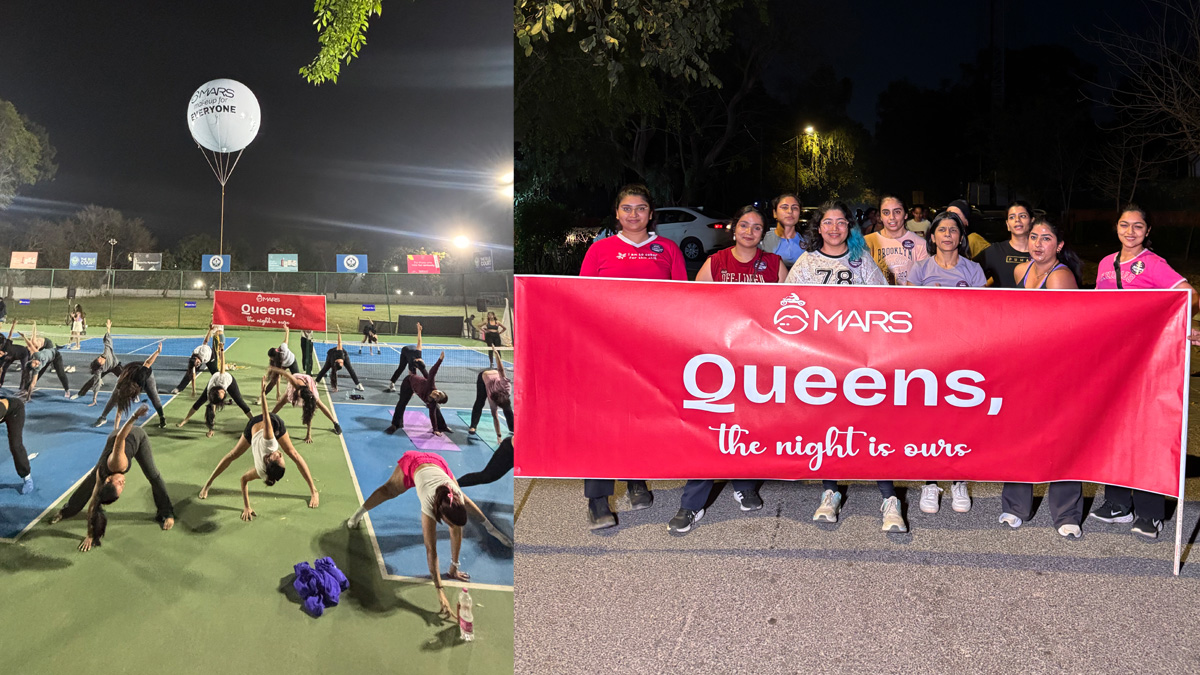
MUMBAI: Mars Cosmetics gave International Women’s Day a fresh twist this year, turning it into a vibrant Women’s Night. The brand celebrated women by creating an immersive evening that blended movement, community, and confidence.

Under the banner of ‘Play Like a Girl,’ participants swapped traditional celebrations for night runs, cycling, pickleball matches, and fitness sessions. The event encouraged women to compete, connect, and celebrate together, turning strangers into friends through shared energy and enthusiasm.

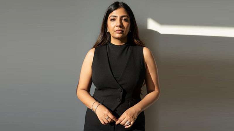
Mars Cosmetics director Rishabh Sethia said, “Beauty is closely tied to confidence and self-expression. With Women’s Night, we wanted women to move freely, play fearlessly, and own the night. This was not just a campaign; it was an experience that celebrated strength, energy, and unapologetic spirit.”

Advertisement

After the sporting sessions, participants enjoyed beauty touch-ups and relaxed social interactions, seamlessly combining fitness and glamour. The event showcased Mars Cosmetics’ evolving vision of beauty, one that goes beyond makeovers to embrace confidence, individuality, and real-life experiences.

The night proved that beauty is more than a shade of lipstick. It is the confidence to run, rally, and play like a girl, even after the sun goes down. Mars Cosmetics’ Women’s Night turned a celebration into an empowering movement, proving that the night truly belongs to women too.

Advertisement
Click to comment

Leave a Reply

Your email address will not be published. Required fields are marked *

Brands

Godrej clarifies ‘GI’ identifier after logo similarity debate

Says GI is not a logo, will not replace Godrej signature across products.

Published

on

MUMBAI: In a branding storm where shapes did the talking, Godrej is now spelling things out. Godrej Industries Group (GIG) has issued a clarification on its newly introduced ‘GI’ identifier, addressing questions around its purpose and design following a wave of online criticism. At the centre of the debate were two concerns: whether the new mark replaces the long-standing Godrej logo, and whether its geometric design mirrors other corporate identities.

The company has drawn a clear line. The Godrej signature logo, it said, remains unchanged and continues to be the sole logo across all consumer-facing products and services. The ‘GI’ mark, by contrast, is not a logo but a corporate group identifier intended for use alongside the Godrej signature or company name, and aimed at stakeholders such as investors, media and talent rather than consumers.

The need for such a distinction stems from the 2024 restructuring of the broader Godrej Group into two separate business entities. With both continuing to operate under the same Godrej name and signature, the identifier is positioned as a way to differentiate the Godrej Industries Group at a corporate level.

Advertisement

The rollout, however, triggered a broader conversation on design originality. Critics pointed to similarities between the GI mark’s geometric composition and logos used by companies globally, raising questions about distinctiveness.

Responding to this, GIG said its intellectual property and legal review found that such overlaps are common in minimalist, geometry-led design systems. Basic forms such as circles and rectangles appear across dozens of brand identities worldwide, the company noted.

It added that the identifier emerged from an extensive design process and was chosen for its simplicity, allowing it to sit alongside the Godrej signature without competing visually. While acknowledging that elemental shapes may appear less distinctive in isolation, the group emphasised that the mark is part of a broader identity system that includes a custom typeface, sonic branding and other proprietary elements.

Advertisement

Following legal and ethical assessments, the company said it found no impediment to using the identifier, reiterating that the GI mark is a corporate tool not a consumer-facing symbol.

In short, the logo isn’t changing but the conversation around it certainly has.

Advertisement
Continue Reading

Advertisement News18
Advertisement
Advertisement
Advertisement
Advertisement Whtasapp
Advertisement Year Enders

Indian Television Dot Com Pvt Ltd

Signup for news and special offers!

Copyright © 2026 Indian Television Dot Com PVT LTD

This will close in 10 seconds