Brands
Leeford Ortho turns orthopedic care into a fitness lifestyle
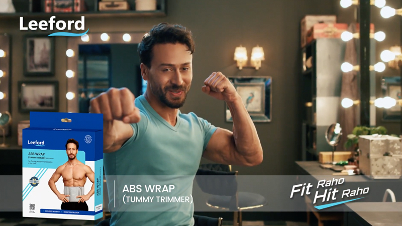
MUMBAI: Leeford Ortho is giving orthopedic support a fresh twist, turning it from a medical necessity into a lifestyle choice with its new high-energy campaign, ‘Fit raho, hit raho’. The campaign stars fitness icon Tiger Shroff and comedian Varun Sharma in three fun, relatable films that celebrate movement, ambition, and everyday fitness.
Instead of focusing on pain and recovery, Leeford Ortho celebrates activity as a way of life. The campaign positions the brand for active, goal-driven consumers who see fitness as part of their identity, not just an occasional workout. With fast-acting relief that fits seamlessly into daily routines, the brand becomes a partner in staying on the move rather than a temporary fix for discomfort.
Schbang handled the complete creative journey, shaping the brand’s voice and coining the memorable tagline ‘Fit raho, hit raho’. Produced by Hogarth, the films capture situations that feel natural for Tiger and Varun, ensuring the message resonates with audiences while keeping product recall strong.
Leeford Healthcare Ltd. director Sidhant Gupta said, “With ‘Fit raho, hit raho’, we target people who see fitness as a way of life, not just a solution. Schbang helped us make that vision energetic and relatable for today’s consumers.”
Schbang creative director Hariharan Subramanian added, “Leeford was a rare opportunity. We could give the brand its first advertising voice and take it out of the clinical mould. Instead of talking medicine, we talk to people before they even become patients.”
By blending Leeford’s healthcare expertise with a youth-relevant, fitness-first approach, the campaign proves that orthopedic care can be more than relief, it can be a celebration of continuous momentum.
Brands
Godrej clarifies ‘GI’ identifier after logo similarity debate
Says GI is not a logo, will not replace Godrej signature across products.
MUMBAI: In a branding storm where shapes did the talking, Godrej is now spelling things out. Godrej Industries Group (GIG) has issued a clarification on its newly introduced ‘GI’ identifier, addressing questions around its purpose and design following a wave of online criticism. At the centre of the debate were two concerns: whether the new mark replaces the long-standing Godrej logo, and whether its geometric design mirrors other corporate identities.
The company has drawn a clear line. The Godrej signature logo, it said, remains unchanged and continues to be the sole logo across all consumer-facing products and services. The ‘GI’ mark, by contrast, is not a logo but a corporate group identifier intended for use alongside the Godrej signature or company name, and aimed at stakeholders such as investors, media and talent rather than consumers.
The need for such a distinction stems from the 2024 restructuring of the broader Godrej Group into two separate business entities. With both continuing to operate under the same Godrej name and signature, the identifier is positioned as a way to differentiate the Godrej Industries Group at a corporate level.
The rollout, however, triggered a broader conversation on design originality. Critics pointed to similarities between the GI mark’s geometric composition and logos used by companies globally, raising questions about distinctiveness.
Responding to this, GIG said its intellectual property and legal review found that such overlaps are common in minimalist, geometry-led design systems. Basic forms such as circles and rectangles appear across dozens of brand identities worldwide, the company noted.
It added that the identifier emerged from an extensive design process and was chosen for its simplicity, allowing it to sit alongside the Godrej signature without competing visually. While acknowledging that elemental shapes may appear less distinctive in isolation, the group emphasised that the mark is part of a broader identity system that includes a custom typeface, sonic branding and other proprietary elements.
Following legal and ethical assessments, the company said it found no impediment to using the identifier, reiterating that the GI mark is a corporate tool not a consumer-facing symbol.
In short, the logo isn’t changing but the conversation around it certainly has.


