Connect with us

Brands

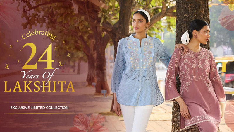
Lakshita lights up Karwa Chauth with biggest festive bash across 21 stores

Published

on

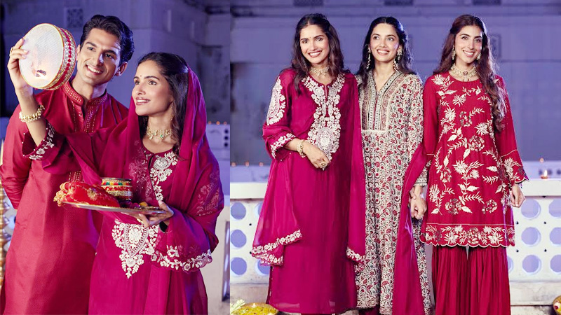
MUMBAI: Who said festive shopping had to be a serious affair? This season, Lakshita is rewriting the script with its ‘Chandni Raatein’ pre-Karwa Chauth party, rolling out the biggest retail celebration of its kind across 21 outlets, including 11 sparkling new stores.

The brand has gone all out to make shopping feel like a festival in itself. Think free mehendi, bangle and gajra counters, curated hampers brimming with Karwa Chauth essentials, live music, dhol beats, and even a spread of snacks to keep spirits high. Customers walking in aren’t just browsing clothes, they’re stepping into a carnival of colour, tradition, and togetherness.

“Festivals are about memories, and we wanted to give our customers an experience as joyful as the occasion itself,” said  Lakshita, co-founder and managing director, Sachin Kharbanda. “With mehendi, bangles, hampers, and festive music, we’ve created an atmosphere that mirrors the spirit of Karwa Chauth.”

Advertisement

The move marks a milestone for the ethnic wear retailer, with Lakshita expecting a 50 per cent surge in footfall as shoppers embrace the chance to dress up, indulge, and celebrate under one roof. The festive merchandise has been carefully curated in hues that echo the season, ensuring every shopper leaves with both style and stories.

By transforming the ritual of shopping into a pre-festival gala, Lakshita has set the tone for the celebrations ahead, proving that sometimes, the real magic of tradition lies in how you choose to celebrate it.


Advertisement
Click to comment

Leave a Reply

Your email address will not be published. Required fields are marked *

Brands

Godrej clarifies ‘GI’ identifier after logo similarity debate

Says GI is not a logo, will not replace Godrej signature across products.

Published

on

MUMBAI: In a branding storm where shapes did the talking, Godrej is now spelling things out. Godrej Industries Group (GIG) has issued a clarification on its newly introduced ‘GI’ identifier, addressing questions around its purpose and design following a wave of online criticism. At the centre of the debate were two concerns: whether the new mark replaces the long-standing Godrej logo, and whether its geometric design mirrors other corporate identities.

The company has drawn a clear line. The Godrej signature logo, it said, remains unchanged and continues to be the sole logo across all consumer-facing products and services. The ‘GI’ mark, by contrast, is not a logo but a corporate group identifier intended for use alongside the Godrej signature or company name, and aimed at stakeholders such as investors, media and talent rather than consumers.

The need for such a distinction stems from the 2024 restructuring of the broader Godrej Group into two separate business entities. With both continuing to operate under the same Godrej name and signature, the identifier is positioned as a way to differentiate the Godrej Industries Group at a corporate level.

Advertisement

The rollout, however, triggered a broader conversation on design originality. Critics pointed to similarities between the GI mark’s geometric composition and logos used by companies globally, raising questions about distinctiveness.

Responding to this, GIG said its intellectual property and legal review found that such overlaps are common in minimalist, geometry-led design systems. Basic forms such as circles and rectangles appear across dozens of brand identities worldwide, the company noted.

It added that the identifier emerged from an extensive design process and was chosen for its simplicity, allowing it to sit alongside the Godrej signature without competing visually. While acknowledging that elemental shapes may appear less distinctive in isolation, the group emphasised that the mark is part of a broader identity system that includes a custom typeface, sonic branding and other proprietary elements.

Advertisement

Following legal and ethical assessments, the company said it found no impediment to using the identifier, reiterating that the GI mark is a corporate tool not a consumer-facing symbol.

In short, the logo isn’t changing but the conversation around it certainly has.

Advertisement
Continue Reading

Advertisement News18
Advertisement
Advertisement
Advertisement
Advertisement Whtasapp
Advertisement Year Enders

Indian Television Dot Com Pvt Ltd

Signup for news and special offers!

Copyright © 2026 Indian Television Dot Com PVT LTD

This will close in 10 seconds