Brands
Killer celebrates India with Meezaan Jaffri films
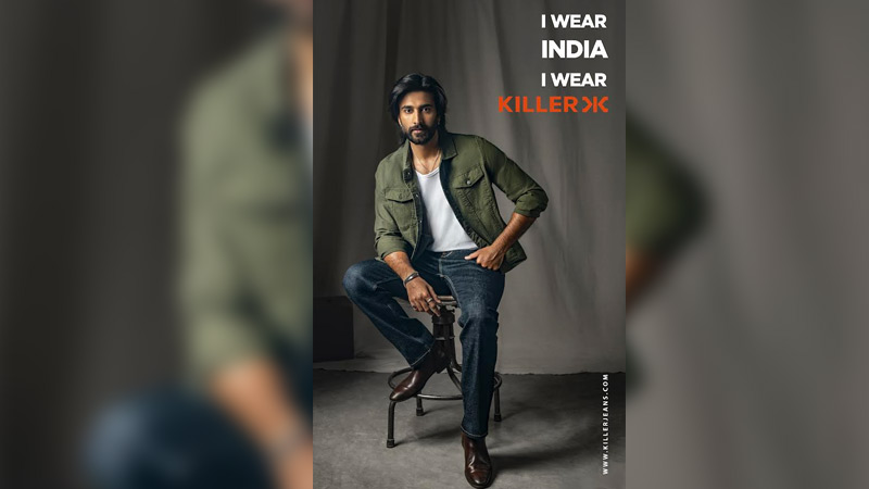
MUMBAI: India’s fashion scene just got a fresh dose of homegrown swagger as Killer releases a new series of digital films featuring actor Meezaan Jaffri under its I Wear India. I Wear Killer campaign. The films put the spotlight firmly on Indian style and celebrate the evolution of Killer from a denim label to a full men’s lifestyle brand.
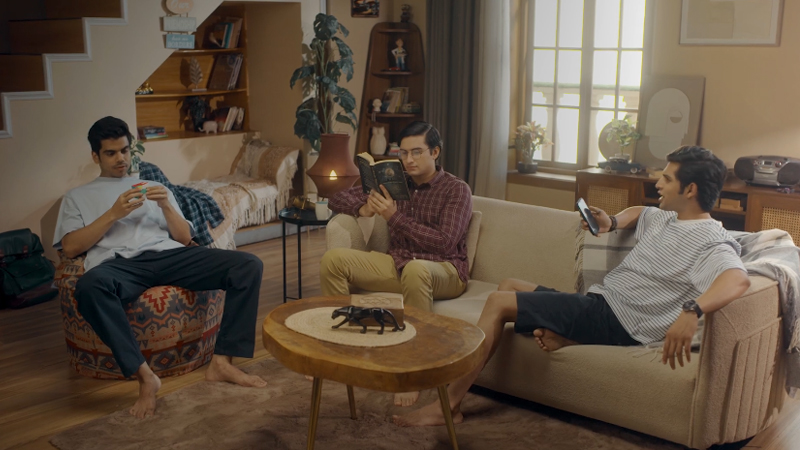
The campaign kicks off with a playful twist. Meezaan scrolls through global fashion trends with his stylist, who suggests recreating a look from abroad. Meezaan pauses, smiles, and says, “How about I trend in India? I wear India. I wear Killer.” That simple line encapsulates the brand’s message, Indian craftsmanship and design can stand tall on the global stage.
Once known primarily for denim, Killer now offers a complete wardrobe for the modern Indian man, including jeans, joggers, shirts, hoodies, jackets, nightwear, and accessories like bags and wallets. The campaign reinforces this transformation, showcasing stylish, premium, and proudly local fashion with global relevance.
Meezaan Jaffri, brand ambassador, said, “Killer represents the new Indian man who is confident, stylish, and proud of where he comes from. When I say ‘I Wear India. I Wear Killer,’ it’s about owning that pride and showing the world that Indian fashion stands tall.”
Kewal Kiran Clothing Ltd. joint managing director Hemant Jain added, “From starting as a denim brand to becoming a full lifestyle wardrobe for men, Killer reflects the evolution of Indian fashion itself. Our campaign celebrates a generation that is bold, stylish, and unapologetically proud of what India creates.”
The films are rolling out across digital platforms, in-store experiences, and outdoor displays, visually sharp and attitude-driven, mirroring the mindset change sweeping Indian fashion: homegrown style can be aspirational, premium, and proudly Indian at the same time.
Brands
Godrej clarifies ‘GI’ identifier after logo similarity debate
Says GI is not a logo, will not replace Godrej signature across products.
MUMBAI: In a branding storm where shapes did the talking, Godrej is now spelling things out. Godrej Industries Group (GIG) has issued a clarification on its newly introduced ‘GI’ identifier, addressing questions around its purpose and design following a wave of online criticism. At the centre of the debate were two concerns: whether the new mark replaces the long-standing Godrej logo, and whether its geometric design mirrors other corporate identities.
The company has drawn a clear line. The Godrej signature logo, it said, remains unchanged and continues to be the sole logo across all consumer-facing products and services. The ‘GI’ mark, by contrast, is not a logo but a corporate group identifier intended for use alongside the Godrej signature or company name, and aimed at stakeholders such as investors, media and talent rather than consumers.
The need for such a distinction stems from the 2024 restructuring of the broader Godrej Group into two separate business entities. With both continuing to operate under the same Godrej name and signature, the identifier is positioned as a way to differentiate the Godrej Industries Group at a corporate level.
The rollout, however, triggered a broader conversation on design originality. Critics pointed to similarities between the GI mark’s geometric composition and logos used by companies globally, raising questions about distinctiveness.
Responding to this, GIG said its intellectual property and legal review found that such overlaps are common in minimalist, geometry-led design systems. Basic forms such as circles and rectangles appear across dozens of brand identities worldwide, the company noted.
It added that the identifier emerged from an extensive design process and was chosen for its simplicity, allowing it to sit alongside the Godrej signature without competing visually. While acknowledging that elemental shapes may appear less distinctive in isolation, the group emphasised that the mark is part of a broader identity system that includes a custom typeface, sonic branding and other proprietary elements.
Following legal and ethical assessments, the company said it found no impediment to using the identifier, reiterating that the GI mark is a corporate tool not a consumer-facing symbol.
In short, the logo isn’t changing but the conversation around it certainly has.


