Brands
Greaves Cotton shifts gears with Parag Satpute as group CEO
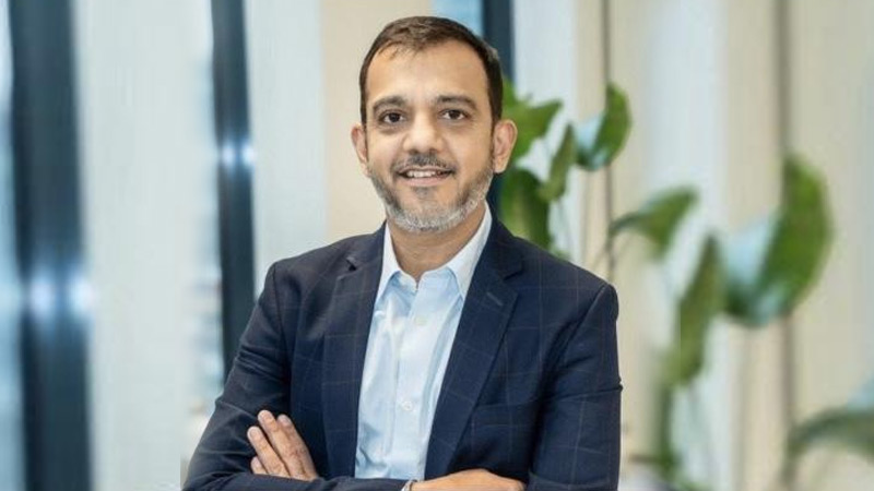
MUMBAI: Greaves Cotton Ltd has turned a fresh chapter in its storied 165-year history, appointing Parag Satpute as group CEO and managing director. Satpute, a seasoned leader with a career spanning over three decades, steps into the driver’s seat of the engineering powerhouse, renowned for its pivotal role in powering India’s growth story across agriculture, transportation, and infrastructure.
Under Satpute’s stewardship, Greaves Cotton is set for a transformation — evolving beyond its roots to become a fuel-agnostic mobility solutions provider. With a portfolio that spans diesel, petrol, CNG/LPG, electric, and even hydrogen-powered engines, the company is charging towards its vision of “Empowering Lives,” aiming to touch a billion lives by 2030.
Satpute’s credentials speak for themselves. His leadership stints at Bridgestone and Sandvik have honed his expertise in change management and strategy, making him a perfect fit to lead Greaves Cotton through this next phase of growth. From leading Bridgestone Mobility Solutions in Amsterdam to overseeing Sandvik’s India operations, Satpute has a proven track record of steering industry giants through transformative journeys.
As he steps up at Greaves Cotton, Satpute aims to build a digitally integrated ecosystem that connects consumers, business partners, and service providers across the mobility and power generation value chain — setting the stage for a new era of sustainable, inclusive growth.
Brands
Godrej clarifies ‘GI’ identifier after logo similarity debate
Says GI is not a logo, will not replace Godrej signature across products.
MUMBAI: In a branding storm where shapes did the talking, Godrej is now spelling things out. Godrej Industries Group (GIG) has issued a clarification on its newly introduced ‘GI’ identifier, addressing questions around its purpose and design following a wave of online criticism. At the centre of the debate were two concerns: whether the new mark replaces the long-standing Godrej logo, and whether its geometric design mirrors other corporate identities.
The company has drawn a clear line. The Godrej signature logo, it said, remains unchanged and continues to be the sole logo across all consumer-facing products and services. The ‘GI’ mark, by contrast, is not a logo but a corporate group identifier intended for use alongside the Godrej signature or company name, and aimed at stakeholders such as investors, media and talent rather than consumers.
The need for such a distinction stems from the 2024 restructuring of the broader Godrej Group into two separate business entities. With both continuing to operate under the same Godrej name and signature, the identifier is positioned as a way to differentiate the Godrej Industries Group at a corporate level.
The rollout, however, triggered a broader conversation on design originality. Critics pointed to similarities between the GI mark’s geometric composition and logos used by companies globally, raising questions about distinctiveness.
Responding to this, GIG said its intellectual property and legal review found that such overlaps are common in minimalist, geometry-led design systems. Basic forms such as circles and rectangles appear across dozens of brand identities worldwide, the company noted.
It added that the identifier emerged from an extensive design process and was chosen for its simplicity, allowing it to sit alongside the Godrej signature without competing visually. While acknowledging that elemental shapes may appear less distinctive in isolation, the group emphasised that the mark is part of a broader identity system that includes a custom typeface, sonic branding and other proprietary elements.
Following legal and ethical assessments, the company said it found no impediment to using the identifier, reiterating that the GI mark is a corporate tool not a consumer-facing symbol.
In short, the logo isn’t changing but the conversation around it certainly has.


