Brands
Finolex names new MD and technical director as growth picks up
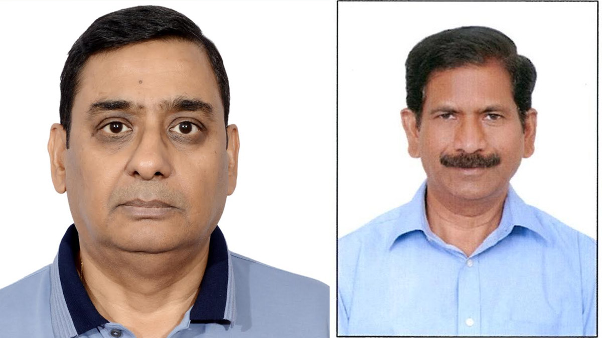
PUNE: Finolex Industries has refreshed its leadership ranks as it gears up for a new phase of growth. The company has appointed Udipt Agarwal as managing director from November 1, while Rambabu Sanka stepped in as director technical earlier on August 2.
Agarwal, 56, arrives with more than three decades of experience across chemicals, bio-industrial solutions and specialty materials. A graduate of HBTI Kanpur and an Insead alumnus, he has built a career around operations, business strategy and market development across Asia. His remit now is to steer Finolex’s expansion as demand for pipes and fittings continues to rise.
Sanka, 63, brings close to forty years of expertise in chemical manufacturing with deep experience in VCM and PVC operations. Known for his strengths in plant management and process optimisation, he is expected to boost Finolex’s quest for manufacturing excellence.
Welcoming the duo, executive chairman Prakash P. Chhabria said their complementary strengths will help drive innovation, agility and market leadership. He added that the company is confident of building a future-ready Finolex that delivers greater value across its ecosystem.
The leadership change follows the retirement of managing director Saurabh Dhanorkar and director technical Saumya Chakrabarti. Chhabria thanked both leaders for laying a strong foundation and for their consistent commitment to Finolex’s values and culture.
Finolex Industries, one of India’s most trusted names in PVC pipes and fittings, has spent 44 years perfecting one craft. From sourcing raw materials and producing resin to manufacturing, logistics, sales and customer engagement, the company has kept its focus narrow and its standards high. The result is a brand known for reliable quality, strong dealer networks and unwavering customer goodwill.
Even as it expands into new markets, the company continues to measure success not just in numbers but in reputation. Its commitment to quality extends to its dealer support, supplier relationships, employee opportunities and social initiatives that improve education, health and living standards in the communities it serves.
After four decades of staying steady, focused and trusted, Finolex now enters its next chapter under new leadership, determined to strengthen what it already does best.
Brands
Godrej clarifies ‘GI’ identifier after logo similarity debate
Says GI is not a logo, will not replace Godrej signature across products.
MUMBAI: In a branding storm where shapes did the talking, Godrej is now spelling things out. Godrej Industries Group (GIG) has issued a clarification on its newly introduced ‘GI’ identifier, addressing questions around its purpose and design following a wave of online criticism. At the centre of the debate were two concerns: whether the new mark replaces the long-standing Godrej logo, and whether its geometric design mirrors other corporate identities.
The company has drawn a clear line. The Godrej signature logo, it said, remains unchanged and continues to be the sole logo across all consumer-facing products and services. The ‘GI’ mark, by contrast, is not a logo but a corporate group identifier intended for use alongside the Godrej signature or company name, and aimed at stakeholders such as investors, media and talent rather than consumers.
The need for such a distinction stems from the 2024 restructuring of the broader Godrej Group into two separate business entities. With both continuing to operate under the same Godrej name and signature, the identifier is positioned as a way to differentiate the Godrej Industries Group at a corporate level.
The rollout, however, triggered a broader conversation on design originality. Critics pointed to similarities between the GI mark’s geometric composition and logos used by companies globally, raising questions about distinctiveness.
Responding to this, GIG said its intellectual property and legal review found that such overlaps are common in minimalist, geometry-led design systems. Basic forms such as circles and rectangles appear across dozens of brand identities worldwide, the company noted.
It added that the identifier emerged from an extensive design process and was chosen for its simplicity, allowing it to sit alongside the Godrej signature without competing visually. While acknowledging that elemental shapes may appear less distinctive in isolation, the group emphasised that the mark is part of a broader identity system that includes a custom typeface, sonic branding and other proprietary elements.
Following legal and ethical assessments, the company said it found no impediment to using the identifier, reiterating that the GI mark is a corporate tool not a consumer-facing symbol.
In short, the logo isn’t changing but the conversation around it certainly has.


