Brands
Converse and Isabel Marant honor Chuck Taylor and sneaker wedge
Mumbai: Converse and Isabel Marant have partnered for the first time to launch a capsule collection combining new and classic Converse styles with Isabel Marant’s Parisian aesthetic.
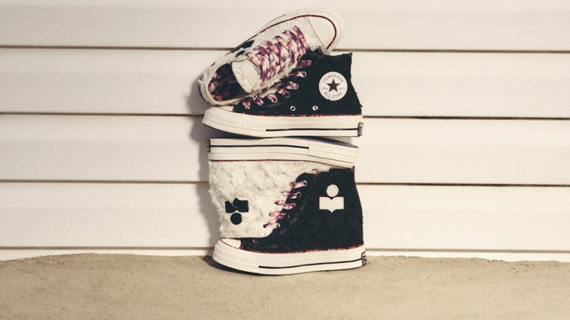
Marant, known for blending high and low fashion with spontaneity, independence, and natural elegance, aligns with Converse’s values. The collection will feature the new Chuck 70 Wedge and an updated Chuck 70, reflecting a mix of nostalgia and “Effortless Luxury.”
The Chuck 70 Wedge, with its hidden 2.5-inch heel, builds on Marant’s pioneering work with sneaker wedges from the 2010s. The collection also includes the Chuck 70 High Top and Chuck 70 Ox Low Top, showcasing Marant’s design elements with key Chuck details. Features include a frayed Jacquard upper, Marant’s logo on raw edge canvas, multi-colored pinstripes, and a translucent outsole. Colorways include Vanilla White and Raven for the Chuck 70 Wedge, Raven for the Chuck 70, and Vanilla White for the Chuck 70 Ox.
The Converse x Isabel Marant collection will be available on Converse.in from 12 September 2024 and on partner platforms VegNonVeg and Limited Edt from 13 September 2024. Pricing is Rs 11,499 for the Chuck 70 Ox, Rs 12,299 for the Chuck 70, and Rs 15,499 for the Chuck 70 Wedge.
The collaboration also introduces a new Chuck Taylor All Star Wedge, featuring a 2.5-inch hidden heel, available in black and white from 12th October 2024 on Converse.in and partner platforms. An inline Chuck 70 Wedge will also be released in the coming months.
Brands
Godrej clarifies ‘GI’ identifier after logo similarity debate
Says GI is not a logo, will not replace Godrej signature across products.
MUMBAI: In a branding storm where shapes did the talking, Godrej is now spelling things out. Godrej Industries Group (GIG) has issued a clarification on its newly introduced ‘GI’ identifier, addressing questions around its purpose and design following a wave of online criticism. At the centre of the debate were two concerns: whether the new mark replaces the long-standing Godrej logo, and whether its geometric design mirrors other corporate identities.
The company has drawn a clear line. The Godrej signature logo, it said, remains unchanged and continues to be the sole logo across all consumer-facing products and services. The ‘GI’ mark, by contrast, is not a logo but a corporate group identifier intended for use alongside the Godrej signature or company name, and aimed at stakeholders such as investors, media and talent rather than consumers.
The need for such a distinction stems from the 2024 restructuring of the broader Godrej Group into two separate business entities. With both continuing to operate under the same Godrej name and signature, the identifier is positioned as a way to differentiate the Godrej Industries Group at a corporate level.
The rollout, however, triggered a broader conversation on design originality. Critics pointed to similarities between the GI mark’s geometric composition and logos used by companies globally, raising questions about distinctiveness.
Responding to this, GIG said its intellectual property and legal review found that such overlaps are common in minimalist, geometry-led design systems. Basic forms such as circles and rectangles appear across dozens of brand identities worldwide, the company noted.
It added that the identifier emerged from an extensive design process and was chosen for its simplicity, allowing it to sit alongside the Godrej signature without competing visually. While acknowledging that elemental shapes may appear less distinctive in isolation, the group emphasised that the mark is part of a broader identity system that includes a custom typeface, sonic branding and other proprietary elements.
Following legal and ethical assessments, the company said it found no impediment to using the identifier, reiterating that the GI mark is a corporate tool not a consumer-facing symbol.
In short, the logo isn’t changing but the conversation around it certainly has.


