Brands
Converse and Golf Wang slip into style with nature-inspired collection
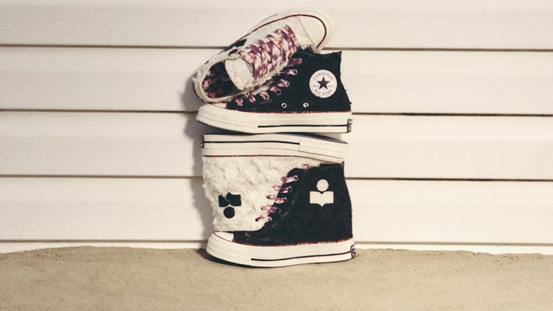
MUMBAI: When fashion and skate culture collide, the result is anything but flat-footed. Converse and Golf Wang have dropped a fresh spin on their long-running collaboration with the debut of the one star CC slip pro, a slip-on skate silhouette that’s as textured as it is stylish.
It’s a first for the partnership, drawing on Converse’s 1960s Deck Star Gore and Sea Star Gore designs, while also nodding to the brand’s 1970s One Star heritage. Tyler, The Creator, known for raiding Converse’s archives, gives the One Star formula a Golf Wang twist turning history into something boldly irreverent and unmistakably current.
The collection is served up in three earthy iterations, each named and shaded after natural landscapes:
● Forget Me Not (Concrete), a muted blue suede recalling soft, cloudy skies.
● Forest Elf (Grass), lush green suede that feels like walking on a forest floor.
● Black Beauty (Dirt), rich, dark suede mirroring fertile soil.
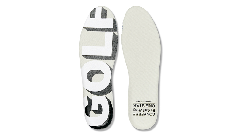
Every pair features a two-tone hairy suede upper, egret foxing tape with a varnished finish, and a co-branded sock liner stamped with landscape-inspired artwork. Underfoot, skaters get practical perks: ConS traction rubber for grip and board feel, and CX foam cushioning for comfort that lasts from tricks to hangouts.
Priced at Rs 6,999, the Converse x Golf Wang one star CC slip pro is available now on converse.in and select retail partners. For sneakerheads and skaters alike, it’s a design that proves slipping on can still mean standing out.
Brands
Godrej clarifies ‘GI’ identifier after logo similarity debate
Says GI is not a logo, will not replace Godrej signature across products.
MUMBAI: In a branding storm where shapes did the talking, Godrej is now spelling things out. Godrej Industries Group (GIG) has issued a clarification on its newly introduced ‘GI’ identifier, addressing questions around its purpose and design following a wave of online criticism. At the centre of the debate were two concerns: whether the new mark replaces the long-standing Godrej logo, and whether its geometric design mirrors other corporate identities.
The company has drawn a clear line. The Godrej signature logo, it said, remains unchanged and continues to be the sole logo across all consumer-facing products and services. The ‘GI’ mark, by contrast, is not a logo but a corporate group identifier intended for use alongside the Godrej signature or company name, and aimed at stakeholders such as investors, media and talent rather than consumers.
The need for such a distinction stems from the 2024 restructuring of the broader Godrej Group into two separate business entities. With both continuing to operate under the same Godrej name and signature, the identifier is positioned as a way to differentiate the Godrej Industries Group at a corporate level.
The rollout, however, triggered a broader conversation on design originality. Critics pointed to similarities between the GI mark’s geometric composition and logos used by companies globally, raising questions about distinctiveness.
Responding to this, GIG said its intellectual property and legal review found that such overlaps are common in minimalist, geometry-led design systems. Basic forms such as circles and rectangles appear across dozens of brand identities worldwide, the company noted.
It added that the identifier emerged from an extensive design process and was chosen for its simplicity, allowing it to sit alongside the Godrej signature without competing visually. While acknowledging that elemental shapes may appear less distinctive in isolation, the group emphasised that the mark is part of a broader identity system that includes a custom typeface, sonic branding and other proprietary elements.
Following legal and ethical assessments, the company said it found no impediment to using the identifier, reiterating that the GI mark is a corporate tool not a consumer-facing symbol.
In short, the logo isn’t changing but the conversation around it certainly has.


