Brands
Cipla Health and Dcell unfold a bold new look
MUMBAI: When it comes to intimate wellness, Cipla Health is ready to turn the page, or rather, Unfold it. The healthcare major has entered the sexual wellness space with Unfold, a brand that dares to redefine intimacy with trust, style, and self-assurance at its core.
To bring this bold vision to life, c teamed up with Dcell, the specialist design arm of Mullenlowe Lintas Group, to craft a striking, stigma-free identity that feels as global as it is grounded in Indian sensibilities.
“With Unfold, we’ve entered the sexual wellness category guided by strong consumer insights, where trust and packaging play a pivotal role,” said Cipla Health managing director and CEO Shivam Puri. “Dcell has translated these insights into a modern, fresh design that reframes intimacy while remaining stigma-free.”
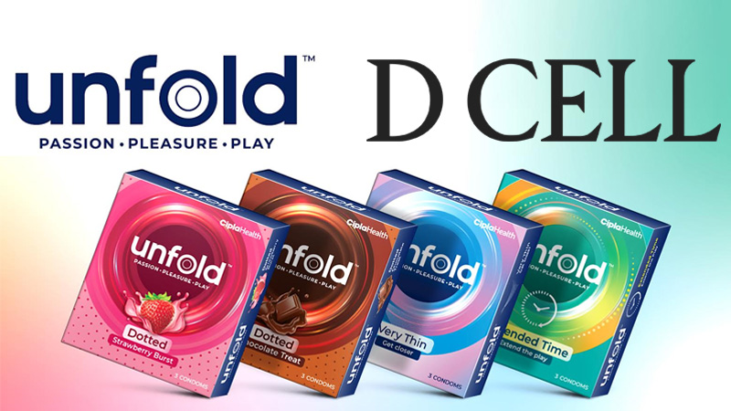
Unfold’s design breaks away from the conventional cues of the category. Its sleek, metallic holographic finish and layered visuals symbolise the idea of “unfolding” passion and connection, while vibrant colours bring modernity and warmth to the fore.
“Unfold is more than just a product, it’s a step towards normalising conversations around intimacy in India,” said Dcell executive design director Bhumika Shah. “Its aspirational yet discreet design reflects a shift towards products that combine aesthetics with confidence and quality.”
With an identity that’s as confident as its message, Unfold doesn’t just sell wellness, it invites India to open up to it.
Brands
Godrej clarifies ‘GI’ identifier after logo similarity debate
Says GI is not a logo, will not replace Godrej signature across products.
MUMBAI: In a branding storm where shapes did the talking, Godrej is now spelling things out. Godrej Industries Group (GIG) has issued a clarification on its newly introduced ‘GI’ identifier, addressing questions around its purpose and design following a wave of online criticism. At the centre of the debate were two concerns: whether the new mark replaces the long-standing Godrej logo, and whether its geometric design mirrors other corporate identities.
The company has drawn a clear line. The Godrej signature logo, it said, remains unchanged and continues to be the sole logo across all consumer-facing products and services. The ‘GI’ mark, by contrast, is not a logo but a corporate group identifier intended for use alongside the Godrej signature or company name, and aimed at stakeholders such as investors, media and talent rather than consumers.
The need for such a distinction stems from the 2024 restructuring of the broader Godrej Group into two separate business entities. With both continuing to operate under the same Godrej name and signature, the identifier is positioned as a way to differentiate the Godrej Industries Group at a corporate level.
The rollout, however, triggered a broader conversation on design originality. Critics pointed to similarities between the GI mark’s geometric composition and logos used by companies globally, raising questions about distinctiveness.
Responding to this, GIG said its intellectual property and legal review found that such overlaps are common in minimalist, geometry-led design systems. Basic forms such as circles and rectangles appear across dozens of brand identities worldwide, the company noted.
It added that the identifier emerged from an extensive design process and was chosen for its simplicity, allowing it to sit alongside the Godrej signature without competing visually. While acknowledging that elemental shapes may appear less distinctive in isolation, the group emphasised that the mark is part of a broader identity system that includes a custom typeface, sonic branding and other proprietary elements.
Following legal and ethical assessments, the company said it found no impediment to using the identifier, reiterating that the GI mark is a corporate tool not a consumer-facing symbol.
In short, the logo isn’t changing but the conversation around it certainly has.


